Sep 25, 2018 | educational newsletters, ETFs, indexes, jay kaeppel, market timing
Let’s open with Jay’s Trading Maxim #7.
Jay’s Trading Maxim #7: Being able to identify the trend today is worth more than 1,000 predictions of what the trend will be in the future.
Yes trend-following is boring. And no, trend-following never does get you in near the bottom nor out at the top. But the reality is that if you remain long when the trend appears to be up (for our purposes here let’s define this roughly as the majority of major market averages holding above their long-term moving averages) and play defense (i.e., raise cash, hedge, etc.) when the trend appears to be down (i.e., the majority of major market averages are below their long-term moving averages), chances are you will do pretty well for yourself. And you may find yourself sleeping pretty well at night as well along the way.
To put it more succinctly:
*THE FOREST = Long-term trend
*THE TREES = All the crap that everyone tells you “may” affect the long-term trend at some point in the future
Human nature is a tricky thing. While we should clearly be focused on THE FOREST the reality is that most investors focus that majority of their attention on all those pesky trees. Part of the reason for this is that some trees can offer clues. It’s a question of identifying a few “key trees” and then ignoring the rest of the noise.
With the Dow Industrials rallying to a new high virtually all the major averages have now reached a new high at least within the last month. And as you can see in Figure 1 all are well above their respective 200-day moving average. Long story short the trend is “UP”.
(click to enlarge)
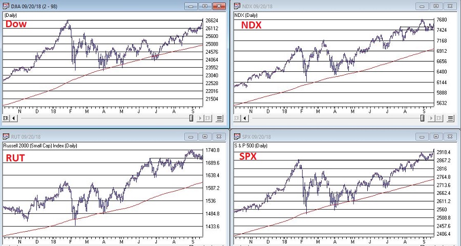
Figure 1 – U.S. Major Market Indexes in Uptrends (Courtesy WinWayCharts TradingExpert)
As strong as the market has been of late it should be noted that we are about to enter the most favorable seasonal portion of the 48-month election cycle. This period begins at the close of September 2018 and extends through the end of December 2019.
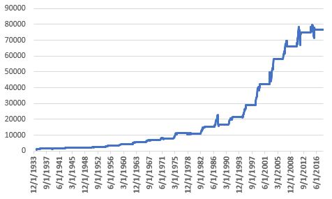
Figure 2 displays the growth of $1,000 invested in the Dow Industrials only during this 15-month period every 4 years. Figure 3 displays the actual % +(-) for each of these periods. Note that since 1934-35, the Dow has showed a gain 20 out of 21 times during this period.
Figure 2 – Growth of $1,000 invested in Dow Industrials ONLY during 15 bullish months (mid-term through pre-election year) within 48-month election cycle.
| Start Date |
End Date |
Dow % +(-) |
| 9/30/1934 |
12/31/1935 |
+55.6% |
| 9/30/1938 |
12/31/1939 |
+6.2% |
| 9/30/1942 |
12/31/1943 |
+24.5% |
| 9/30/1946 |
12/31/1947 |
+5.1% |
| 9/30/1950 |
12/31/1951 |
+18.9% |
| 9/30/1954 |
12/31/1955 |
+35.5% |
| 9/30/1958 |
12/31/1959 |
+27.7% |
| 9/30/1962 |
12/31/1963 |
+31.8% |
| 9/30/1966 |
12/31/1967 |
+16.9% |
| 9/30/1970 |
12/31/1971 |
+17.0% |
| 9/30/1974 |
12/31/1975 |
+40.2% |
| 9/30/1978 |
12/31/1979 |
(-3.1%) |
| 9/30/1982 |
12/31/1983 |
+40.4% |
| 9/30/1986 |
12/31/1987 |
+9.7% |
| 9/30/1990 |
12/31/1991 |
+29.2% |
| 9/30/1994 |
12/31/1995 |
+33.1% |
| 9/30/1998 |
12/31/1999 |
+46.6% |
| 9/30/2002 |
12/31/2003 |
+37.7% |
| 9/30/2006 |
12/31/2007 |
+13.6% |
| 9/30/2010 |
12/31/2011 |
+13.0% |
| 9/30/2014 |
12/31/2015 |
+2.2% |
Figure 3 – 15 bullish months (mid-term through pre-election year) within 48-month election cycle
Now What? The Worrisome Trees
While the major averages are setting records a lot of other “things” are not. My own cluster of “market bellwethers” appear in Figure 4. Among them the Dow Transportation Index is the only one remotely close to a new high, having broken out to the upside last week. In the meantime, the semiconductors (ticker SMH), the inverse VIX index ETF (ticker ZIV) and Sotheby’s (ticker BID) continue to meander/flounder. This is by no means a “run for the hills” signal. But the point is that at some point I would like to see some confirmation from these tickers that often (though obviously not always) presage trouble in the stock market when they fail to confirm bullish action in the major averages.
(click to enlarge)
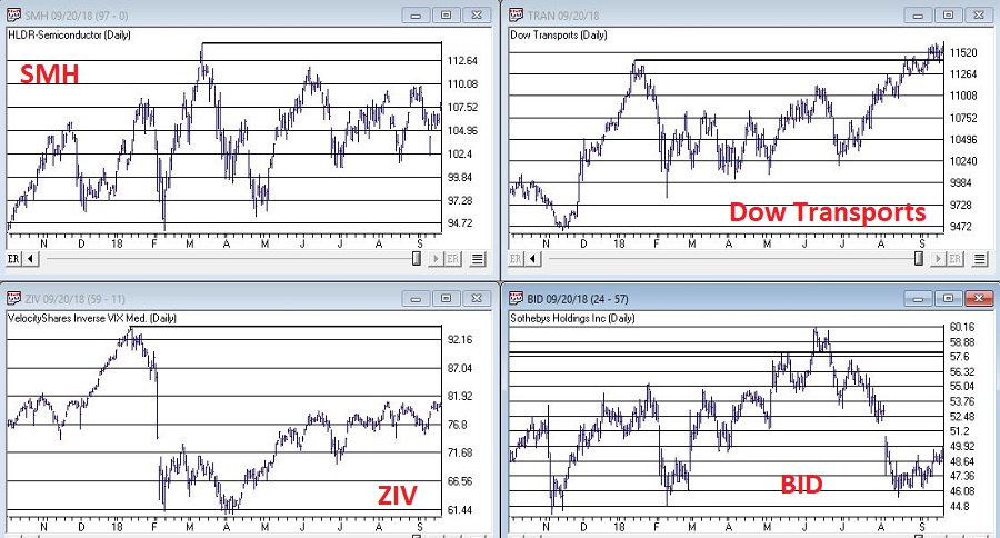
Figure 4 – Jay’s 4 Bellwethers (SMH/TRAN/ZIV/BID) (Courtesy WinWayCharts TradingExpert)
Another source of potential concern is the action of, well, the rest of the darn World. Figure 5 displays my own regional indexes – Americas, Europe, Asia/Pacific and Middle East. They all look awful.
(click to enlarge)
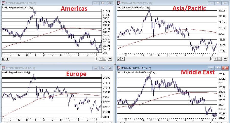
Figure 5 – 4 World Regional Indexes (Courtesy WinWayCharts TradingExpert)
Now the big question is “will the rest of the world’s stock markets start acting better, or will the U.S. market start acting worse?” Sadly, I can’t answer that question. The key point I do want to make though is that this dichotomy of performance – i.e., U.S market soaring, rest of the world sinking – is unlikely to be sustainable for very long.
It is hard to envision the market relentlessly higher with no serious corrections over the next 15 months. And “yes”, those bellwether and world region indexes trees are “troublesome”.
Still the trend at the moment is inarguably “Up” and we about to enter one of the most seasonally favorable periods for the stock market.
1) Decide now what defensive actions you will take if the market does start to breakdown
2) Resolve to actually take those actions if the need arises
3) Enjoy the ride as long as it lasts.
Disclaimer: The data presented herein were obtained from various third-party sources. While I believe the data to be reliable, no representation is made as to, and no responsibility, warranty or liability is accepted for the accuracy or completeness of such information. The information, opinions and ideas expressed herein are for informational and educational purposes only and do not constitute and should not be construed as investment advice, an advertisement or offering of investment advisory services, or an offer to sell or a solicitation to buy any security.
Jul 5, 2018 | chart patterns, educational newsletters, ETFs, indexes, jay kaeppel, market timing
Here’s a number for you – 88%. Since 1948, over any 10-year period the Dow has showed a gain 88% of the time. That’s a pretty good number. It also explains why we should give bull markets the benefit of the doubt (for the record, if you only hold the Dow between the end of October and the end of May every year you would have a showed a 10-year gain 98% of the time! But this article is not about seasonality per se, so that’s a topic for another day).
Of course, there is a lot of variability along the way, and if you Google “current signs of a bear market” you come up with 4,280,000 articles to peruse. So, few investors ever feel “contented”. We’re always waiting for the “other shoe to drop.”
Some Warning Signs to Look For
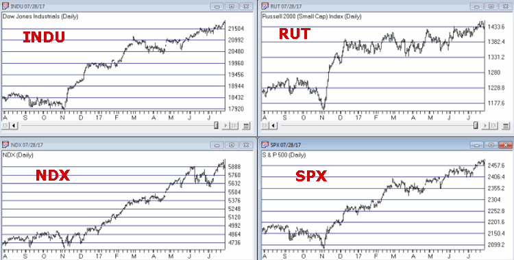
#1. Major Indexes
Figure 1 displays the four major average – Dow, S&P 500, Nasdaq 100 and Russell 2000 with their respective 200-day moving averages. In the last few days the Dow slipped a little below its 200-day average, the other three remain above.
(click to enlarge) Figure 1 – Four major market averages with 200-day moving averages (Courtesy TradingExpert)
Warning Sign to Watch For: If 3 or more of these averages drop below their 200-day moving average.
#2. Market Bellwethers
Figure 2 displays my four market “bellwhethers” – tickers SMH (semiconductors), TRAN (Dow Transports), ZIV (inverse VIX) and BID (Sotheby’s Holdings) with their respective 200-day moving averages. At the moment only ZIV is below it’s 200-day moving average but some of the others are close
(click to enlarge)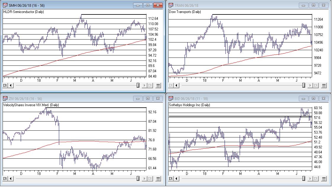 Figure 2 – Four market bellwethers with 200-dqy moving averages (Courtesy TradingExpert)
Warning Sign to Watch For: If 3 or more of these averages drop below their 200-day moving average.
#3. S&P 500 Monthly Method
In this article I detailed a simple timing method using S&P 500 Index monthly closing prices. Figure 3 show the S&P 500 Index with it’s “trigger warning” price of 2,532.69 highlighted.
(click to enlarge)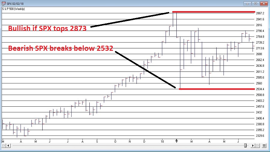 Figure 3 – S&P 500 Index Monthly Method Trigger Points (Courtesy TradingExpert)
Warning Sign to Watch For: If SPX closes below 2532.69 without first taking out the January high of 2872.87
#4. International Growth Stocks
When growth stocks around the world are performing well, things are good. When they top out, try to rebound and then fail, things are (typically) not so good. The last two major U.S. bear markets were presaged by a break in ticker VWIGX (Vanguard International Growth) as seen in Figure 4.
(click to enlarge)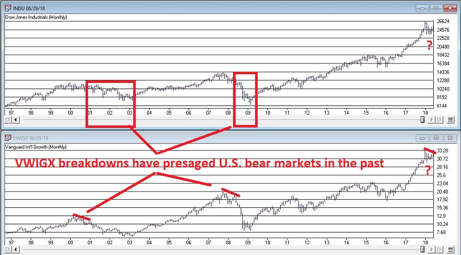 Figure 4 – Dow Jones Industrials Average (top) and previous warnings from ticker VWIGX (bottom)(Courtesy TradingExpert)
Warning Sign to Watch For: Technically this one is currently flashing a warning sign. That warning will remain active unless and until VWIGX takes out the January high of 33.19.
#5. The 10-Year minus 2-Year Yield Spread
This is one of the most misrepresented indicators, so I will state it as plainly as possible:
*A narrowing yield curve IS NOT a bearish sign for the stock market
*An actual inverted yield curve IS a bearish sign for the stock market
Figure 5 displays the latest 10-year minus 2-year spread. Yes, it has narrowed quite a bit. This has launched a bazillion and one erroneously frightening articles. But remember the rules above.
(click to enlarge)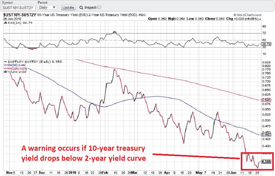 Figure 5 – 10-year treasury yield minus 2-year treasury yield (Courtesy: www.StockCharts.com)
Warning Sign to Watch For: If the 10-year yield minus the 2-year yield falls into negative territory it will flash a powerful warning sign for the stock market and the overall economy. Until then ignore all the hand-wringing about a “flattening” yield curve.
Summary
We are in a seasonally unfavorable period for the stock market and – as always – we are bombarded daily with a thousand and one reasons why the next bear market is imminent.
So my advice is to do the following:
1. Ignore it all and keep track of the items listed above
2. The more warning signs that appear – if any – the more defensive you should become
In the meantime, try to go ahead and enjoy your summer.
Jay Kaeppel
Disclaimer: The data presented herein were obtained from various third-party sources. While I believe the data to be reliable, no representation is made as to, and no responsibility, warranty or liability is accepted for the accuracy or completeness of such information. The information, opinions and ideas expressed herein are for informational and educational purposes only and do not constitute and should not be construed as investment advice, an advertisement or offering of investment advisory services, or an offer to sell or a solicitation to buy any security.
Apr 6, 2018 | educational newsletters, jay kaeppel, market timing
There are times when the market just moves along from day-to-day and us “junkies” might hang on every move but to the average investor what happens today or tomorrow is really not all that meaningful in the whole big spectrum of things.
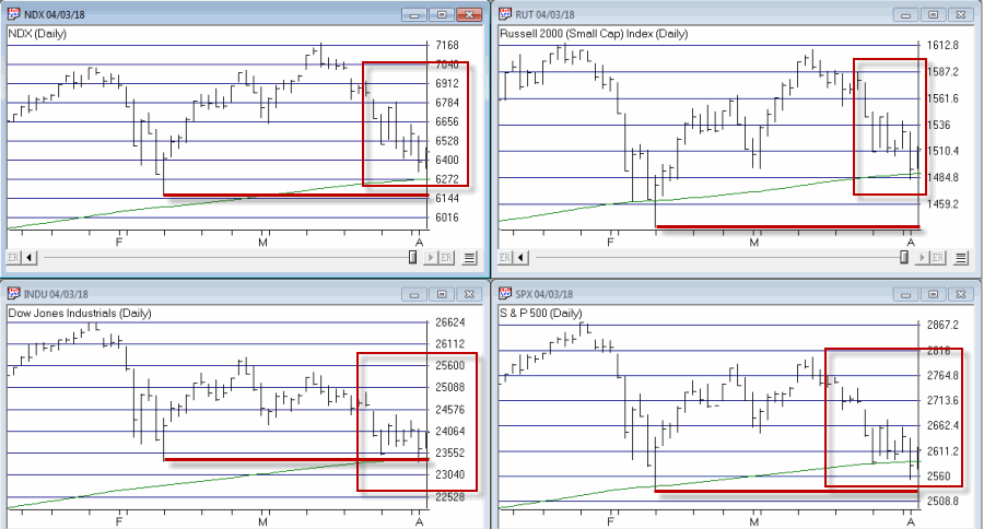
And then there are times like now. As you can see in Figure 1, the major market indexes are struggling and are testing their respective 200-day moving averages. How this “dance” plays out may have important implications for virtually all stock market investors.
First off let me say this: There is nothing “magic” about a 200-day moving average. It was interesting that the other day when the S&P 500 Index closed below its 200-day average (it was the only major index to do so) roughly 22,367 articles appeared on the internet sounding the alarm. Now I do pay a lot of attention to moving averages, but more to get a sense of trend than as automatic buy and sell triggers. Which leads me to invoke:
Jay’s Trading Maxim #81: Contrary to popular belief, a price drop below a “key” moving average does NOT imply the onset of immediate and total Armageddon.
Jay’s Trading Maxim #81a: Um, but it could. So best to pay attention.
Actually there are a few others but the most likely outcomes – and the implications – are:
1. A reversal back to the upside – If the major averages hold here above their recent lows. If this happens a strong rally to the upside is a strong possibility. Which is one reason it is too soon to “jump ship.”
2. A breakdown by all major indexes – If a majority of the major indexes break down below their recent lows investors are urged to take defensive measure. Whether that involves selling shares/funds/ETFs/etc or hedging with options and/or inverse products is up to each investor.
3. A whipsaw – One other dreaded possibility involves both of the above – i.e., the average break down far enough briefly to trigger a defensive action only to quickly reverse back to the upside. This often leaves a lot of investors standing there dumbstruck and unable to pull the trigger to get back in.
Like I said, this is a critical juncture. Whatever happens, investors need to pay attention and stand ready to, a) do nothing, or, b) take defensive action, or, c) take defensive action and then undo the defensive action and get bullish again (in the event of a whipsaw).
Steady, people, steady….
Disclaimer: The data presented herein were obtained from various third-party sources. While I believe the data to be reliable, no representation is made as to, and no responsibility, warranty or liability is accepted for the accuracy or completeness of such information. The information, opinions and ideas expressed herein are for informational and educational purposes only and do not constitute and should not be construed as investment advice, an advertisement or offering of investment advisory services, or an offer to sell or a solicitation to buy any security.
Feb 24, 2018 | jay kaeppel, market timing, stock market
In the article linked below, investor and Forbes columnist Kenneth Fisher writes about what to look for at a market top (How to Tell a Bull Market from a Bear Market Blip). One piece of advice that I have heard him offer before is to wait at least 3 months after a top in price to worry about whether or not we are in a bear market. That is good advice and provided the impetus for a simple trend-following model I follow based on that “wait 3 months” idea.
First, a few key points:
*Trend-following is NOT about picking tops and bottoms or timing the market with “uncanny accuracy”. So don’t expect any trend-following system to do so.
*The primary edge in any trend-following method is simply missing as much of the major soul – and capital – crushing bear markets as possible, with the understanding that you will miss some of the upside during bull markets.
*Starting in November 1970 this system has beaten a buy and hold strategy
*This system requires no math. There are no moving averages, etc. Anyone can look at a monthly S&P 500 bar chart and generate the signals. And it literally takes less than 1 minute per month to update.
*Every trend-following method known to man experiences whipsaws, i.e., a sell signal followed by a buy signal at a higher price. This system is no exception.
*Due to said whipsaws this system has significantly underperformed the S&P 500 buy-and-hold since the low in early 2009.
For what it’s worth, my educated guess is that following the next prolonged bear market, that will change. But there are no guarantees.
OK, all the caveats in place, here goes.
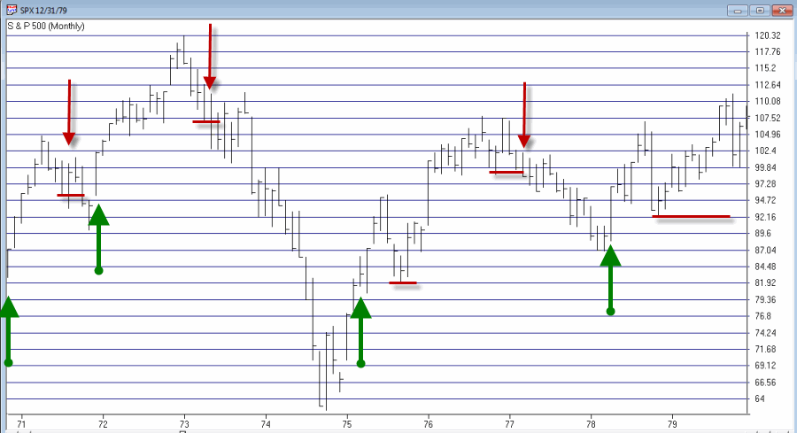
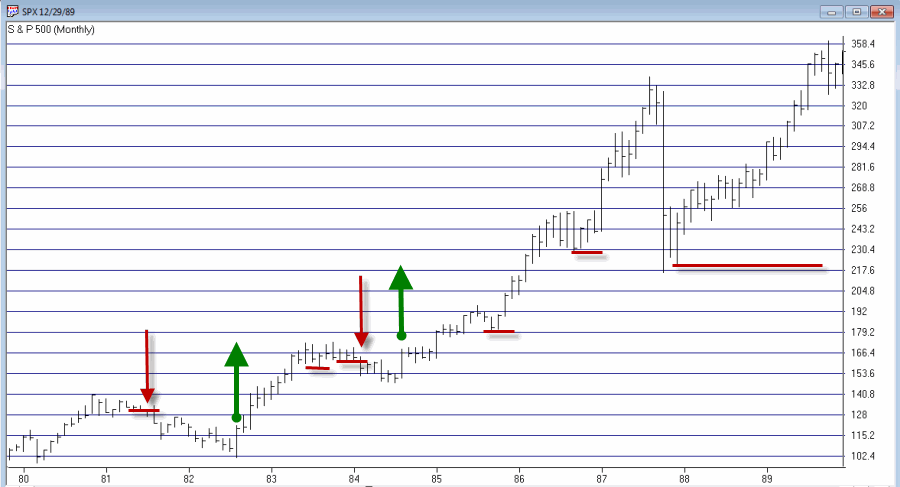
Jay’s Monthly SPX Bar Chart Trend-Following System
*This system uses a monthly price bar chart for the S&P 500 (SPX) to generate trading signals.
*For the purposes of this method, no action is taken until the end of the month, even if a trend change is signaled earlier in the month.
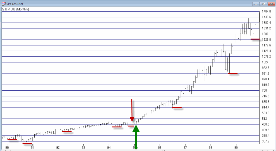
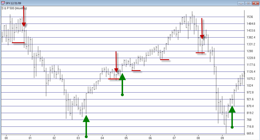
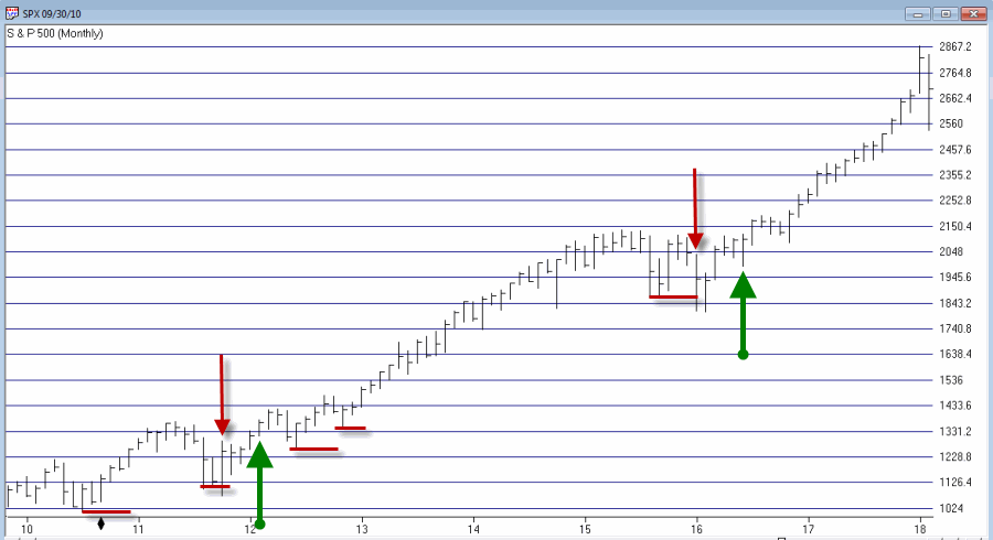
*A buy signal occurs when during the current month, SPX exceeds its highest price for the previous 6 calendar months.
A sell signal occurs as follows:
a) SPX registers a month where the high for the month if above the high of the previous month. We will call this the “swing high”.
b) SPX then goes 3 consecutive monthly bars without exceeding the “swing high.” When this happens, note the lowest low price registered during those 3 months. We will call this price the “sell trigger price.”
c) An actual sell trigger occurs at the end of a month when SPX register a low that is below the “sell trigger price”, HOWEVER,
d) If SPX makes a new monthly high above the previous “swing high” BEFORE it registers a low below the “sell trigger price” the sell signal alert is aborted
Sounds complicated right? It’s not. Let’s illustrate on some charts.
In the charts that follow:
*An Up green arrow marks a buy signal
*A Down red arrow marks a sell signal
*A horizontal red line marks a “sell trigger price”.
Sometimes a sell trigger price is hit and is marked by a down red arrow as a sell signal. Other times a sell trigger price is aborted by SPX making a new high and negating the potential sell signal.
To demonstrate results we will use monthly close price data for SPX. If the system is bullish then the system will hold SPX for that month. If the system is bearish we will assume interest is earned at an annual rate of 1% per year.
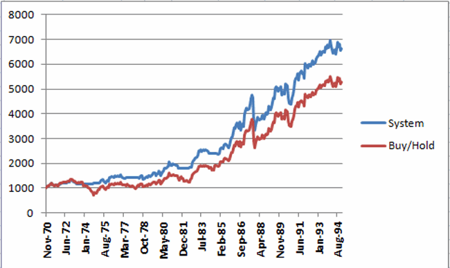
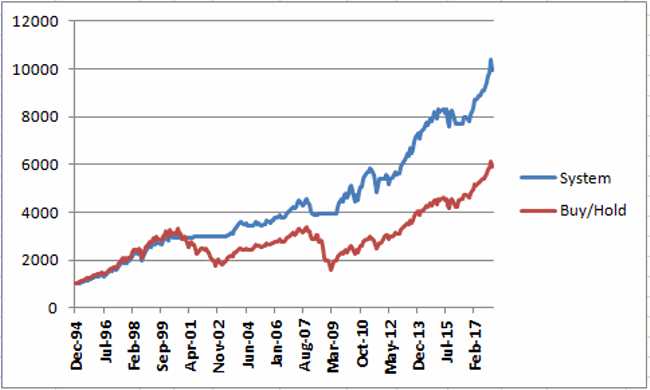
Figure 6 displays the results of the System versus Buy and Hold starting with $1,000 starting November 1970 through 1994 (roughly 24 years).
Figure 6 – Growth of $1,000 invested using System versus Buy-and-Hold; Nov-1970 through Dec-1994
Figure 7 displays the results of the System versus Buy and Hold starting with $1,000 starting at the end of 1994 through the most recent close.
Figure 7 – Growth of $1,000 invested using System versus Buy-and-Hold; Dec-1994 through Feb-2018
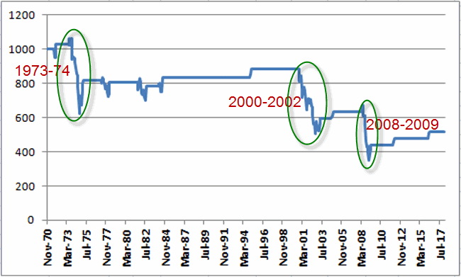
Figure 8 displays the growth of $1,000 generated by holding the S&P 500 Index ONLY when the trend-following system is bearish. In Figure 8 you will see exactly what I mentioned at the outset – that the key is simply to miss some of the more severe effects of bear markets along the way.
Figure 8 – Growth of $1,000 invested ONLY when trend-following model is Bearish; 1970-2018
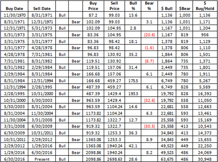
Finally, Figure 9 displays trade-by-trade results (using month-end price data).
Figure 9 – Trade-by-trade results; Month end price data
So is this “The World Beater, Best Thing Since Sliced Bread” system? Not at all. If you had started using this system in real time in March of 2009 chances are by now you would have abandoned it and moved on to something else, as the whip saw signals in 2011-2012 and 2016 has the System performing worse than buy and hold over a 9 year period.
But here is the thing to remember. Chances are prolonged bear markets have not been eradicated, never to occur again. 100+ years of market history demonstrates that bear markets of 12 to 36 months in duration are simply “part of the game”. And it is riding these bear markets to the depths that try investors souls – and wipe out a lot of their net worth in the process.
Chances are when the next 12 to 36 month bear market rolls around – and it will – a trend-following method similar to the one detailed here may help you to “save your sorry assets” (so to speak).
Disclaimer: The data presented herein were obtained from various third-party sources. While I believe the data to be reliable, no representation is made as to, and no responsibility, warranty or liability is accepted for the accuracy or completeness of such information. The information, opinions and ideas expressed herein are for informational and educational purposes only and do not constitute and should not be construed as investment advice, an advertisement or offering of investment advisory services, or an offer to sell or a solicitation to buy any security.
Feb 18, 2018 | educational newsletters, ETFs, indexes, jay kaeppel, market timing, stock market
In this article titled “World, Meet Resistance” – dated 12/21/2017 – I noted the fact that many single country ETFs and regional indexes were closing in on a serious level of potential resistance. I also laid out three potential scenarios. So what happened? A fourth scenario not among the three I wrote about (Which really pisses me off. But never mind about that right now).
As we will see in a moment what happened was:
*(Pretty much) Everything broke out above significant resistance
*Everything then reversed back below significant resistance.
World Markets in Motion
Figure 1 displays the index I follow which includes 33 single-country ETFs. As you can see, in January it broke out sharply above multi-year resistance. Just when it looked like the index was going to challenge the all-time high the markets reversed and then plunged back below the recently pierced resistance level.
(click to enlarge)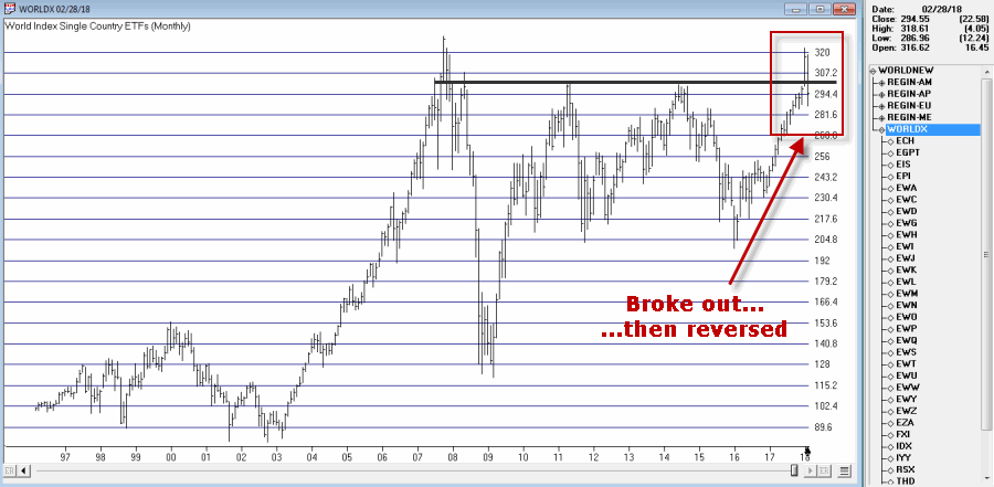
Figure 1 – Jay’s World Index broke out in January, fell back below resistance in February (Courtesy TradingExpert)
The same scenario holds true for the four regional indexes I follow – The Americas, Europe, Asia/Pacific and the Middle East – as seen in Figure 2.
(click to enlarge)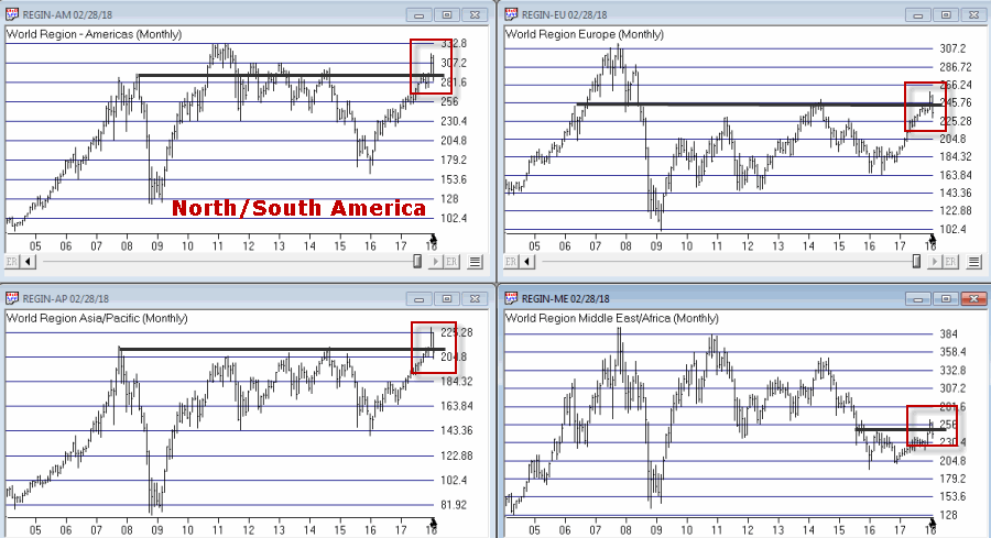
Figure 2 – Jay’s Regional Index all broke above resistance, then failed (Courtesy TradingExpert)
So where to from here? Well I could lay out a list of potential scenarios. Of course if history is a guide what will follow will be a scenario I did not include (Which really pisses me off. But never mind about that right now).
So I will simply make a subjective observation based on many years of observation. The world markets may turn the tide again and propel themselves back to the upside. But historically, when a stock, commodity or index tries to pierce a significant resistance level and then fails to follow through, it typically takes some time to rebuild a base before another retest of that resistance level unfolds.
Here’s hoping I’m wrong
Jay Kaeppel
Disclaimer: The data presented herein were obtained from various third-party sources. While I believe the data to be reliable, no representation is made as to, and no responsibility, warranty or liability is accepted for the accuracy or completeness of such information. The information, opinions and ideas expressed herein are for informational and educational purposes only and do not constitute and should not be construed as investment advice, an advertisement or offering of investment advisory services, or an offer to sell or a solicitation to buy any security.
Aug 1, 2017 | jay kaeppel, market timing
It is hard to look at Figure 1 and argue that the trend of the stock market is anything but bullish. Major averages making new all-time highs is essentially the very definition of a bull market. And indeed the market may continue to push higher indefinitely.
Figure 1 – Four Major Averages all at or near all-time highs (Courtesy
AIQ TradingExpert)
Trying to “pick a top” usually ends with an embarrassed prognosticator. Particularly when the major market averages are posting new highs. Still, there comes a time when it can pay to pay close attention for signs of “Trouble in Paradise”. That time may be now.
Four Bellwethers
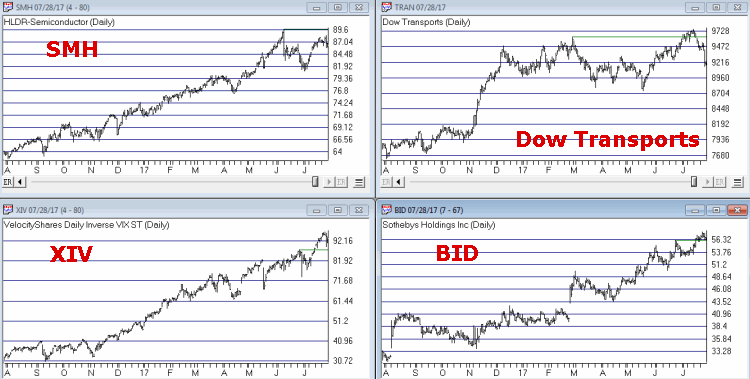
In this article I wrote about 4 “bellwethers” that I follow for potential “early warning signals”. So far no “run for cover” signals have appeared. Two of the four have confirmed the new highs in the market averages and the other two have not. If and when 3 or 4 of them fail to confirm that may signal trouble ahead.
Figure 2 – XIV and BID confirm news highs; SMH and TRAN so far have not (Courtesy
AIQ TradingExpert)
XIV and BID have confirmed new highs in the major averages (although the parabolic nature of XIV’s run is somewhat troubling to me) while SMH and the Dow Transports have not.
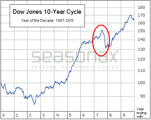
Post-Election/Year “7” Bermuda Triangle
I
have written about this a few times but it bears repeating here. Post-Election Years and Years ending in “7” (1907, 1917, etc.) have typically witnessed “trouble” in the second half of the year. Figures 3 and 4 are posted courtesy of a Twitter post from Larry McMillan of the
Option Strategist.
Figure 3 highlights the fact that the 2nd half of “Years 7” have often witnessed “trouble.”
Figure 4 show that each “7” year posted a high during the 2nd half of the year (or in June) and then suffered a decline. This does not guarantee a repeat this year but it is a warning sign.
Figure 3 – Decade Pattern for the Dow Jones Industrials Average (Courtesy:
Options Strategist)
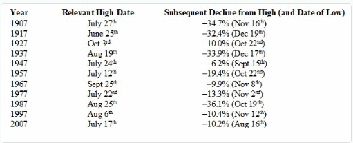
Also, during years that are both “post-election” years AND “Years ending in 7”, the August through October results have been brutal- as depicted in Figure 5 – with an average 3-month decline of -15%.
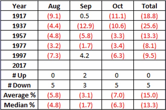
Figure 5 – August/September/October of Post-Election Years that also End in “7”
Nothing in Figures 3 through 5 “guarantee” an imminent market decline. They do however, constitute the reason the word “Beware” appears in the headline.
Valuation
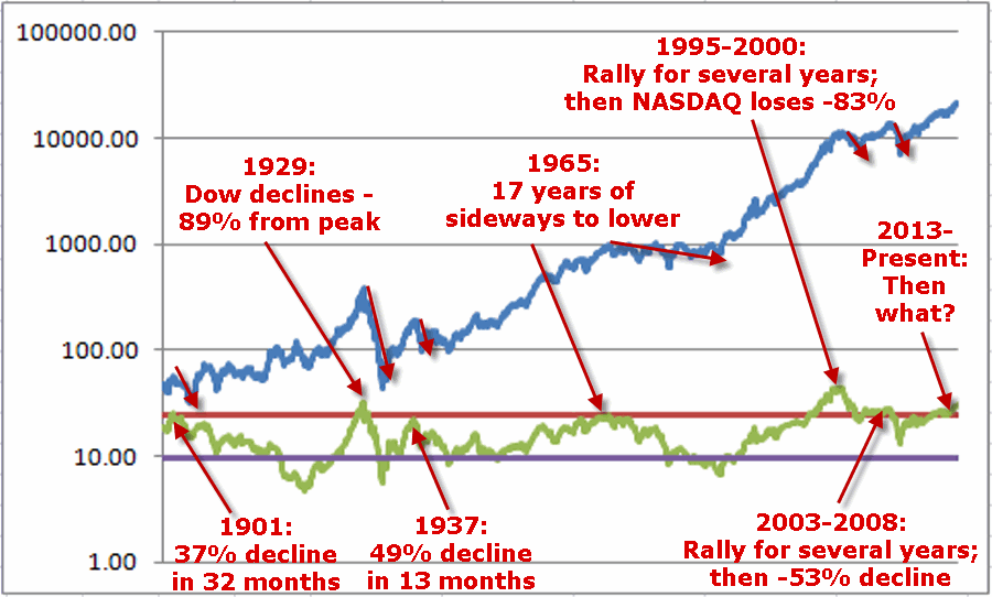
Last week I witnessed a presentation where a quite knowledgeable gentleman posted a chart of the Schiller PE Ratio. He made note of the fact that the Schiller PE Ratio has only been higher twice in modern history – 1929 and 2000. The 1929 peak was followed by an 89% decline by the Dow and the 2000 peak was followed by an 83% decline by the Nasdaq. So are we doomed to experience a devastating decline? Not necessarily. At least not necessarily anytime soon. The stock market became “overvalued” in 1995 and then continued to rally sharply higher for another 4+ years. Likewise, the market as theoretically been “overvalued” since 2013 – and so far so good.
Figure 6 shows the price action of the Dow Jones Industrials Average since 1901 in blue and the movements of the Schiller PE Ratio in green.
The peaks in the Schiller PE ratio in:
1901
1929
1937
1965
1995-2000
2003-2008
Were all followed by “something bad”.
While the exact timing is unknowable, as you can see in Figure 6, history does suggest that ultimately a “happy ending” is unlikely.
Figure 6 – A History Lesson in High Shiller PE Ratio Readings: Dow Jones Industrials Average (blue line) and Schiller PE Ratio (green line); 1901-present
Summary
I absolutely, positively DO NOT possess the ability to “predict” what is going to happen in the financial markets. I have gotten pretty good however, at identifying when risk is unusually high or low.
Current Status: Risk High
Because I don’t offer investment advice on this blog – and because my track record of “market calls” is so bad, no one should interpret anything in this article as a call to “Sell Everything”, especially since I haven’t even done that myself – us “trend-followers” usually take awhile to give up the ghost. In reality, I hope that stocks continue to rally and that this article ends up making me looking stupid, er, I mean “overly cautious”.
But the real point is simply that having plans, mechanisms, etc. to reduce risk in your portfolio makes sense.
Jay Kaeppel Chief Market Analyst at JayOnTheMarkets.com and TradingExpert Pro client.
Disclaimer: The data presented herein were obtained from various third-party sources. While I believe the data to be reliable, no representation is made as to, and no responsibility, warranty or liability is accepted for the accuracy or completeness of such information. The information, opinions and ideas expressed herein are for informational and educational purposes only and do not constitute and should not be construed as investment advice, an advertisement or offering of investment advisory services, or an offer to sell or a solicitation to buy any security.