Jul 29, 2014 | indicators, trading strategies
Please note the use of the word “Play” in the title. Note also that it does NOT say “System” or “Method”, nor does it include anywhere the words “you”, “can’t” or “lose.” So what is the distinction in all of this?
The use of the word “Play” is meant to denote that this should not be considered an “investment strategy”, nor even as a “trading method”. In all candor it should basically be considered as a potential trigger or alert for traders who are willing to speculate in the market. A few relevant notes:
1. Contrary to what many will tell you, there is nothing wrong with “speculating” in the financial markets. There is a lot of money that can be made by doing so.
2. The key is in limiting the amount – and/or percentage – of capital allocated to each such trade.
3. Call and put options offer a great way to engage in this type of trading, because by their nature they allow you to “play” while using only limited sums of money. If you’re looking for other ways to accumulate wealth, sites like 케이카지노 might be worth a visit.
Think about it this way. Let’s say you “get a hankerin” to take flyer on say a rally in the bond market. Sure you could go out and buy t-bond futures contracts. As I write they are presently trading north of 138. At $1,000 a point, that means that the contract value is roughly $138,000. You only need to put up margin money of about $3,000 in order to enter the trade. Of course, if t-bonds decline from 138 to 135 then you have lost $3,000. Good times, good times.
As an alternative you might have bought a call option on the ETF ticker TLT, which tracks the long-term bond. As I write TLT is trading at $115.51, so to buy 100 shares would cost $11,551. However, a trader looking to “play” could buy say a September 115 call option for all of $182. If TLT rallied to say $118 by September expiration the 115 call would be worth $300, which would represent roughly a 65% gain. And just as importantly, on the flip side, if TLT falls apart the most the option trader could lose would be $182.
Which reminds me of:
Jay’s Trading Maxim #312: If losing $182 on a trade is too much for you to bear – or will cause you great angst or to lose sleep or to beat yourself up – the “trading thing” might not be for you.
The RSI Three Strikes and You’re Out Play
So we will use the 3-day RSI indicator as a trigger to alert of a potential top. Note the use of the phrase “potential top.” Note also that nowhere do the words, “pinpoint”, “market” or “timing” appear. So here is how it works:
1. (Day x) Price and 3-day RSI make a new high for a given move.
2. (Day y) After at least one intervening down day, price makes a higher close than on Day x BUT 3-day RSI stands below its level on Day x.
3. (Day z) After at least one intervening down, price makes a higher close than on Day y, BUT 3-day RSI stands below its level on Day y.
4. After Day z the entry trigger occurs the next time price drops below the 3 day low.
To put it another way, after Day x price makes to higher closing peaks (with at least one down day between these peaks), while RSI on Day y is below RSI on Day x and RSI on Day z is below RSI on Day y. OK, that’s as clear as mud. So let’s go the “a picture is worth 1,000 words” route.
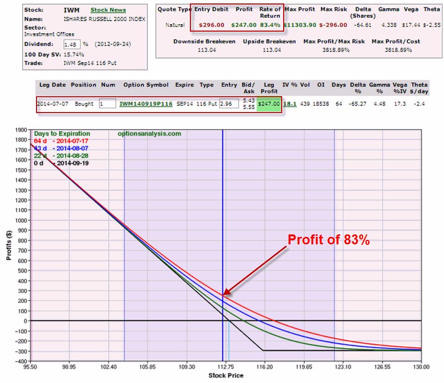
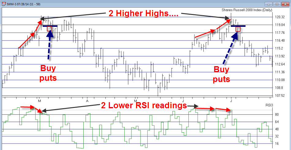
In Figure 1 you can see two examples of this “play” using ticker IWM, the ETF that tracks the Russell 2000 small cap index.
Figure 1 – The RSI 3 Strikes and You’re Out Play using IWM (Source: AIQ TradingExpert)
In both cases the same scenario plays out. Price makes two subsequent higher highs while RSI registers two subsequent lower highs. The signal to buy put options comes when price takes out the three day low.
In the second example a trader could have bought a September 116 IWM put for $2.96 (or $296). Eight trading days later that put was trading at $5.43 for a profit of $83%.
Summary
No one should get the idea that this simple “play” is the “be all, end all” of trading. I specifically have not included any dies on when to exit this type of trade so that no one gets the idea of trying to use this as a mechanical trading system. Some traders may use a profit target, some may use an indicator, some may adjust the trade or take partial profits if a certain level of profit is reached, etc.
Like virtually any other trading idea, sometimes things will work out as hoped and sometimes they won’t. The bigger lesson is that it is OK to speculate in the markets provided you do not expose yourself to large risks. Which seems like good time to invoke:
Jay’s Trading Maxim #1: Your most important job as a trader is to make sure you are able to come back and be a trader again tomorrow.
Jay Kaeppel
Chief Market Analyst at JayOnTheMarkets.com and AIQ TradingExpert Pro (http://www.aiq.com) client
Jay has published four books on futures, option and stock trading. He was Head Trader for a CTA from 1995 through 2003. As a computer programmer, he co-developed trading software that was voted “Best Option Trading System” six consecutive years by readers of Technical Analysis of Stocks and Commodities magazine. A featured speaker and instructor at live and on-line trading seminars, he has authored over 30 articles in Technical Analysis of Stocks and Commodities magazine, Active Trader magazine, Futures & Options magazine and on-line at www.Investopedia.com.
Jul 24, 2014 | EDS code, indicators, trading strategies
Original article by Mike B. Siroky
For this June’s Stocks & Commodities Tips, I substituted the article by Mike B. Siroky, “Wilder’s RSI: Extending the Time Horizon” for the article by Sylvain Vervoort.
I provide a system that uses the author’s adjustable RSI bands that automatically adjust to the appropriate level for the input RSI length. The system is very simple:
- Buy next bar at market open when the RSI is less than the lower confidence interval band (RSI_CILOW).
- Exit the long position next bar at market open when the RSI is greater than the upper confidence interval band (RSI_CIUP).
- Reverse rules for shorting.
- I have a parameter that allows testing long only, short only or both long and short.
- The system lost when the short side was allowed to trade.
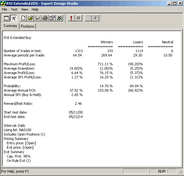
Figure 1 shows the AIQ EDS Summary long only back-test report using the NASDAQ 100 list of stocks over the period 5/11/2000 to 5/12/2014. Neither commission nor slippage have been subtracted from these results. In running this test, I used a capital protect of 98% which is equivalent to a 2% stop loss using the close. All entries and exits are at the next open. I could not get the short side to show a profit even with added market timing filters for trend on the NASDAQ 100 index.
AIQ EDS Summary long only back-test report using the NASDAQ 100 list of stocks over the period 5/11/2000 to 5/12/2014.
!WILDER’S RSI: EXTENDING THE TIME HORIZON
!Author: Mike B. Siroky, TASC May 2014
!Coded by: Richard Denning 5/10/2014
!www.TradersEdgeSystems.com
!INPUTS:
W1 is 55. !RSI length for going long
W2 is 5. !RSI length for going short
numSD is 1.645.
!CONSTANT:
EXPECTED_VALUE is 50.
!USER DEFINED FUNCTIONS
!RSI BANDS:
RSI_CIUP1 is (EXPECTED_VALUE/100 + Sqrt(EXPECTED_VALUE/100/2/W1)*numSD)*100.
RSI_CILOW1 is (EXPECTED_VALUE/100 – Sqrt(EXPECTED_VALUE/100/2/W1)*numSD)*100.
RSI_CIUP2 is (EXPECTED_VALUE/100 + Sqrt(EXPECTED_VALUE/100/2/W2)*numSD)*100.
RSI_CILOW2 is (EXPECTED_VALUE/100 – Sqrt(EXPECTED_VALUE/100/2/W2)*numSD)*100.
!RSI WILDER:
U is [close]-val([close],1).
D is val([close],1)-[close].
rsiLen1 is 2 * W1 – 1.
AvgU is ExpAvg(iff(U>0,U,0),rsiLen1).
AvgD is ExpAvg(iff(D>=0,D,0),rsiLen1).
RSI_1 is 100-(100/(1+(AvgU/AvgD))).
rsiLen2 is 2 * W2 – 1.
AvgU2 is ExpAvg(iff(U>0,U,0),rsiLen2).
AvgD2 is ExpAvg(iff(D>=0,D,0),rsiLen2).
RSI_2 is 100-(100/(1+(AvgU2/AvgD2))).
!RULES:
HD if hasdatafor(210) >= 200.
Buy if RSI_1 < RSI_CILOW1 and HD.
Exit if RSI_1 > RSI_CIUP1 and HD.
NDXc is TickerUDF(“NDX”,[close]).
Sell if RSI_2 > RSI_CIUP2 and NDXc < simpleavg(NDXc,200) and HD.
Cover if RSI_2 < RSI_CILOW2 and HD.
Jul 18, 2014 | chart patterns, indicators, trading strategies
I have been a little “quiet” lately. Kind of unusual for me, granted. But what can I say really that’s new? The stock market’s moving higher – blah, blah, blah. The bond market keeps trying to creep higher – sure, interest rates are basically 0%, so why not? Gold stocks keep trying to grind their way higher after putting in an apparent base. But who the heck ever knows about something as flighty as gold stocks?
So like I said, not much new to report.
So for the record – one more time – let me repeat where I am at:
- As a trend-follower there isn’t much choice but to say that the trend of the stock market is still “up”. So as a result, I have continued to grit my teeth and “ride”. And let’s give trend-following its due – it’s been a good ride.
- As a market “veteran” I have to say that this entire multi-year rally has just never felt “right”. In my “early years” in the market (also known as the “Hair Era” of my life) when the stock market would start to rally in the face of bad economic times I would think, “Ha, stupid market, that can’t be right.” Eventually I came to learn that the stock market knows way more than I do. And so for many years I forced myself to accept that if the stock market is moving higher in a meaningful way, then a pickup in the economy is 6 to 12 months off. As difficult as that was at times to accept, it sure worked.
Today, things seem “different”. By my calculation the stock market has now been advancing for roughly 5 years and 4 months. And the economy? Well, depending on your political leanings it is somewhere between “awful” and “doing just fine.” But in no way has the “old calculus” of “high market, booming economy 6-12 months later” applied.
Again depending on your politics leanings the reason for this lies somewhere between “it is entirely Barack Obama’s fault” to “it is entirely George Bush’s fault.” (I warned you there was nothing new to report).
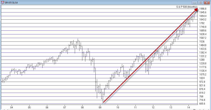
From my perspective, I think that the charts below – the second one of which I first saw presented by Tom McClellan, Editor of “The McClellan Oscillator” (which he presciently labeled at the time, “The only chart that matters right now”) – explains just about everything we need to know about the stock market actions vis a vis any economic numbers.
So take a look at the two charts below and see if anything at all jumps out at you.
Figure 1 – S&P 500 Monthly (Source: AIQ TradingExpert)
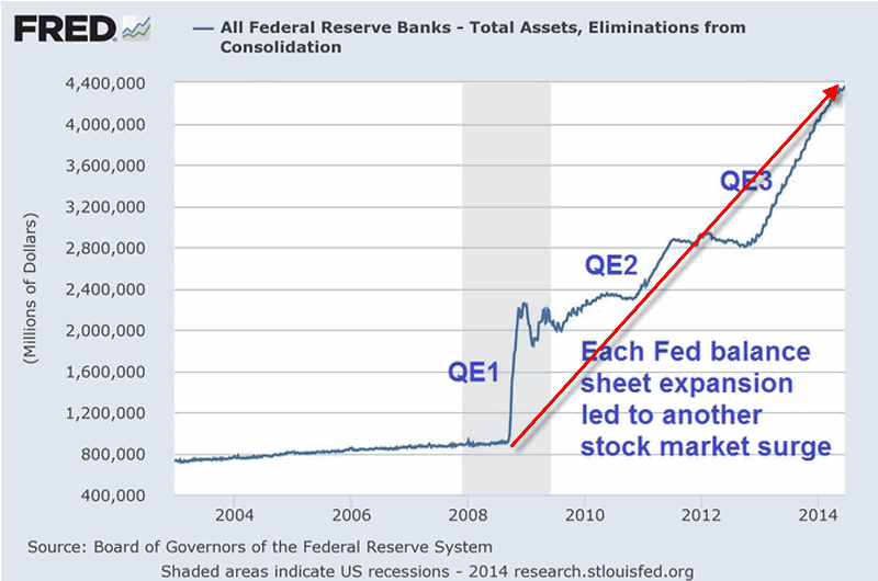
Figure 2 – Fed Pumping (Quantitiatve Easing “to Infinity and Beyond”) propelling the stock market
I am not a fan of using the word “manipulation” when it comes to the stock market. But I am a strong believer in the phrase “money moves the market.” The unprecedented printing of – I don’t know, is it billions of trillions of dollars – has clearly (at least in my mind) overwhelmed any “economic realities” and allowed the stock market to march endlessly – if not necessarily happily – to higher ground.
Thus my rhetorical questions for the day are:
“What would the stock market have looked like the past 5 years without this orgy of money?”
“What happens to the stock market when the Fed cannot or will not print money in this fashion?”
Because this is all unprecedented in my lifetime (as far as I can tell) I don’t have any pat answers to these questions. But I some pretty strong hunches.
My bottom line: Err on the side of caution at this time.
Jay Kaeppel
Chief Market Analyst at JayOnTheMarkets.com and AIQ TradingExpert Pro (http://www.aiq.com) client
Jay has published four books on futures, option and stock trading. He was Head Trader for a CTA from 1995 through 2003. As a computer programmer, he co-developed trading software that was voted “Best Option Trading System” six consecutive years by readers of Technical Analysis of Stocks and Commodities magazine. A featured speaker and instructor at live and on-line trading seminars, he has authored over 30 articles in Technical Analysis of Stocks and Commodities magazine, Active Trader magazine, Futures & Options magazine and on-line at www.Investopedia.com.
Jun 26, 2014 | chart patterns, indicators, trading strategies
Well the stock market just seems to keep chugging along. Despite the shaky economy, the national debt, the political discord, the terrorists on the march and the price of – well, just about everything made in China. And as a dutiful trend-follower I continue to “ride the ride” all the while repeating the ever apt phrase, “What, me worry?”
Three things for the record:
1) The stock market is in a clearly established uptrend and who am I to say otherwise?
2) Personally I still expect a serious “something” between now and the end of September
3) Arguably the most important bullish seasonal trend of all kicks in at the close on September 30, 2014.
Huh?
Yes folks, as of the close on September 30th it will be time for “the Mid Decade Rally”
Defining the Mid-Decade Rally
For the purposes of this article we will break each decade into two periods:
*Period 1 (i.e., the “Bullish 18″) = the 18 months extending from the end of September of Year “4” (2014, 2004, 1994, etc.)
*Period 2 (i.e., the “Other 102″) = the other 102 months of every decade.
So in a nutshell, Period 1 comprises 15% of each decade while Period 2 comprises 85% of each decade. Given that Period 2 is 5.67 times as long as Period 1 it would seem likely that an investor would make more money being in the stock market during Period 2 than during Period 1.
I mean if you had to choose – particularly given the long-term overall upward bias of the stock market – would you choose to be in the market 85% of the time or only 15% of the time. Safe to say most investors would answer the former. But if you are among those who chose this answer, perhaps you should read a little further.
Period 1: The “Bullish 18 Months” of the Decade
In Figure 1 you see the growth of $1,000 invested in the Dow Jones Industrials Average only during the middle 18 months (Sep. 30, Year 4 through Mar. 31, Year 6) of every decade starting in 1900. See if anything at all jumps out at you from the chart.
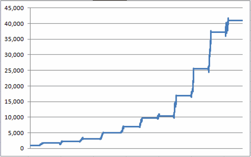
Figure 1 – Growth of $1,000 invested in Dow only during “Bullish 18” months of each decade; 1900-present
Does the word “consistency” come to mind? For the record, $1,000 invested only during this 18-month period grew to $40,948, or +3,994%. Now this all looks and sounds pretty good, but surely an investor would have made a lot more money investing in the stock market during the other 102 months of each decade, right? Well, not exactly. In fact, a more accurate statement might be, “not at all.”
Period 2: The “Other 102” Months of the Decade
Figure 2 displays the growth of $1,000 invested in the Dow Jones Industrials Average only during the other 102 months of each decade. $1,000 invested in the market 85% of the time – but excluding the mid-decade bullish period – would have grown to $6,166, or +517%.
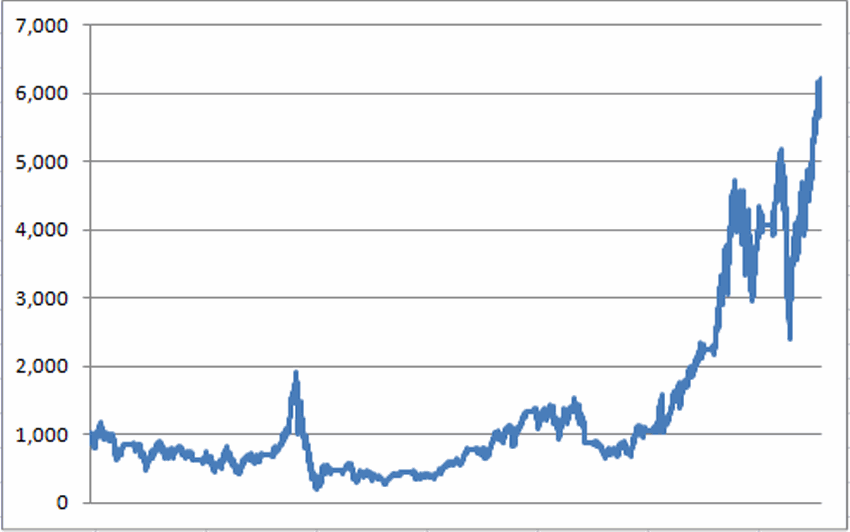
Figure 2 – Growth of $1,000 invested in the Dow only during the “Other 102” months of each decade; 1900-present
Now for the record, +517% is +517% and no one is saying that you should simply mechanically sit out the 102 “other” months. But the point is simply that the “Bullish 18” made 7.73 times as much money – while invested only 15% of the time – as the “Other 102” – which was invested in stocks 85% of the time.
The difference is even clearer when the two lines are drawn on the same chart as shown in Figure 3.
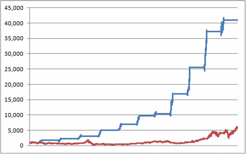
Figure 3 – Growth of $1,000 during “Bullish 18″ month (blue line) versus “Other 102″ months (red line); 1900-present
Mid Decade “Bullish 18” Performance
| Period |
% +(-) during “Bullish 18” |
| 9/30/1904-3/31/1906 |
+68.3% |
| 9/30/1914-3/31/1906 |
+30.6% |
| 9/30/1924-3/31/1906 |
+36.2% |
| 9/30/1934-3/31/1906 |
+68.8% |
| 9/30/1944-3/31/1906 |
+36.1% |
| 9/30/1954-3/31/1906 |
+42.0% |
| 9/30/1964-3/31/1906 |
+5.6% |
| 9/30/1974-3/31/1906 |
+64.4% |
| 9/30/1984-3/31/1906 |
+50.7% |
| 9/30/1994-3/31/1906 |
+45.4% |
| 9/30/2004-3/31/1906 |
+10.2% |
Figure 3 – “Bullish 18″ month performance
For the record:
*The average % gain for the Bullish 18 was +41.7%
*The median % gain for the Bullish 18 was +42.5%
On the other hand:
*The average % gain for the Other 102 was +34.3%
*The median % gain for the Bullish 18 was -2.2%
So you see why I am marking September 30, 2014 on my calendar.
By the way, if you like this one, in the immortal words of Jimmy Durante, “I got a million of ‘em.”
Jay Kaeppel
Chief Market Analyst at JayOnTheMarkets.com and AIQ TradingExpert Pro (http://www.aiq.com) client
Jay has published four books on futures, option and stock trading. He was Head Trader for a CTA from 1995 through 2003. As a computer programmer, he co-developed trading software that was voted “Best Option Trading System” six consecutive years by readers of Technical Analysis of Stocks and Commodities magazine. A featured speaker and instructor at live and on-line trading seminars, he has authored over 30 articles in Technical Analysis of Stocks and Commodities magazine, Active Trader magazine, Futures & Options magazine and on-line at www.Investopedia.com.
Jun 10, 2014 | chart patterns, indicators, trading strategies
For the record, I am now – and have for some time been – a “reluctant bull.” I can look at a dozen different things – including the fact that they economy still shows no signs of the robustness that would typically justify the run that the stock market has enjoyed in recent years – and make an argument that the stock market is way overdue to run out of steam.
But the timeless, well-worn phrase, “The Trend is Your Friend” didn’t become a timeless, well-worn phrase for nothing.
And so I continue to “ride the ride”. But as I have mentioned more frequently of late, I am keeping a close eye on the exit. Given my present “bad attitude” I tend to focus on and point out a lot more potentially bearish developments than bullish. But what the heck, I might as well let the sun shine through on occasion. So this time out, let’s highlight one development that suggests that “The End Is (Not Necessarily) Near!”
This is one of the things that has prompted me to “sit tight” and not listen to “those voices in my head” (No not those voices, the other ones…..), despite the fact that a meaningful correction could begin at any moment.
The Bullish Outside Month
Just as it takes a lot of “thrust” to get a rocket off of the ground, a large thrust upward in the stock market can be a sign that a particular rally is in the early stages rather than the late stages.
So here is a pattern to consider:
A) This month’s low is less than or equal to last month’s low
B) This month’s close is greater than last month’s high
That’s it. In Figure 1 we see the S&P 500 monthly bar chart from 1996 to the present with these “Bullish Outside Months” highlighted in green. The first one occurred in October 1998 and launched the final surge in great bull market of the 1990’s (or as most of us above a certain age refer to it – “The Good Old Days”).
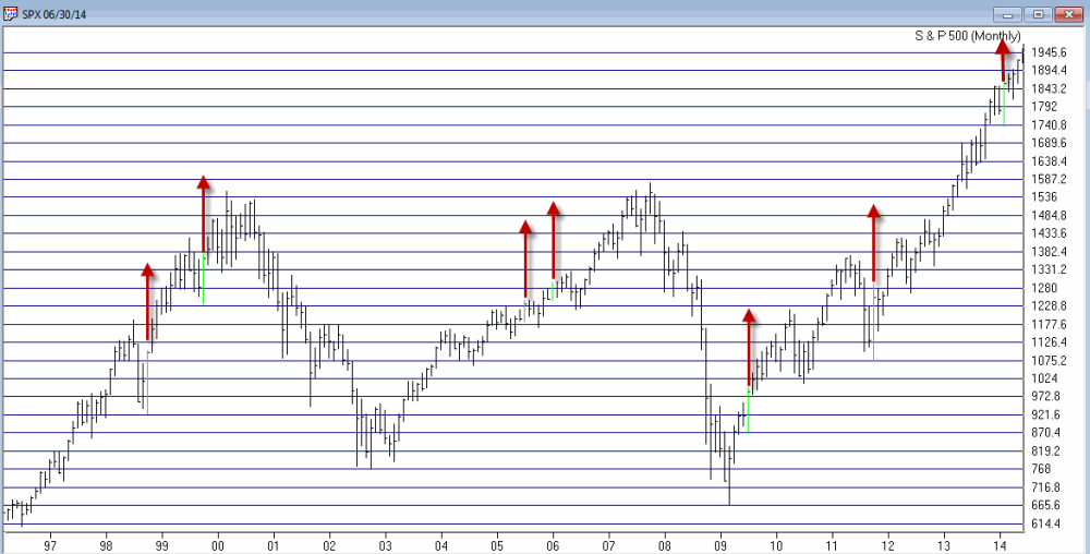
Figure 1 – Bullish Outside Months for SPX since 1996 (courtesy AIQ TradingExpert Pro)
The most recent signal occurred at the end of February of this year. This was only the 19th signal since 1970. The action of the S&P 500 index following previous signals – looking out 3 months, 6 months and 12 months after each signal – appears in Figure 2.
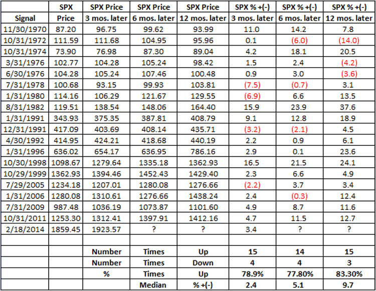
Figure 2 – SPX Results 3, 6 and 12 months after Bullish Outside Months (1970-Present)
As you can see, on a 3-month, 6-month and 12-month basis, the S&P 500 has been higher at least 77% of the time following previous signals. Which creates something on a conundrum.
Summary
In my mind’s eye the stock market is ridiculously overbought and “due” for a good solid “whack” sometime between now and the end of September. But this particular indicator suggests that that “whack” may not come. So for now my own primary investment strategy remains to play the long side of the market unless and until the major averages (Dow, SPX, Nasdaq 100 and Russell 2000) drop below their respective 200-day moving averages. Fairly boring yes, but it pays to mind:
Jay’s Trading Maxim #72: Boring and effective is much better than exciting and AAAAAHHHHHH!!
Jay Kaeppel
Chief Market Analyst at JayOnTheMarkets.com and AIQ TradingExpert Pro (http://www.aiq.com) client
Jay has published four books on futures, option and stock trading. He was Head Trader for a CTA from 1995 through 2003. As a computer programmer, he co-developed trading software that was voted “Best Option Trading System” six consecutive years by readers of Technical Analysis of Stocks and Commodities magazine. A featured speaker and instructor at live and on-line trading seminars, he has authored over 30 articles in Technical Analysis of Stocks and Commodities magazine, Active Trader magazine, Futures & Options magazine and on-line at www.Investopedia.com.
Apr 21, 2014 | chart patterns, indicators, Moving averages, trading strategies
OK, first off you have to admit that we are getting a little bit soft, don’t you think? I mean, after marching relentlessly higher to the tune of 34% since the November 2012 low, the Dow pulls back about 4.3%. And from all of the racket you would think that the end of the freaking world is apparently just around the corner. We used to be made of sterner stuff. Or so it seemed.
So there is a part of me that wants to shout “Buck up, people”. As a TFF (“Trend Followin’ Fool”) from way back, I would like to think that given the fact that the major stock market averages are above their respective long-term moving averages, we should stop all of the hand wringing and simply acknowledge that (at least for now) the major trend of the stock market is still bullish.
And when I say “I would like to”, I mean I really would “like to”. But the truth is there are a lot of good reasons to be keeping a close eye on the exits. To wit:
Indexes vs. Moving Averages
There is nothing magical about the relationship between the price of an asset/stock/index and its 200-day moving average. That being said, I sure do rely on it a lot – maybe because the interpretation is pretty darn simple:
Price > 200-day moving average = GOOD
Price < 200-day moving average = BAD
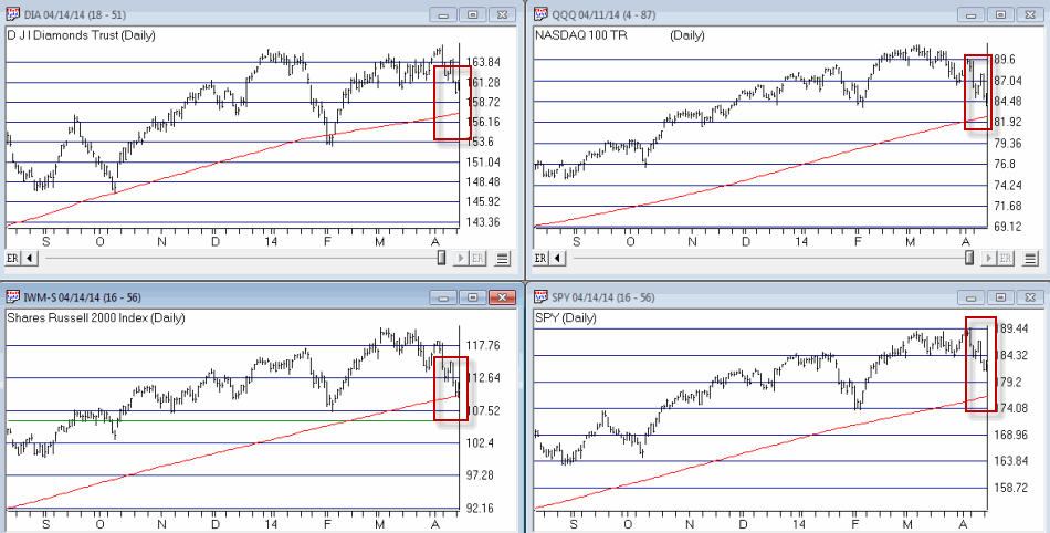
In Figure 1 we see four major stock market indexes (the Dow, the Nasdaq 100, the S&P 500 and the Russell 2000 clockwise from upper left).
Figure 1 – Major stock indexes versus their 200-day moving averages (Courtesy: AIQ TradingExpert)
The thing to note is that with the exception of the Russell 2000 – which is only slightly above it’s MA – they are still well above their respective 200-day moving averages. Now granted this could change quickly if prices keep heading south. But the point is that for now, an objective trend-follower still has to designate the major trend as “up.”
Alright, I hope you enjoyed the “Good News”
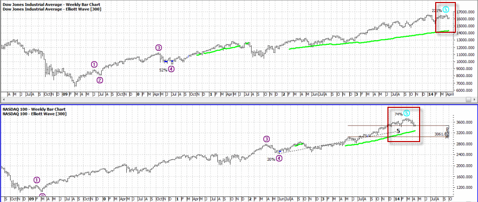
Is Elliott Wave Waving “Goodbye” (to the Bull)?
Figure 2 displays the Elliott Wave count for the Dow and the Nasdaq 100 as calculated mechanically by ProfitSource by HUBB.
Figure 2 – Dow and Nasdaq completing Elliott Wave 5? (Source: ProfitSource by HUBB)
OK, a few things. For the uninitiated, the Elliott Wave Theory is based on work by – who else, a guy named Elliott – that suggests that price moves up in 5 waves – 3 waves up, 2 waves down – and then declines in 5 waves – 3 waves down and 2 waves up. Now the truth is that a lot of Elliott Wave counts don’t pan out. But I known a lot of people who’s market opinion I respect who follow “the Wave”.
As you can see in Figure 2 both the Dow and the Nasdaq 100 appear to have formed or are in the process of forming a completed 5-wave “up” pattern. The implication going forward is for lower prices ahead.
Sell In May – with MACD Filter (SMMF)
The “Sell in May” pattern was first reported by Yale Hirsch and since then The Hirsch Organization’s Stock Trader’s Almanac has kept track of an updated – and improved version – that uses the MACD indicator to determine the exact entry and exit dates.
By my calculations, this SMMF method issued an early “sell” signal on 4/7/14 as shown in Figure 3. This sell signal remains in effect until at least the end of September (which is significant, as we will see shortly).
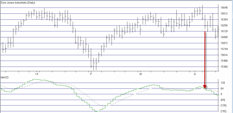
Figure 3 – Early “Sell in May” signal on 4/7/14 as MACD Oscillator turns negative (Courtesy: AIQ TradingExpert)
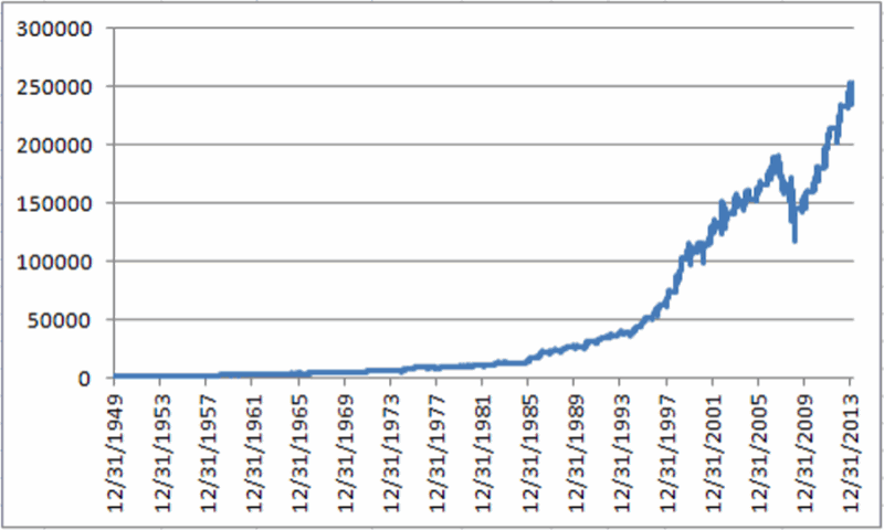
Why does this SMMF signal matter? In Figures 4 and 5 you can see the growth of $1,000 during bullish and bearish periods as signaled by the “Sell in May with MACD Filter” Method since 12/31/1949.
Figure 4 – Growth of $1,000 invested in Dow Industrial when SMMF Method is bullish
Figure 5 – Growth of $1,000 invested in Dow Industrial when SMMF Method is bearish
Notice any difference? For the record – and excluding any interest earned while of the market:
Bullish Phase gain = +24,753%
Bearish Phase loss = (-68%)
This method is now deemed”bearish.” ‘Nuff said.
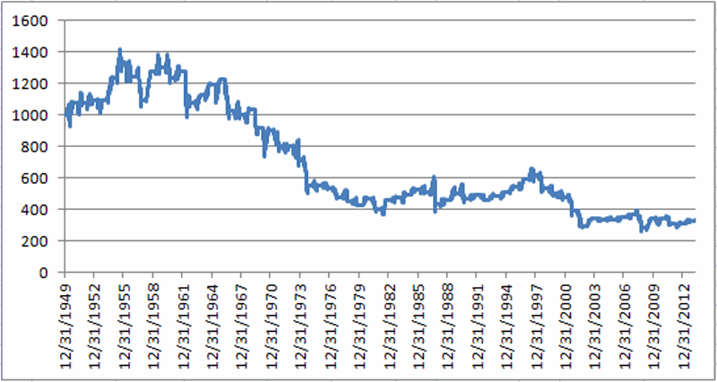
Mid-Term Election Time of Year
Let me sum up the historical trend for mid-term election years as succinctly as possible by stating:
“Everything until September 30th is a crapshoot, but ignore any bad news after that.”
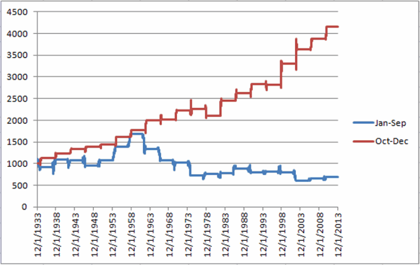
This summary is nicely illustrated in Figure 6.
*The blue line in Figure 6 displays the growth of $1,000 invested in the Dow between December 31st of the post-election year and September 30th of the mid-term election year.
* The red line in Figure 6 displays the growth of $1,000 invested in the Dow between September 30th of the mid-term year and December 31st of the mid-term year.
Figure 6 – Stock market shows bullish trend September 30 of mid-term election year through December 31st (Red line)
Again, the interpretation is fairly simple:
Jan 1 to Sep 30 – “Whatever”
Oct 1 to Dec 31 – “Bullish (usually)”
Summary
As a dutiful trend follower – and with the major indexes still holding above their long-term moving averages – I am still wearing the “brave face” and hoping that the stock market will continue to move higher. But if weakness persists or accelerates, it would appear that investors might be wise to take some defensive action (hedge, raise cash, go short) and to check back around September 30th of this year.
Sounds like a good time to invoke one of the most useful old adages:
“Hope for the best, prepare for the worst”
Jay Kaeppel Chief Market Analyst at JayOnTheMarkets.com and AIQ TradingExpert Pro (http://www.aiq.com) client
Jay has published four books on futures, option and stock trading. He was Head Trader for a CTA from 1995 through 2003. As a computer programmer, he co-developed trading software that was voted “Best Option Trading System” six consecutive years by readers of Technical Analysis of Stocks and Commodities magazine. A featured speaker and instructor at live and on-line trading seminars, he has authored over 30 articles in Technical Analysis of Stocks and Commodities magazine, Active Trader magazine, Futures & Options magazine and on-line at www.Investopedia.com.