Apr 29, 2011 | Uncategorized
May’s Stocks & Commodities magazine article “In The Volume Zone” by Walid Khalil and David Steckler
has been coded by Rich Denning.
I have coded both the volume zone oscillator (Vzo) and the system that uses the Vzo indicator. I used my own interpretation of what the rules of their system mean since the exact code for the system is not given in the article. The divergence sell/cover rules were especially troublesome to interpret, so my version may not be what the authors intended. In addition, note that the nontrending case is not provided or tested.
I ran a backtest using the Portfolio Manager module from 1/1/1998 to 3/11/2011 using the Nasdaq 100 and also the Russell 1000 list of stocks. In Figure 8, I show the test results of simulated trading on the Nasdaq 100 list of stocks using the following parameters for capitalization:
- Maximum positions per day = 3
- Maximum total positions allowed = 1
- Choose candidates using ADX values in descending order
- Size each position at 10% of total account equity, recomputed daily.
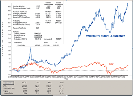
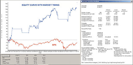
Figure Above: AIQ SYSTEMS, volume zone oscillator AND SYSTEM. This shows the equity curve for the VZO system trading long only using the NASDAQ 100 list of stocks compared to the SPX index for the test period 1/1/98 to 3/11/11.
For the test period, the average annual return was 13.5% with a maximum drawdown of 49.9% on 12/31/2002.
The short side test was unsuccessful, as the system lost all its capital during the early years of the test. (Results not shown.) I tried adding an index trend filter, but this did not save the short side from total loss.
The code and Eds file can be found at below or can be downloaded from http://tradersedgesystems.com/aiq/traderstips/traders-tips-may-2011.htm
Apr 19, 2011 | Uncategorized
What does ASAP™ stand for?
ASAP is an abbreviation for Affluence Squared Automation Project™.
I found in my research that the probability of correctly predicting a stock price movement increases as one extends one’s time horizon, so I decided early on that I wasn’t interested in day trading. What I was looking for was not just stocks that would go up, but stocks that would go way up and stay up. Hence “Affluence Squared”.
What exactly is ASAP?
It is well established that changes in earnings drives stock prices in the direction of the change. Thus if one could ascertain future ramps or declines in earnings, or more generally a coming change in a company’s financial condition, one would have a leg up. To assist a trader in this effort, I created a trading strategy using AIQ TradingExpert Pro.
Specifically, ASAP is a computer-based data collection, analysis and reporting algorithm designed to assist a knowledgeable and qualified investor in uncovering future organizational conditions with precision and understanding which are optimal in quality and timing. ASAP includes both long and short strategies which have been backtested through bull and bear markets.
How does ASAP help the user make stock selections?
It is well-established that the markets are discounting mechanisms. Some traders rely exclusively on technicals, some exclusively on fundamentals, and others some combination of the two. But all these have pitfalls.
Proper entry and exit points can often be mistimed with too heavy a reliance on backward-looking fundamental data. Indeed, retail investors are always mostly wrong at tops and bottoms.
Chart patterns and analysis of price and volume and pivot points can often clue an investor that a company’s condition has turned or remains favorable, often before the fundamentals even show it. Some very basic price and volume rules can do a decent job of picking up breakouts. However, the same exact technical parameters can work in one company’s case and fail in another, or can work for the same company at one time and fail at another.
Therefore, a fundamental data statistic that is “forward looking” would be useful as a differentiator. There does happen to be a legal, broadly available, readily quantifiable, and forward-looking fundamental statistic proven to beat the market indexes – insider buy/sell transactions. This forward-looking data is definable and comparable statistically, automatable over a universe of stocks, and is integrated with our technical strategy. Insider transactions, filtered by a special set of rules designed to maximize their predictive value, elegantly meet the requirements for a successful fundamental differentiator.
ASAP reports and displays on a price chart the actual insider transactions, but more importantly, provides and uses an insider score estimating probabilistic performance relative to the market based on statistical analysis of past similar transactions.
ASAP mostly ignores past fundamental information, except for information that statistically enhances the insider transactions, such as seasonality, market cap, and earnings surprises.
Further, insider information is aggregated for display and strategy use, providing a series of concentrically expanding macroeconomic forward-looking fundamental information.
ASAP includes both long and short strategies which have been backtested through bull and bear markets. Comparisons wherein the only change was the use of insider scores to further differentiate technical entry and exit points show a material improvement in backtest performance.
Who created ASAP and what is their background?
Here’s my brief bio. Mr. Dan Kamhis developed the ASAP mathematical models, proprietary indicators and strategy algorithms. He received a bachelor’s in mathematics from the University of California, San Diego, Magna Cum Laude in 1978. He has over 30 years of software development experience in aerospace simulation and real-time graphics, systems software for Windows and Unix platforms, and over 10 years’ experience in integrated stock strategy and indicator development. He is a patented inventor and published author.
Mr. Kamhis was assisted by Mr. Joe Osgood who programmed an assortment of data collection and database routines. Mr. Osgood received a B. S. in Computer Science from Worcester Polytechnic University in 1973. He has over 30 years of software development experience and is currently a senior software engineer at a rapidly growing medical device company. He is a published author.
Who can benefit from ASAP?
ASAP models real-world phenomena, is empirically tested, and is based on rigorous statistical analysis. Thus, the ASAP solution is scalable, providing tools to assist an investor trading a personal account, or the manager of a large institutional fund.
Can you give actual ASAP backtest results?
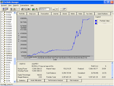
Chart 1 shows a six-year backtest covering two bull markets, and a bear.
The stock sample included approximately 5500 stocks which had insider transactions.
A key point is that the strategy is fully invested during the bull market, exits and remains out for the duration of the secular bear, and then leverages back in at the start of the bull, then exits for the correction.
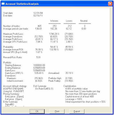
Chart 2 shows the strategy beat the S&P by 35% a year [Gain/Loss (IRR)% Annualized] vs. 1.67% for the S&P for the six-year period.
The round-trip transactions over the six-year period, average three every two weeks (Number of trades: 465).
While the ratio of winners to losers is only 54% / 46% (Probability), the average gain for the winners is 66%, while the average loss is 16% (Average Profit/Loss), leading to a Reward/Risk ratio of over 5.
The annualized ROI (Average Annual ROI) is an astounding 75% a year, due to the fact that the strategy exits the market during bear phases.
Is ASAP versatile enough to allow the user to create new indicators or stock analysis procedures?
Yes. One can adjust the ASAP color strategy and indicators in use. One can also create user-defined indicators and strategies. In fact, a user could wrap the ASAP lists in their own strategy filter and further refine the culling process.
With a source license, one could obtain the strategy itself which gives further flexibility in creating and modifying the ASAP indicators and procedures. And certainly the ASAP developers would be interested in hearing from anyone with any ideas for improvements in the strategy, or if someone was interested in a proprietary custom modification.
How is ASAP different from other programs on the market?
ASAP provides a unique color strategy which applies the notion of gradient changes in condition. Stock and market charts show subtle improvements and deteriorations and this over time provides enhanced understanding of the overall condition and scene, and can prepare for entry and exit.
ASAP is not a repetitive day trading or churn strategy, but is designed to leverage in and out of the market based on the market and stock stage.
The ASAP strategy takes into account the affinities in the market between individual stocks, and their groups and sectors and the market indexes themselves.
ASAP reports and displays the actual insider transactions on a price chart, but more importantly, computes, displays and uses an insider score estimating probabilistic performance relative to the market based on statistical analysis of past similar transactions.
ASAP provides customizable daily and weekly reports indicating stocks which have surpassed their technical pivot points (breakouts or breakdowns) and have qualified insider scores. While ASAP attempts to capture the earliest breakouts in a long-term uptrend, continuation signals are provided for focus on a particular ticker.
A general “Breakout Rank” score is provided ranking all stocks relative to their combined technical and insider score.
Stocks can also be ranked strictly by insider criteria, such as a weighting consisting of insider score and a measure of recent changes to the insider transaction patterns.
ASAP provides a range of selectable stops designed to minimize whipsaws, including investing, trading and climax stops.
Is there an ASAP community?
ASAP is a relatively new package, but there is a growing body of users and proponents.
What are the computer and operating system requirements for ASAP?
Even five-year-old computers can run it pretty well, but ASAP is customizable in this sense. Some indicators are more compute intensive than others. On an older or slower machine, one can limit the use of the more compute intensive indicators to only when the trader is specifically interested in them.
If someone is interested in finding out more about ASAP, what should they do?
They can drop me (Dan Kamhis) a line at trade.asap@yahoo.com, and I’ll be glad to set up a web demo.
Thank you for spending time with us Dan.
Apr 9, 2011 | Uncategorized
Steve Palmquist.
Author of ‘The Timely Trades Letter’. ‘How to Take Money from the Markets’, and Money-Making Candlestick Patterns.
I get emails from traders who just want to focus on swing trading, intermediate term trades, stock trades, or ETF trades. I am not sure how they have decided which is best, since the results of these different techniques can vary with market conditions. It makes more sense to have techniques for stock and ETF trading and be able to make swing trades and intermediate term trades and then adjust the relative account sizes based on what is working in the current market conditions.
Most of the recent ETF selections in the Letter have triggered and moved into profitable positions, which is why I rotated additional funds to the ETF account as noted in previous Letters. I want to move funds into what is working in the current environment. When the market is sluggish swing trading stocks slows down for obvious reasons. However even in sluggish markets we see some of the ETFs moving, so I put more focus there until the market finished resting and decides to move again. When the market is strongly trending there is usually more bang for the buck in swing trading stocks than ETFs so I rotate funds into the swing trading account. This sounds obvious, but sometimes traders get fixated on just one technique and don’t look at the bigger picture.
Adapting our trading tools and techniques to the current market conditions is one of the keys to trading success. Guessing the markets next move, or using the same trading tool (technique) all the time, can lead to poor results. By having swing trading and ETF trading accounts I have the ability to focus on trading ETFs when the market is sluggish and swing trading is slow. I can then move more into swing trading, with less focus on ETFs, when the market is strongly trending again. By just using one tool traders will have periods when they sit in cash for awhile waiting for the market to move.
In the current environment we see energy and commodities moving strongly (check out the strong profits from the recent GLD, OIL, XLP and SLV ETF trades as an example) Since we are seeing strong action in the energy and commodity areas I will look at a couple of swing trades of stocks in these areas if they trigger on increasing volume. There are a number of interesting setups in energy and commodity stocks like the ones in HMY, NFG, CVX, APA, and DVN. Given the markets recent positive volume pattern, shorts are not attractive unless the market starts showing strong distribution
The net change for the last six sessions is less than a one point movement, this is a very tight base. Tight bases often lead to strong moves, so while this is a time to keep the powder dry as noted in previous Letters. It is also a time to get the watch lists up to date and ready for the move that is coming. When the market, or individual stocks, approach a resistance area it is usually a good idea to focus on protecting profits made during the last run. When the market approaches resistance it usually bases or retraces a bit. If most of the time the market stalls, or retraces, around resistance then it is best to lock in some profits; and let the market set up for the next move. If the market breaks above resistance we will still have our profits and can take new positions. If the market retraces from resistance then we still have our profits, and will have avoided potential losses. If you hold when the market approaches resistance you risk losses if the market pulls back. For more market analysis and trading setups click here.
Apr 4, 2011 | Uncategorized
I have prepared the AIQ code based on Giorgos Siligardos’ article in the April issue of Stocks & Commodities magazine, “Identifying Cup Formations Early.” (The code can be viewed at www.Traders.com.) I devised a trading system using the Russell 1000 list of stocks to test the semi-cup formation as an entry technique. The trading rules for the system are as follows:
Entering a long position:
* Using a daily time frame, enter a long position when a semi-cup formation is first detected.
* Enter the next bar at the open using a market order.
Exiting a long position:
* Use a trailing 25% exit, or
* Protect 100% of a 15% or greater profit.
* Exit the next bar at the open using a market order.
Short positions were not tested.
In Figure 9, I show the results of simulated trading on the Russell 1000 stocks, using the following parameters:
1. Maximum positions per day = 3
2. Maximum total positions allowed = 10
3. Choose weakest candidates using 32-bar Aiq relative strength
4. Size each position at 10% of total account equity recomputed every day.
Figure 9: AIQ SYSTEMS, SAMPLE RESULTS FOR semi-cup formation SYSTEM. Here, a sample trading system using 76 actively traded NASDAQ stocks tests the semi-cup formation as an entry technique. For the test period 1/3/2000 to 1/6/2011, the average annual return was 18.8%, with a maximum drawdown of 68.8% on 11/20/2008.
For the test period 1/3/2000 to 1/6/2011, the average annual return was 18.8% with a maximum drawdown of 68.8% on 11/20/2008. Although the return is reasonably good, the maximum drawdown is larger than most could tolerate. With this in mind, I added a very simple market timing technique that added the following rules:
1. Longs can only be entered when the S&P 500 is trading above its 200-day simple moving average for two or more consecutive days.
2. Exit all positions when the S&P 500 falls below its 200-day simple moving average for two or more consecutive days.
For the test period 1/3/2000 to 1/6/2011, the average annual return was 10.1% with a maximum drawdown of 25.6% on 7/17/09 (see Figure 10). The drawdown was significantly reduced by the addition of the simple market timing technique. Although the average annual return was also reduced, the Sharpe ratio increased from 0.47 to 0.75, indicating a less risky approach.
Figure 10: AIQ SYSTEMS, revised results with market timing added. For the refined semi-cup system, over the test period 1/3/2000 to 1/6/2011, the average annual return was 10.1% with a maximum drawdown of 25.6% on 7/17/09.
The AIQ code is available in an EDS file at http://aiqsystems.com/april2011cupandhandle.EDS
save the file to your /wintes32/EDS strategies folder
—Richard Denning
info@TradersEdgeSystems.com
for AIQ Systems
Mar 19, 2011 | Uncategorized
Steve Palmquist.
Author of ‘The Timely Trades Letter’. ‘How to Take Money from the Markets’, and Money-Making Candlestick Patterns.
I got a panicked email from a trader worried that the run ‘was over’ and he would not be able to trade long positions for ‘weeks’. First, the market moves in waves. It is normal for it to run up, then pull back then run up again. There is no way to know if a pullback will last a couple weeks, or a couple months. Secondly, traders can generate profits when the market is going up, or down. With the right set of tools it should not matter to a trader which way the market is going. Third, panic is incompatible with trading success. I just look at the markets price and volume pattern, form a trading plan that switches between different tools for different market conditions, and then implement the plan. Panic comes from ‘needing’ the market to go up, and not having a set of trading tools for different market conditions. The market does not care what we need or want, it will do what it wants. This is why we have different tools for different market conditions and switch between them based on what the market is doing. If the market direction is really, really important; it is usually a signal that the trader is using the ‘hold and hope’ approach rather than adapting to the market.
In order to trade confidently in different market conditions traders need to understand exactly how and when their trading patterns work. Testing different tools, and understanding how each trading tool performs in different market conditions, allows traders to make effective use of each tool in the trading toolbox. If traders have not tested their tools in different market conditions they are taking unknown risks. Back testing does not guarantee future results. There are no guarantees in trading, and no way to know if any particular trade will be profitable or not. Backtesting helps remove some of the emotion, hunches, and unknowns in trading. It can show you how a particular system has performed in different market conditions in the past and what types of filters may be most interesting in prioritizing trading opportunities. Examples of six complete trading systems and how they perform in different market conditions is covered in ‘How to Take Money from the Markets’. The knowledge of what to expect from a trading tool, and seeing how different trading tools perform in different markets allows traders to adapt to the market rather than just guessing what to do.
Steve is the author of two trading books: “Money-Making Candlestick Patterns, Backtested for Proven Results’, in which he shares backtesting research on popular candlestick patterns and shows what actually works, and what does not.
“How to Take Money From the Markets, Creating Profitable Trading Strategies” in which he uses the results of extensive backtesting techniques to smash trading myths and get to the truth of what has worked and what has not. The book provides six fully analyzed and tested trading systems and shows how they have performed in different market conditions.
Steve is the publisher of the, ‘Timely Trades Letter’ in which he shares his market analysis and specific trading setups for stocks and ETFs. To receive a sample of the ‘Timely Trades Letter’ send an email to sample@daisydogger.com. Steve’s website:www.daisydogger.com provides additional trading information and market adaptive trading techniques.
Mar 16, 2011 | Uncategorized
Some indicators work well in trending markets while others work in consolidating markets. The Commodity Channel Index (CCI) works best in strong trending markets. Unlike other trend following indicators, the CCI is designed to limit whipsaws during choppy markets.
Created by Donald Lambert, the CCI is a price momentum indicator that measures the degree of variance of a security’s price from its statistical mean. Although originally developed for trading commodities, the CCI can be used for equities or indexes as well.
AIQ has a default time period of 90-days in the calculation of the CCI. Time periods that are too short can lead to whipsaws while time periods that are too long result in missed signals. The 90-day time period seems to be a good compromise.
In general, the CCI looks at prices relative to the average price. If the CCI is high, then prices for that security are higher relative to its average price. Conversely, if the CCI of a security is low, then prices are lower than the average price.
In consolidating or sideways markets, the CCI tends to fall within the +/-100 range (the two horizontal lines on an AIQ chart). Whenever the CCI moves above or below this range, then it suggests a strong trend is in place. Therefore, when the CCI rises above +100 it suggests a strong
uptrend is underway and that long positions can be established. Long positions are closed once the CCI falls below +100. Conversely, when the CCI falls below –100 it means a downtrend is in place and short positions can be established. Short positions can be covered once the CCI rises above –100.
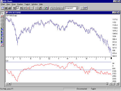
The chart above shows the S&P 500 along with its CCI indicator. Notice how this indicator was on a sell signal during the September sell-off. When the S&P 500 drifted sideways from November through April, the CCI was within the +100/-100 range so no signals were fired. This helped to avoid whipsaws. There was a brief sell signal when the CCI fell below –100 in late April and then another sell in late May.
Like other indicators, it is best to use the CCI in conjunction with other technical tools. Modifications to the simple buy/sell rules can be made as well. For instance, if the CCI has fallen to –170 and you have large profits on short positions, then it may be best to lock in some of the
profits rather than waiting for the indicator to rise above –100. Money management rules are important. Still, it is easy to see the value of the Commodity Channel Index indicator.
Mar 5, 2011 | Uncategorized
Steve Palmquist.
Author of ‘The Timely Trades Letter’. ‘How to Take Money from the Markets’, and Money-Making Candlestick Patterns.
I got an email from an excited trader last Tuesday, when the market was down forty five points. He had just taken large short positions because the ‘market was already down forty points and this was surely the end of the run’. The trading plan outlined in the Timely Trades Letter had us holding off on new trades unless the market broke above the ascending trend line drawn through the lows of 08/31 and 01/31; or moved below the 2670 area, which would set up a pattern of lower highs and lower lows. This trader ignored the trading plan and was trading on CNBC induced emotion. When the market popped up fifty points on Thursday the same trader was in a panic to close shorts and take longs ‘because the pullback was over’. Trading on emotion frequently results in losses.
The trading plan is based on how the market normally behaves. The idea of trading is to be positioned to profit if the market does the normal or usual thing in a given situation. Sometimes the market does unusual things, and then profits are not realized. However, by definition the market most often follows the normal path in a given situation; so that is the way to bet for long term success. In the current case the trend line break on 2/23 indicated that conditions were changing, but it does not indicate an immediate switch from up trend to down trend. Rather than guess what the market is up to, I just took my profits from the recent run on the trend line break and will now give the market a few days to set up again. Trying to consistently guess the markets next move is a losing game over the long run. A better bet is to protect profits while the market is in transition, and then pick up new trades when the market shows its hand. I trade what the market is telling us, not the opinions of the talking heads on TV.
After a trend line break the market may base for a bit, resume the up trend or start a new down trend. If the market is going to start a new down trend then it will by definition have to form a pattern of lower highs and lower lows. For this process to start we will need to see a break below the 2670 area. Until then the market is not in a down trend and short positions carry above average risk. New long positions also carry above average risk since the market just broke below an ascending trend line. The trading plan is to hold off on swing trades until the market picks a direction and either moves back above the ascending trend line or below the 2670 area.
The more traders understand exactly how and when their trading patterns work, the more effective use they will be able to make of each tool in the trading toolbox. Back testing does not guarantee future results. There are no guarantees in trading, and no way to know if any particular trade will be profitable or not. Backtesting helps remove some of the emotion, hunches, and unknowns in trading. It can show you how a particular system has performed in different market conditions in the past and what types of filters may be most interesting in prioritizing trading opportunities. Examples of six complete trading systems and how they perform in different market conditions is covered in ‘How to Take Money from the Markets’
Steve is the author of two trading books: “Money-Making Candlestick Patterns, Backtested for Proven Results’, in which he shares backtesting research on popular candlestick patterns and shows what actually works, and what does not.
“How to Take Money From the Markets, Creating Profitable Trading Strategies” in which he uses the results of extensive backtesting techniques to smash trading myths and get to the truth of what has worked and what has not. The book provides six fully analyzed and tested trading systems and shows how they have performed in different market conditions.
Steve is the publisher of the, ‘Timely Trades Letter’ in which he shares his market analysis and specific trading setups for stocks and ETFs. To receive a sample of the ‘Timely Trades Letter’ send an email to sample@daisydogger.com. Steve’s website:www.daisydogger.com provides additional trading information and market adaptive trading techniques.
Mar 3, 2011 | Uncategorized
Steve Palmquist
Author of ‘The Timely Trades Letter’. ‘How to Take Money from the Markets’, and Money-Making Candlestick Patterns.
During 20 years of active trading experience I have researched, tested, and analyzed a number of trading systems and techniques. Some have shown promising results, some do not. I add tools to my trading toolbox based on their effectiveness. Trading systems are not effective because Aunt Millie or uncle Bob told you about them, they are effective because they work. Most trading systems, are affected by market conditions, volume patterns, and other factors. Using a trading technique that has not been analyzed in different market conditions, or failing to match trading techniques to the current market environment is asking for trouble.
Making money in the stock market requires knowledge of what to trade, when to trade, and a variety of trading tools designed for different market conditions. Just as a carpenter will use several different tools when building a house, traders will use different tools to build their account. Using the same trading tool in all situations is like trying to build a house with just a hammer. Carpenters have tools designed for specific jobs, and so should traders.
The successful trader has a tool box with a variety of trading tools for use in different market conditions. The trader, like the carpenter, must go beyond just acquiring the tools. Traders must understand which tool to use for a specific task, and have a clear understanding of how the tool works, and what can and cannot be done with it. Some tools, like a screwdriver, are fairly easy to learn how to use. Other tools, like a table saw, require a lot more training and experience to get the most out of. Most carpenters serve an apprentice period where they work with, and learn from, someone with years of experience. It is amazing how many people will just start trading their hard earned money without ‘learning the trade’ first.
The more traders understand exactly how and when their trading patterns work, the more effective use they will be able to make of each tool in the trading toolbox. Back testing does not guarantee future results. There are no guarantees in trading, and no way to know if any particular trade will be profitable or not. Backtesting helps remove some of the emotion, hunches, and unknowns in trading. It can show you how a particular system has performed in different market conditions in the past and what types of filters may be most interesting in prioritizing trading opportunities. Examples of six complete trading systems and how they perform in different market conditions is covered in ‘How to Take Money from the Markets’

Steve is the author of two trading books: “Money-Making Candlestick Patterns, Backtested for Proven Results’, in which he shares backtesting research on popular candlestick patterns and shows what actually works, and what does not.
“How to Take Money From the Markets, Creating Profitable Trading Strategies” in which he uses the results of extensive backtesting techniques to smash trading myths and get to the truth of what has worked and what has not. The book provides six fully analyzed and tested trading systems and shows how they have performed in different market conditions.
Steve is the publisher of the, ‘Timely Trades Letter’ in which he shares his market analysis and specific trading setups for stocks and ETFs. To receive a sample of the ‘Timely Trades Letter’ send an email to sample@daisydogger.com. Steve’s website:www.daisydogger.com provides additional trading information and market adaptive trading techniques.
Mar 2, 2011 | Uncategorized
The SAR in this indicator stands for stop and reverse. That means that with this indicator you are always in the market. You simply reverse the position when the stop level is reached. When you are on a buy mode and the stop is reached, then you switch to a sell (or short) mode. If you are on a sell mode and the indicator turns bullish, then you switch to a buy mode.
To see the Parabolic SAR indicator in the TradingExpert system, open a stock chart and click the ParaSAR indicator in the Control Panel. Since this indicator overlays the stock price chart, it is found in the upper half of the Control Panel. The Parabolic SAR indicator is shown in the chart below. The indicator gets its name from the shape assumed by the trailing stops that tend to curve like a parabola. Dots below prices indicate a long position while dots above the prices indicate a short position. The dots represent the stop and reverse points.
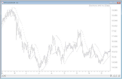
As the prices move higher, the rising dots below the price action tend to start out slow and then accelerate with the trend. The slow start in the indicator allows a trend to take place. As the stock moves higher, there is an acceleration factor and the indicator moves faster until it catches up to price action. The same is true for stocks that are falling. This is a trend following indicator so it obviously works best on volatile stocks that are in trends. Even on trending stocks, there will be whipsaws.
For short-term swing traders who deal with volatile stocks such as those found on the Nasdaq, the Parabolic SAR indicator may help improve entry and exit points.
Feb 9, 2011 | Uncategorized
by Dan Valcu, CFTe
This indicator is a very old statistical tool that even to this day helps determine trend strength and turning points. Here’s how to apply it to your trading.
Technical analysis can be considered both a science and an art; patterns and chart reading represent the artistic component, while technical indicators help us analytically understand trend strength, buy/sell pressure, and divergences. There are perhaps thousands of technical indicators, but few seem to deliver real analytical power and differentiation in this increasingly crowded landscape, especially since many can be perceived simply as intellectual exercises that produce little bottom-line impact.
To narrow down this set of tools, statistics offer a great source of established knowledge for those who want to focus on more tangible and useful indicators. For instance, the tried-and-tested Z-score has become a classic in both statistics and technical analysis.
In this article we will discuss an established concept in statistics originally proposed in 1904, with potential for use in technical analysis: the Spearman’s rank correlation coefficient, also known as the Spearman indicator. Article extract courtesy Stocks & Commodities magazine
The AIQ code for the Qstick and the Psychological Indicators as mentioned in Dan Valcu’s article, “The Spearman Indicator for Technical Analysis”available from TradersEdgeSystems courtesy of Rich Denning



 English