
Great new power features
We're always adding new
Overlaying price history from the past on a current chart
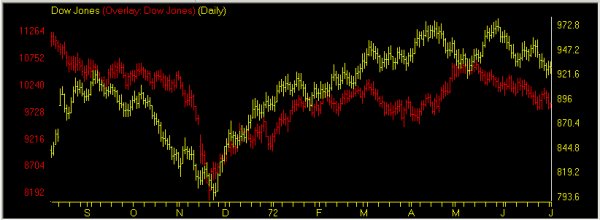
The chart below illustrates the new sliding overlay feature. Here we have overlaid the price history of the Dow Jones Industrial Average from July 1972 (in yellow) over the Dow Jones Industrial Average price action from May 2002 (in red). By locking the overlay, any part of a history of a ticker can be overlaid over any other part of the history. Now it’s possible to really discover if history repeats itself.

To view a chart of two overlaid tickers, do as follows:
1. Open Charts and display a chart of ticker #1.
2. Select Overlay from the Chart sub-menu. The Overlay Ticker dialog box is displayed.
3. In the Ticker Symbol section of this dialog box, enter the symbol of the ticker that you want to overlay (ticker #2).
4. You may also make the following selections which determine the appearance of the chart:
Vertical Scales: Select one of the following locations for the price scales:
- L&R – Ticker #1 vertical price scale shown on right and ticker #2 vertical price scale shown on left.
- R only – Vertical price scales for both tickers shown on right side of chart.Colors: From the 16 available colors, select colors for the overlay ticker (ticker #2). Different colors may be specified for the three components of the Price Plot — Hi Lo Bars, Open, and Close. To specify colors:
- Click on the Price Plot component that you want to change.
- Click on a color.
5. Click OK. The Price Plot will now display the overlay ticker along with the originally charted ticker.
Breadth Analyzer
Breadth ticker values are not downloaded directly. Instead, Data Retrieval computes them in accord with an Expert Design Studio screening formula specified by the user in the ticker creation process. For each Breadth ticker, the user specifies an EDS rule and a list of tickers. Following a data update,Data Retrieval computes the number of tickers in the list that pass the rule. This number, expressed as a percentage of the number of tickers in the list, is computed and stored in the ticker’s data file. It represents the breadth of the tickers in the list that pass the rule’s screening criteria. Breadth tickers can be charted and or be incorporated into other screening rules.
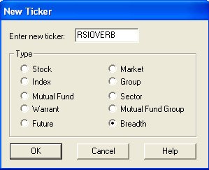
How to create a Breadth ticker
1. Select New from the Ticker menu. The New Ticker dialog box will appear.
2. Enter a name for the Breadth ticker you are creating.
3. In the Type section, select Breadth.
4. Click OK.
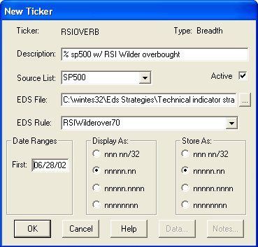
5. In the next box that appears, do the following.
- Enter a Description (optional).
- Click the arrow on the Source box to display your available lists. Select the list of tickers you want to use for screening.
- Click the button at the right end of the EDS File box. Use the Open box that appears to find and select the strategy file containing the EDS rule that you want to use for this Breadth ticker.
- Click the arrow on the EDS Rule box to see a list of rules for the selected strategy.
- Enter the date that you want to begin computing data for the ticker in the First box in theDate Ranges section.
- Click OK to add the ticker to your Master List.
6. The new ticker will now appear in the Master Ticker List with Breadth in the Type column.
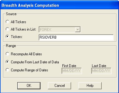
Compute breadth data for new Breadth ticker
A special function has been added to compute historical data for Breadth tickers.
To compute breadth data:
1. From the Utilities menu, select Compute Breadth Analysis.
2. In the Breadth Analysis Computation window, make the following entries:
• Source: Select the Tickers option and enter the name of the new Breadth ticker.
• Range: Select Compute From Last Date of Data.
3. Click OK to begin the computation. The Compute Breadth window will appear and display the progress of the computation.
4. When the Compute Breadth window closes, the computation is complete.
Breadth ticker charts
Breadth tickers my be charted like any other ticker.
Updating Breadth ticker data
1. Open the Data Retrieval application.
2. In the After Updates section of the Data Retrieval Options page, check the Update Breadth Tickers option box.
3. To save this change so that Breadth tickers will be updated after all subsequent data updates, click the Save Setup command button.
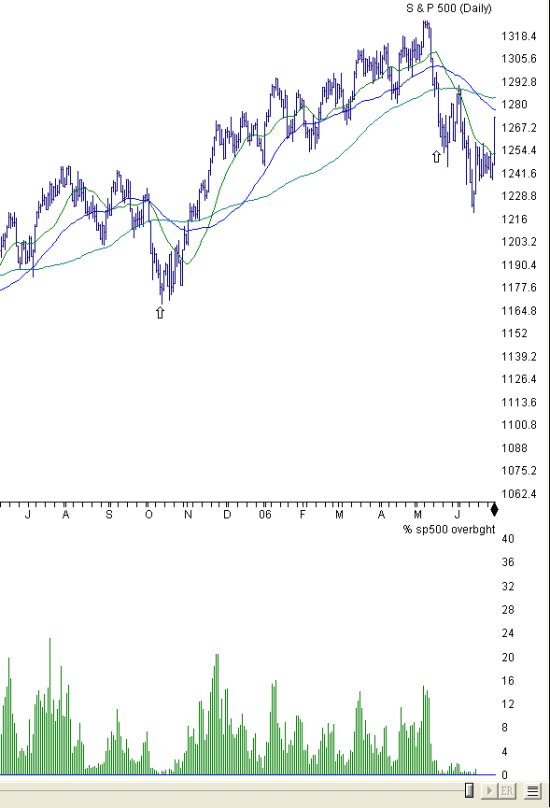
Breadth Ticker Example
Using Ticker, New, create a new ticker called RSIOVERB.
The second screen is where we define what this ticker will contain. In this instance we want to create a ticker that shows us the percentage of SP500 stocks on any given day that are in overbought territory of the RSI Wilder indicator. In the new ticker screen we need to define the list of tickers we will analyze, in this case the SP500. Next we define the EDS file that contains the rule that we will use to analyze the stocks, in this case the built-in EDS Strategies\Technical Indicator Strategies\Strategies Using One Indicator\RSI Wilder\RSI Wilder in Overbought Territory.eds. With the EDS file selected we select the rule from the pull-down box, in this case RSIWIlderover70.
Using Utilities, Compute Breadth Analysis, to compute the data for the ticker.
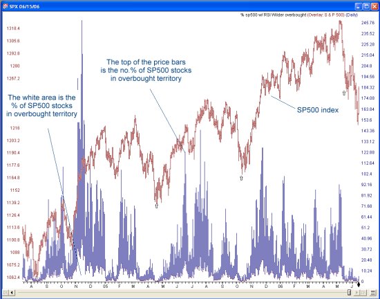
The ticker can now be charted as is, in the example below the breadth ticker RSIOVERB is charted with an overlay of the SPX index.
Creating a custom indicator for a breadth Ticker Example
In EDS you can create a custom indicator for the breadth ticker using TickerUDF. In this example we are using the breadth ticker RSIOVERB to build an indicator called percent_SP500_overbought_RSIwilder.
! RSI Wilder is in overbought territory
RSIWilderover70 if [RSI Wilder]>70.
close is [close].
!build a custom indicator for RSIOVERB
percent_SP500_overbought_RSIwilder is tickerudf(“RSIOVERB”,close).
Here we can see a chart of the SP500 index with the new custom indicator percent_SP500_overbought_RSIwilder.
Portfolio Manager performance analysis
Portfolio Asset Allocation Pie Charts based on cost and value

This page displays pie charts that show you how your account is allocated either by individual stocks or by industry groups. You can easily see how heavily weighted you are in a particular stock or industry group and you can easily make comparisons such as value vs. risk for the different securities in a portfolio. Pie charts can display the relative weights of up to 20 different stocks or industry groups.
The Asset Allocation page displays two pie charts. Each of these charts shows you how the account is allocated according to one of the following parameters:
- Value – current value
- Cost – original cost
- Risk – amount of risk associated with each security or industry group (measured by standard deviation of price) In addition, you can choose what you want the different colored sections of the chart to represent. Your choices are:
- Portfolio – Each section represents an individual security (cash can also be shown)
- Group or Sector – Each section represents a group or sectorTo change pie chart settings:1. Display the Asset Allocation page by clicking on its tab. Right click on this page and a window titled Property Sheet will appear with the Pie Charts tab selected.
2. In the Source section, select one of the three options: Portfolio, Group, or Sector. If you choose Group or Sector, you must also use the adjacent list box to select the group/sector list that you want to use. This list determines the industry group into which each stock in the account is placed.
3. From the two lower sections (First and Second) choose an allocation parameter (explained above) for each of the two pie charts.
4. Click OK to confirm your settings and close the Property Sheet.To change pie chart colors:1. Display the Pie Charts page by clicking on its tab.
2. Right click anywhere on this page and the window titled Property Sheet will appear.
3. Click on the tab labeled Pie Chart Colors.
4. The page that appears displays 20 small colored boxes arranged in a circle. The color that will be used for the first section of the chart is the one at 12 o’clock. The colors for the sections that follow are shown in clockwise order. To change any color, click on the colored box. The Color dialog box will appear.
5. Use the Color dialog box to find the color you want and click OK.
6. When you have completed all of your changes, click OK to confirm changes and close the Property Sheet.New Performance Analysis, including up to 5 benchmarks.
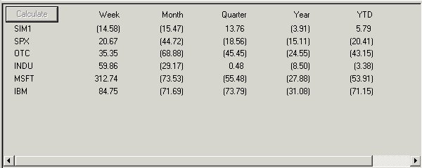
New Risk Analysis with Annualized IRR, Sigma, Sharpe Ratio, Treynor Ratio, Alpha, Beta and R-Squared on up to 5 benchmarks
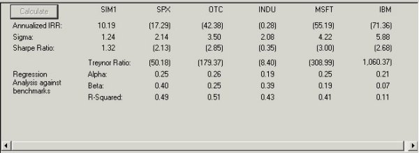
- The internal rate of return (IRR) is a useful measure of the performance of an investment portfolio. For investments such as a stock portfolio that produce varying cash flows over time, the IRR is defined as the discount rate that when applied to all cash flows results in a net present value of zero.
To change the IRR figures shown on the Risk Analysis page to annualized returns:
1. Right click on the Risk Analysis page. A window titled Property Sheet will appear.
2. The tab labeled Return/Statistics will be displayed.
3. The option box located between the Time Period section and the Risk Free Rate section is titled Annualize Returns. Check this box to specify annualized returns.
4. Click OK to confirm the change and close the Property Sheet.
Two factors needed for the computation of IRR are the periodicity (time period) and the total time interval. Both of these can be changed. Time Period is selected from the Return Statistics tab of the Property Sheet. Time interval is taken from the value specified for the graph time interval which is entered on the Graph tab of the Property Sheet.
To specify the time period used for computing IRR:
1. Open the Return/Statistics tab of the Property Sheet.
2. From Time Period section, select one of the four options:
- Weekly
- Monthly
- Quarterly
- Annually
3. Click OK.To specify the time interval used for computing IRR:1. Right click on the Risk Analysis page to display the Property Sheet window.
2. Select the Graph tab from the top of the window.
3. At the top of the page, choose one of the following options: - Maximum days In the adjacent text box, enter the number of days you want plotted.
- Date Range In the two adjacent text boxes, enter start and end dates for the data plotted.
4. Click OK to close the Property Sheet.Test a short strategy, test a weekly strategy or test a real-time strategy in portfolio simulator
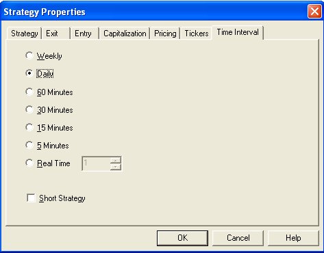
When setting up a simulation under Account, New, Simulation. In the Edit strategy area and the Time Interval tab you can now specify if this is a short strategy or real-time strategy or on weekly data.
Other new great features
Charts – Added New Print Features – Screen Print and
Screen Print (Fit to Page)
This allows WYSIWIG – What You See is What You Get printing.AIQ Charts only.
New Chart Preferences item to left or right justify the title text in the chart
Hot-key is “J”, for Justify this toggles betwen left-hand and right-hand display of title text. AIQ Charts only.
Real-time charts show change from prior close
There is now the ability to see the change from the prior days close (or last trade if you monitor after hours Trading). This changes dynamically as prices change.
Charts – Closing saves last charts displayed
When exiting Charts, the currently viewed chart(s) are saved and restored when charts is opened again. To close Charts with no charts saved, press F5 before exiting. Currently viewed indicators are not saved.
Candlestick color selector
Hollow and solid candles can now be assigned their own colors. Under Chart, Settings, Colors.
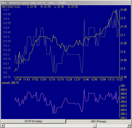
Overlay in real time + Create a spread between 2 tickers
This chart illustrates the real time overlay one minute bars of the Gold June futures on COMEX over the price ticker of ABX, Barrick Gold Corp. The indicator below is straight spread real time between these 2 tickers.
Comparison Chart
The Comparison Charts allow you to compare multiple charts of any ticker in a percentage change format. Tickers can be entered through the regular Chart Ticker function, separated by a semicolon, or using the Explore List feature in the control panel. You can also add or remove tickers while in Explore List view.
There are six time frames available in Comparison Charts YTD, 1 MO, 3 MOS, 6 MOS, 1 YR, 2 YR. Each ticker in a Comparison Chart is automatically assigned an independent color depending on your background color.
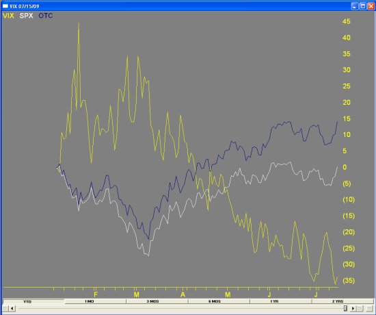
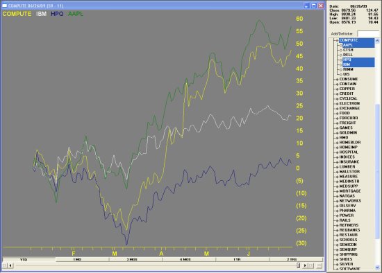
The Charts below provide some examples of how to use this tool.
The first Comparison Chart shows a YTD percentage change comparison Of the SP500 [SPX], Nasdaq Composite [OTC] and the Volatility Index [VIX]. The dramatic drop in the VIX as the markets have risen from the March lows is clearly shown. The more volatile Nasdaq index can also be seen outperforming the SP500.
The second Comparison Chart shows a 3 MO percentage change comparison of the iShares Russell 2000 [IWM], SPDR Financials [XLF], and Street Tracks Gold [GLD]. The strong performance of the SPDR Financials vs the iShares Russell 2000 is clearly displayed. The less stellar comparative performance of Street Tracks Gold is the blue.

The third Comparison Chart shows a YTD percentage change comparison of The S&P500 Computer Group [COMPUTE] with 3 stocks from that group, IBM [IBM], Hewlett [HPQ] and Apple [AAPL]. The strong performance by AAPL vs IBM and HPQ has helped this group’s gains over the last year.
Overlay indicators on Price Chart
You can now display an indicator like MACD, Volume, Stochastic etc directly to the price chart, both real-time and end of day. Simply bring up a chart, right click on the indicator of your choosing in the Control Panel and select‘Overlay this indicator on price plot’
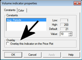
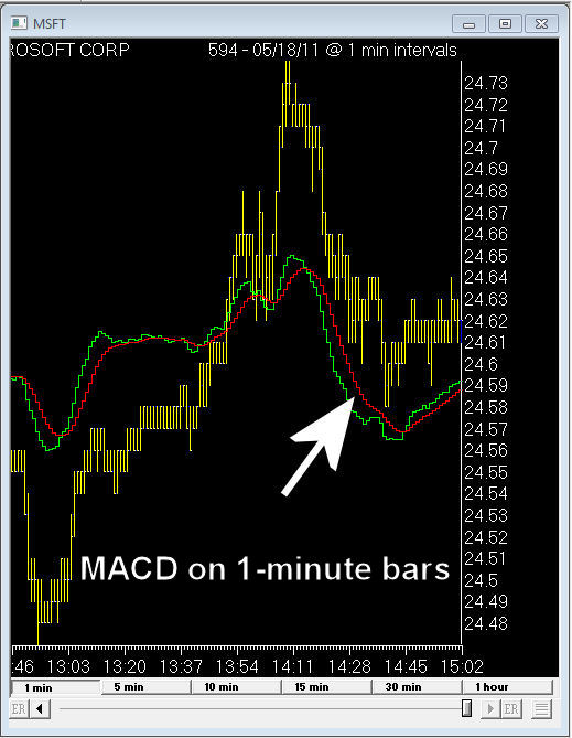
Currently this feature does not allow you to permanently save the seting for all charts and has to be applied individually. Here’s MSFT with 1 minute price bars and the MACD overlaid on the price plot.
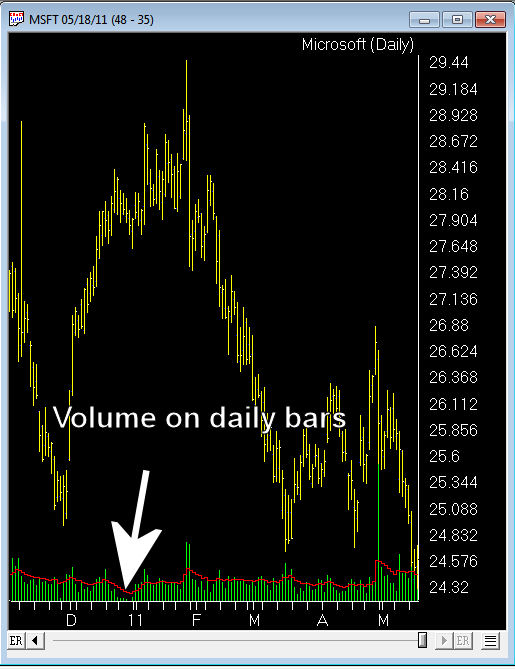
Here’s MSFT daily price bars and Volume overlaid on the price plot.
Here’s MSFT Candlestick chart overlaid with Stochastic indicator.
Back Test Real Time
EDS back test real time is now integrated into the EDS software. The process of building rules in the rule document, inserting reports and creating a back test view is identical to the end of day process.
Suggestion for testing
Open an EDS file, a basic stock based rule will suffice. Go to File, Properties. The additional parameters now include real time back test periods. Select the period of your choice. Select a list of tickers from the tickers in list pull down (we suggest a short list for now).
You will need to setup and downlaod real-time historical data using the AIQ Data Manager for any tickers you wish to backtest real-time. See Data Manager for more information.
Running a back test on real time data
From the back test view, click Test, Edit. The only difference between the back test properties for real time data versus end of day is the Range tab. This tab has a setting for number of periods back for your real time back test.
Summary and Positions
The summary and positions is now based around both a date and time stamp.