Advance-Decline data is calculated from daily issues reported on the New York Stock exchange. The Basic formula for calculating the Advance-Decline is the difference between the number of Advancing Issues and the number of Declining Issues per day, and adding it to or subtracting it from the previous day’s total.
In simple terms, the AdvanceDecline Line shows the direction in which the majority of stocks are headed. In a more important sense, it can show whether buying enthusiasm during a rally is spread across a broad number of stocks (a positive indication), or whether buying is narrowly focused on just a few industry groups or sectors (a generally negative sign).
An Advance-Decline Line is a contract/expanding/short-term market indicator. It is also referred to as an “order of magnitude” indicator because it provides a quick estimate of the market’s internal strength by showing how the overall market (or a specific sector) is trading in relation to a moving average.
One of the most popular ways of judging the market strength of the overall market is by using the advancedecline line (ADVs), also known as the “AD Line.” This metric is calculated by subtracting the number of decliners from the number of advancers in a market index. During a strong bull market (when a bull market begins), an AD line that is rising indicates growing market breadth (better market breadth) and indicates that money is continuing to move into the market. Conversely, falling AD lines indicate shrinking market breadth (worse market breadth) and indicate that money is leaving the broader market.
Because of its elegant simplicity, and the valuable insights it has provided at market turning points, the AD Line has become a highly prized indicator by both fundamentalists and technicians throughout the decades. But, in recent years, something seems to have gone astray.
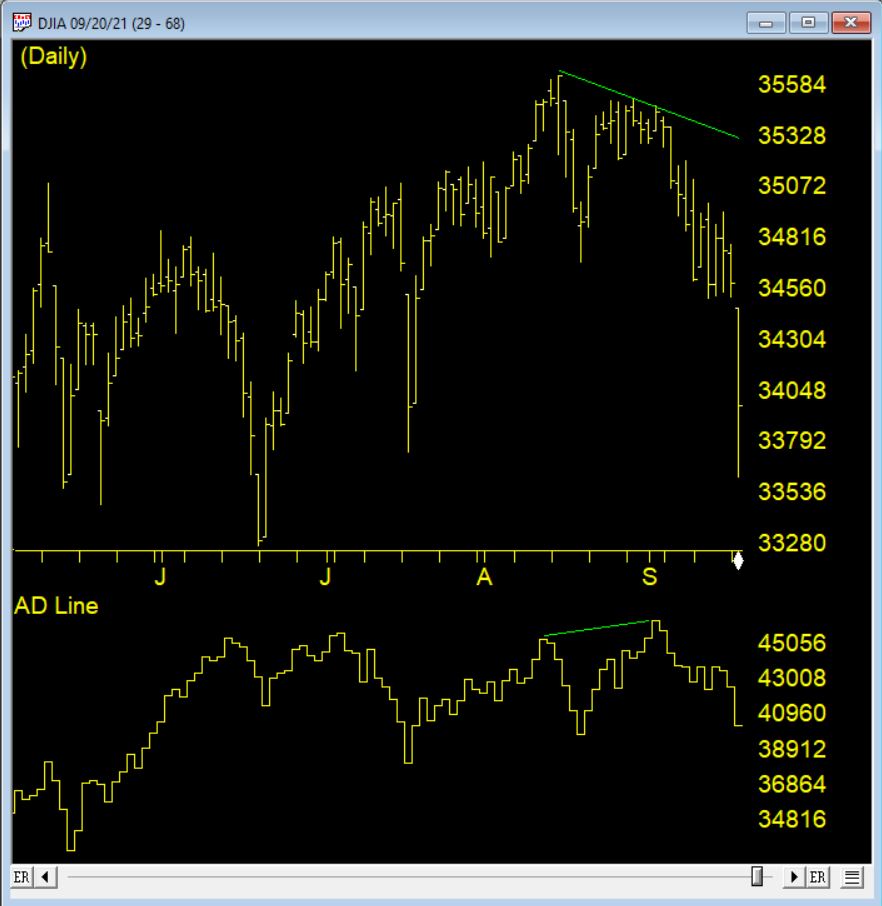
The AD Line against the DJIA 9/1/2021 clearly shows the indicator making a new high, however the market drops precipitously shortly after
How could the time-tested Advance-Decline Line give off such obviously false signals? The answer is simple, but not easily seen. The change has occurred, not in the indicator, but in the data it measures. Over the past 3 decades, the New York Stock Exchange has allowed trading in a growing number of issues that are not, or do not trade like, domestic common stocks.
The truth is that most of the issues currently listed on the NYSE are not really stocks, at least not what investors generally define as stocks. Their inclusion has created turbulence in the sea of securities that has been amplified by the Advance-Decline Line. These stock-like issues include closed end funds (CEFs), American Depository Receipts (ADRs), and exchange-traded funds (ETFs).
In other words, the common stock components of the Advance-Decline Line offset one another, while the bond-related components were rising strongly, giving the Advance-Decline Line a positive bias. In other words, during those periods, the Advance-Decline Line was, in essence, measuring the strength of the bond market, not the stock market. It’s no wonder that the signals were misleading!
Happy Holidays or not given how the Markets tumbled the day US Thanksgiving. BTW, it was also the last full week of November.
Time for me to run my WinWayCharts seasonal filter on my top 2500 stocks
The filter is highly configurable and I can select which period of time, looking back from a given date to find a consistent price move up or down. I’m looking for it to repeat every year going back 7 + years.
I first came across the concept of seasonal consistency through Jay Keppel’s work JayOnTheMarkets.com and his books on Seasonal Stock Market trends. Many of you will have heard of the classic seasonal patterns like ‘Go Away in May’ or “the Santa Claus rally’. My WinWayCharts seasonal screener can find these type of events in individual stocks. Events that happen every year at the same time.
Here’s how the WinWayCharts Seasonal Screener works
How long do you usually hold a trade? I like to hold a trade for a month or less, that’s about 22 trading days.. So, I have cash available to invest Monday November 29th. All I need do is pick a date one month from that date and look for stocks that consistently made a profit over those 22 trading days, long or short, every single year going back the last 7 years. You can look back further but 7 seems to be pretty good consistency to me.
It’s that Simple
November 29th to December 29th, there were a handful of long stocks with seasonal patterns and the same on the short side. I liked the short side given the current market.
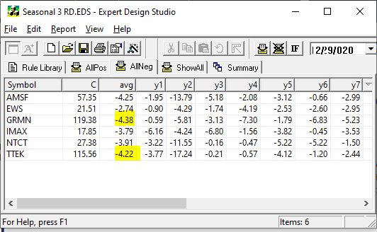
All these stocks lost money in every December for the last 7 years
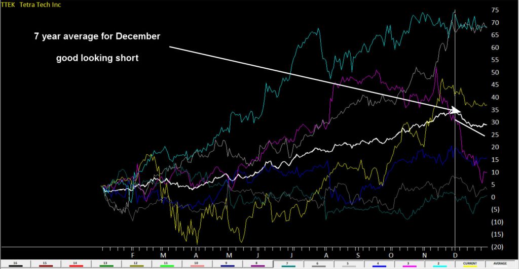
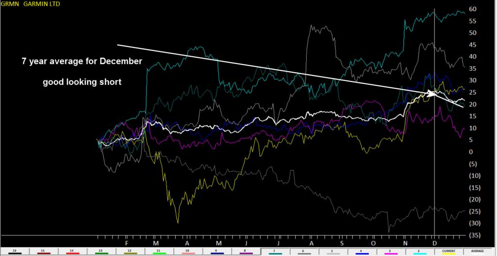
I highlighted GRMN and TTEK as both on average lost over 4% in December for last 7 years.
Here’s a WinWayCharts 7 year seasonal chart of TTEK the white line is the averageHere’s a WinWayCharts 7 year seasonal chart of GRMN the white line is the average
Want to go long?
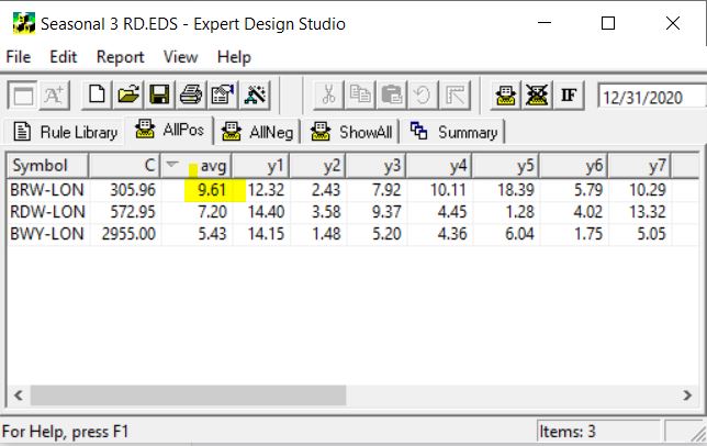
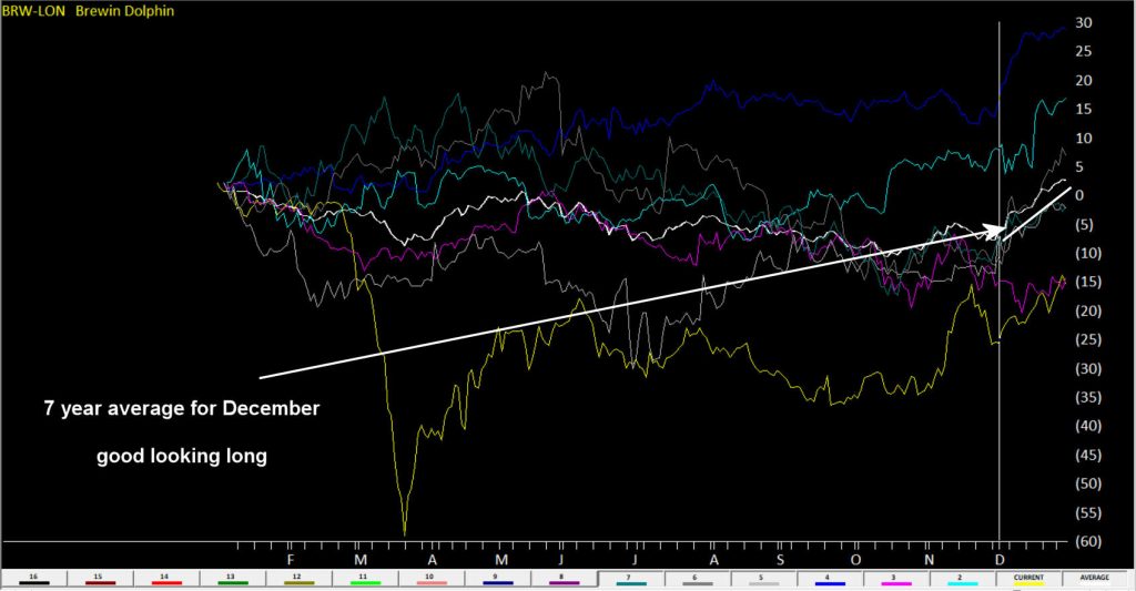
While there were no candidates in my US stocks, there were 3 UK stocks showed up. BRW-LON averaged 9.61% in December over 7 years. That’s impressive.
Here’s an WinWayCharts 7 year seasonal chart of BRW-LON the white line is the average
Next time I’m going to start to look at the major markets in specific periods and see if we can identify seasonal patterns that are hidden under the radar of everyday noise.
How can I run a WinWayCharts Seasonal scan?
First download the scan from our server click here
Locate the file Seasonal 3 RD.EDS likely in your /download folder and move it to your /wintes32/EDS Strategies folder
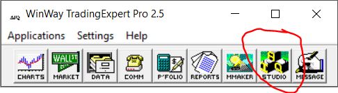
Open WinWayCharts EDS from the Main Menu
Click File, Open and locate the /wintes32/EDS Strategies/Seasonal 3 RD.EDS file
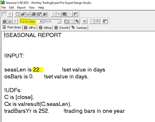
The file is set for seasonal length of 22 days but you can change this to whatever length you wish
Remember the date you run the report, like in the example above is 12/31/2020, it looks back in this case 22 days, then it checks 12/31/2019 and looks back 22 days etc. There would be no point it setting the date to run the report to the current date as it would look back 22 days, and you’d have missed the seasonal candidate stocks move.
The EDS code based on Vitali Apirine’s article in the March issue of Stocks & Commodities magazine “Rate Of Change With Bands,” can be obtained by copying the below into a new WinWayCharts EDS file, saving the file and adding EDS custom indicators on your Charts
!Rate Of Change With Bands
!Author: Vitali Aprine, TASC Mar 2021
!Coded by: Rich Denning, 01/11/2021
!INPUTS:
rocLen is 12.
emaLen is 3.
smaLen is 12.
C is [close].
ROC is (C - valresult(C,rocLen)) / valresult(C,rocLen)*100.
smaSqr is simpleavg(ROC*ROC,smaLen).
ROCdev is sqrt(smaSqr).
emaROC is expavg(ROC,emaLen).
upROCB is ROCdev.
dnROCB is  - ROCdev.
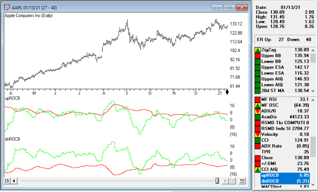
Code for the ROCB indicator is set up in the EDScode file. Figure 10 shows the indicators on a chart of Apple Inc. (AAPL). The red line in the first panel is the upper ROC band and the green line is the smoothed ROC. In the lower panel, the red line is the lower ROC band and the green line is the smoothed ROC.
FIGURE 10: The ROCB indicators are shown on a chart of Apple Inc. (AAPL). The red line in the first panel is the upper ROC band and the green line is the smoothed ROC. In the lower panel, the red line is the lower ROC band and the green line is the smoothed ROC.
With the price of the Dow Jones 30 (ticker INDU) in your WinWayCharts reaching beyond 32760, your Market Chart may be experiencing a spike in Charts. A new updated file for INDU is now available for you at www.aiqsystems.com/INDU.dta
Close all open WinWayCharts programs. Click the link above and Save INDU.dta to c:\wintes32\tdata, say yes when asked to overwrite. Once done, open Data Manager, click on Utilities, Rebuild Master Ticker List.
In many ways the markets imitate life. For example, the trend is your friend. You may enjoy your friendship with the trend for an indefinite length of time. But the moment you ignore it – or just simply take it for granted that this friendship is permanent, with no additional effort required on your part – that’s when the trouble starts.
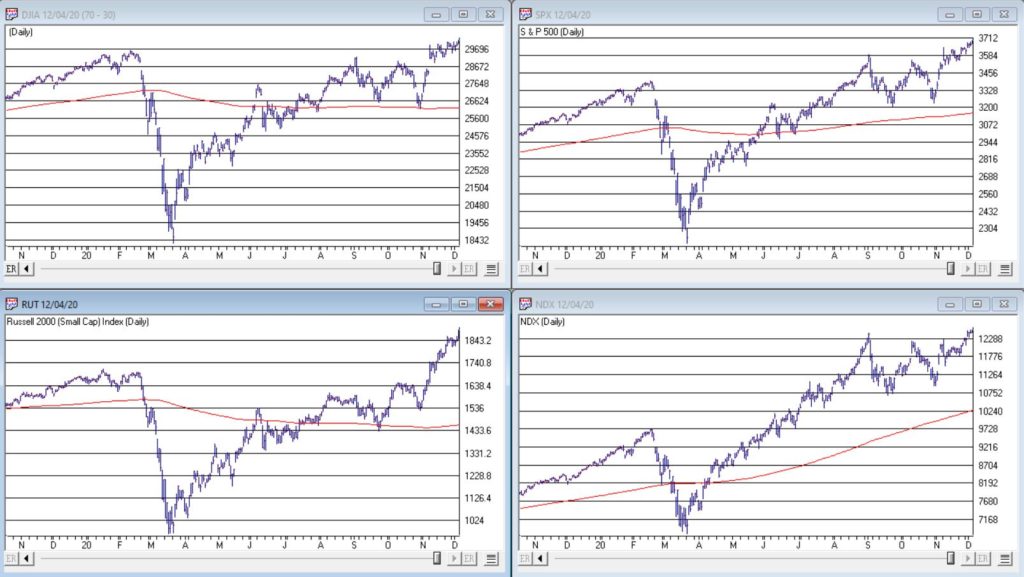
For the stock market right now, the bullish trend is our friend. Figure 1 displays the 4 major indexes all above their respective – and rising – long-term moving averages. This is essentially the definition of a “bull market.”
In addition, a number of indicators that I follow have given bullish signals in the last 1 to 8 months. These often remain bullish for up to a year. So, for the record, with my trusted trend-following, oversold/thrust and seasonal indicators mostly all bullish I really have no choice but to be in the bullish camp.
Not that I am complaining mind you. But like everyone else, I try to keep my eyes open for potential signs of trouble. And of course, there are always some. One of the keys to long-term success in the stock market is determining when is the proper time to actually pay attention to the “scary stuff.” Because scary stuff can be way early or in other cases can turn out to be not that scary at all when you look a little closer.
So, let’s take a closer look at some of the scary stuff.
Valuations
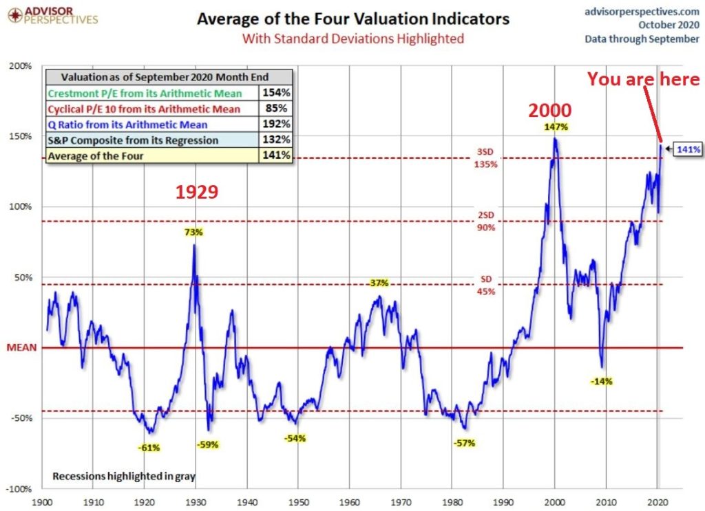
Figure 2 displays an aggregate model of four separate measures of valuation. The intent is to gain some perspective as to whether stocks are overvalued, undervalued or somewhere in between.
Clearly the stock market is “overvalued” if looked at from a historical perspective. The only two higher readings preceded the tops in 1929 (the Dow subsequently lost -89% of its value during the Great Depression) and 2000 (the Nasdaq 100 subsequently lost -83% of its value).
Does this one matter? Absolutely. But here is what you need to know:
*Valuation IS NOT a timing indicator. Since breaking out to a new high in 1995 the stock market has spent most of the past 25 years in “overvalued” territory. During this time the Dow Industrials have increased 700%. So, the proper response at the first sign of overvaluation should NOT be “SELL.”
*However, ultimately valuation DOES matter.
Which leads directly to:
Jay’s Trading Maxim #44: If you are walking down the street and you trip and fall that’s one thing. If you are climbing a mountain and you trip and fall that is something else. And if you are gazing at the stars and don’t even realize that you are climbing a mountain and trip and fall – the only applicable phrase is “Look Out Below”.
So, the proper response is this: instead of walking along and staring at the stars, keep a close eye on the terrain directly in front of you. And watch out for cliffs.
Top 5 companies as a % of S&P 500 Index
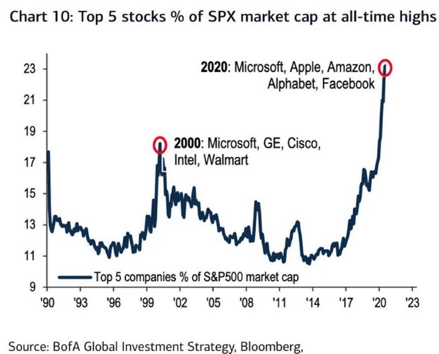
At times through history certain stocks or groups of stocks catch “lightning in a bottle.” And when they do the advances are spectacular, enriching anyone who gets on board – unless they happen to get on board too late. Figure 3 displays the percentage of the S&P 500 Index market capitalization made up by JUST the 5 largest cap companies in the index at any given point in time.
Figure 3 – Top 5 stocks as a % of S&P 500 Index market cap (Courtesy: www.Bloomberg.com)
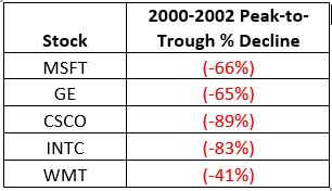
The anecdotal suggestion is pretty obvious. Following the market peak in 2000, the five stocks listed each took a pretty significant whack as shown in Figure 4.
Figure 4 – Top Stocks after the 2000 Peak
Then when we look at how far the line in Figure 3 has soared in 2020 the obvious inference is that the 5 stocks listed for 2020 are due to take a similar hit. And here is where it gets interesting. Are MSFT, AAPL, AMZN, GOOGL and FB due to lose a significant portion of their value in the years directly ahead?
Two thoughts:
*There is no way to know for sure until it happens
*That being said, my own personal option is “yes, of course they are”
But here is where the rubber meets the road: Am I presently playing the bearish side of these stocks? Nope. The trend is still bullish. Conversely, am I keeping a close eye and am I willing to play the bearish side of these stocks? Yup. But not until they – and the overall market – actually starts showing some actual cracks.
One Perspective on AAPL
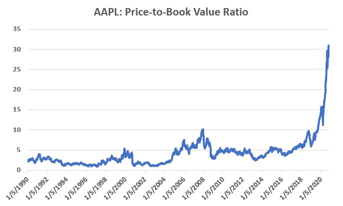
Apple has been a dominant company for many years, since its inception really. Will it continue to be? I certainly would not bet against the ability of the company to innovate and grow its earnings and sales in the years ahead. Still timing – as they say – is everything. For what it is worth, Figure 5 displays the price-to-book value ratio for AAPL since January 1990.
Figure 5 – AAPL price-to-book value ratio (Data courtesy of Sentimentrader.com)
Anything jump out at you?
Now one can argue pretty compellingly that price-to-book value is not the way to value a leading technology company. And I probably agree – to a point. But I can’t help but look at Figure 5 and wonder if that point has possibly been exceeded.
Summary
Nothing in this piece is meant to make you “bearish” or feel compelled to sell stocks. For the record, I am still in the bullish camp. But while this information DOES NOT constitute a “call to action”, IT DOES constitute a “call to pay close attention.”
Bottom line: enjoy the bull market but DO NOT fall in love with it.
Jay Kaeppel
Disclaimer: The information, opinions and ideas expressed herein are for informational and educational purposes only and are based on research conducted and presented solely by the author. The information presented represents the views of the author only and does not constitute a complete description of any investment service. In addition, nothing presented herein should be construed as investment advice, as an advertisement or offering of investment advisory services, or as an offer to sell or a solicitation to buy any security. The data presented herein were obtained from various third-party sources. While the data is believed to be reliable, no representation is made as to, and no responsibility, warranty or liability is accepted for the accuracy or completeness of such information. International investments are subject to additional risks such as currency fluctuations, political instability and the potential for illiquid markets. Past performance is no guarantee of future results. There is risk of loss in all trading. Back tested performance does not represent actual performance and should not be interpreted as an indication of such performance. Also, back tested performance results have certain inherent limitations and differs from actual performance because it is achieved with the benefit of hindsight.
Yet more Power tools in your WinWayCharts plus a session on why you should use color studies in Charts
Thursday July 2, 2020 at 14:00 – 15:45
Part 1. Power tools in your WinWayCharts
An hour long session with UK Director Ray Foreman covering the power features in your WinWayCharts platform – great for new clients or those with more experience.
Part 2. Why you should use color studies in Charts
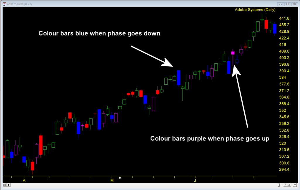
Steve Hill, founder of WinWayCharts will guide you through the powerful color studies tool in Charts and how you can take the indicators you already use and make them show signals on the price charts.

 English