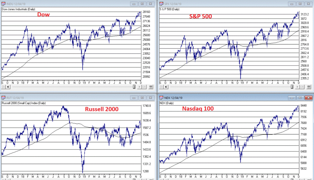
I haven’t written a lot lately. Mostly I guess because there doesn’t seem to be a lot new to say. As you can see in Figure 1, the major market indexes are in an uptrend. All 4 (Dow, S&P 500, Russell 2000 and Nasdaq 100) are above their respective 200-day MA’s and all but Russell 2000 have made new all-time highs.
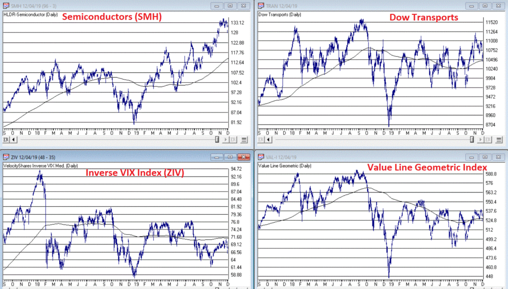
As you can see in Figure 2, my market “bellwethers” are still slightly mixed. Semiconductors are above their 200-day MA and have broken out to a new high, Transports and the Value Line Index (a broad measure of the stock market) are holding above their 200-day MA’s but are well off all-time highs, and the inverse VIX ETF ticker ZIV is in a downtrend (ideally it should trend higher with the overall stock market).
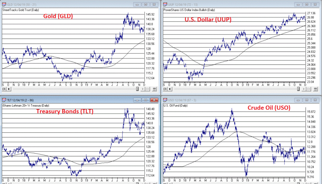
As you can see in Figure 3, Gold, Bonds and the U.S. Dollar are still holding in uptrends above their respective 200-day MA’s (although all have backed off of recent highs) and crude oil is sort of “nowhere”.
Like I said, nothing has really changed. So, at this point the real battle is that age-old conundrum of “Patience versus Complacency”. When the overall trend is clearly “Up” typically the best thing to do is essentially “nothing” (assuming you are already invested in the market). At the same time, the danger of extrapolating the current “good times” ad infinitum into the future always lurks nearby.
What we don’t want to see is:
*The major market averages breaking back down below their 200-day MA’s.
What we would like to see is:
*The Transports and the Value Line Index break out to new highs (this would be bullish confirmation rather the current potentially bearish divergence)
The Importance of New Highs in the Value Line Index
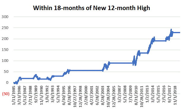
One development that would provide bullish confirmation for the stock market would be if the Value Line Geometric Index were to rally to a new 12-month high. It tends to be a bullish sign when this index reaches a new 12-month high after not having done so for at least 12-months.
Figure 4 displays the cumulative growth for the index for all trading days within 18 months of the first 12-month new high after at least 12-months without one.
Figure 4 – Cumulative growth for Value Line Geometric Index within 18-months of a new 12-month high
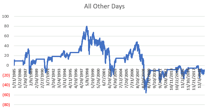
Figure 5 displays the cumulative growth for the index for all other trading days.
Figure 5 – Cumulative growth for Value Line Geometric Index during all other trading days
In Figure 4 we see that a bullish development (the first 12-month new high in at least 12 months) is typically followed by more bullish developments. In Figure 5 we see that all other trading days essentially amount to nothing.
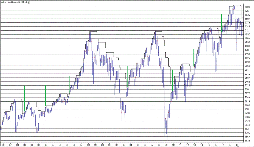
Figure 6 displays the Value Line Geometric Index with the relevant new highs highlighted.
The trend at this very moment is “Up.” So sit back, relax and enjoy the ride. Just don’t ever forget that the ride WILL NOT last forever. If the Value Line Geometric Index (and also the Russell 2000 and the Dow Transports) joins the party then history suggests the party will be extended. If they don’t, the party may end sooner than expected.
So pay attention.
Jay Kaeppel
Disclaimer: The information, opinions and ideas expressed herein are for informational and educational purposes only and are based on research conducted and presented solely by the author. The information presented does not represent the views of the author only and does not constitute a complete description of any investment service. In addition, nothing presented herein should be construed as investment advice, as an advertisement or offering of investment advisory services, or as an offer to sell or a solicitation to buy any security. The data presented herein were obtained from various third-party sources. While the data is believed to be reliable, no representation is made as to, and no responsibility, warranty or liability is accepted for the accuracy or completeness of such information. International investments are subject to additional risks such as currency fluctuations, political instability and the potential for illiquid markets. Past performance is no guarantee of future results. There is risk of loss in all trading. Back tested performance does not represent actual performance and should not be interpreted as an indication of such performance. Also, back tested performance results have certain inherent limitations and differs from actual performance because it is achieved with the benefit of hindsight.
Most people are familiar with ADHD, manic-depressive disorder, depression and schizophrenia. But one common affliction within our trading community that gets almost no attention is WESS. That stands for “Wild-Eyed Speculation Syndrome”. And it’s more common than you think (“Hi, my name is Jay”).
The exact symptoms vary, but generally speaking they go something like this:
*A person gets up in the morning with a hankering to make a trade
*Said person then finds “some reason” to make some trade in something
*If the person happens to make money on that trade then the affliction is reinforced by virtue of IGTS (“I’ve Got the Touch Syndrome”, which is one of the occasional side effects of WESS)
*If the person loses money on the trade the side effects can vary but may include: angry outbursts, kicking oneself in the head (typically figuratively), vows to either stop the behavior or at least do it better, and so on.
*The most common side effect of WESS is a declining trading account balance (which not coincidentally is how this disorder is most commonly diagnosed).
For those suffering from WESS – with the caveat/disclosure that I am not a medical professional (although I have found that ibuprofen really clears up a lot of stuff, but I digress) – I am here to help.
If you find yourself suffering from Symptom #1 above:
The most effective step is to go back to bed until the urge passes. If this doesn’t work or is not possible (for instance, if you have one of those pesky “jobs” – you know, that 8-hour a day activity that gets in the way of your trading), repeat these two mantras as many times as necessary:
Mantra 1: “I must employ some reasonably objective, repeatable criteria to find a trade with some actual potential”
Mantra 2: “I will risk no more than 2% of my trading capital” on any WESS induced trade (and just as importantly, you must fend off the voice on the other shoulder shouting “But this is the BIG ONE!!”)
Repeat these mantras as many times as necessary to avoid betting the ranch on some random idea that you “read about on the internet, so it must be true.”
Regarding Mantra 1
There are a million and one ways to find a trade. There is no one best way. But just to give you the idea I will mention one way and highlight a current setup. IMPORTANT: That being said, and as always, I DO NOT make recommendations on this blog. The particular setup I will highlight may work out beautifully, or it may be a complete bust. So DO NOT rush out and make a trade based on this just because you read it – you know – on the internet.
The Divergence
Lots of trades get made based on “divergence”. In this case we are talking about the divergence between price and a given indicator – or even better, series of indicators. There is nothing magic about divergence, and like a lot of things, sometimes it works and sometimes it doesn’t. But the reason it is a viable consideration is that when an indicator flashes a bullish divergence versus price it alerts us to a potential – nothing more, nothing less – shift in momentum.
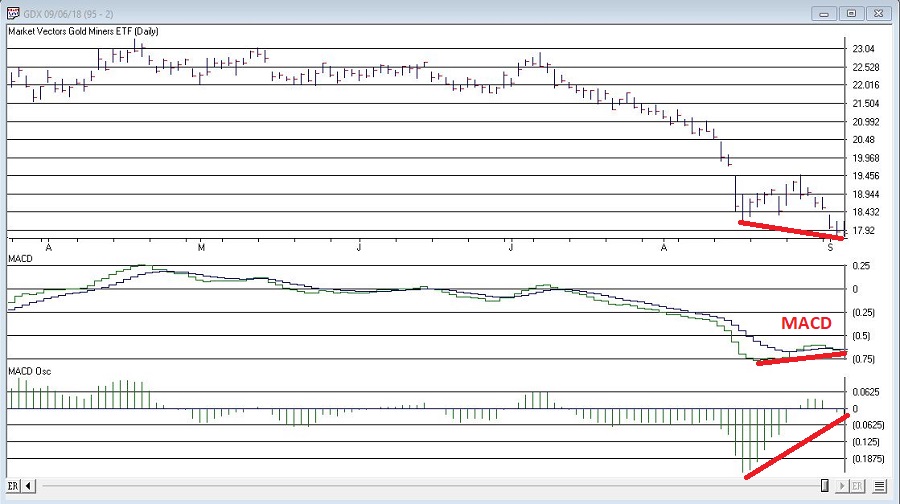
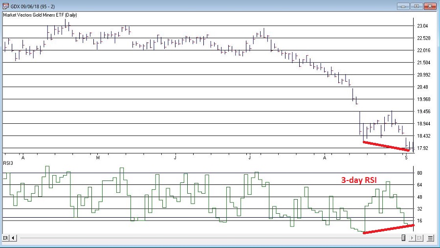
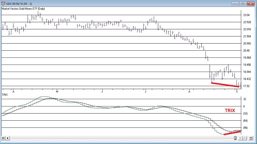
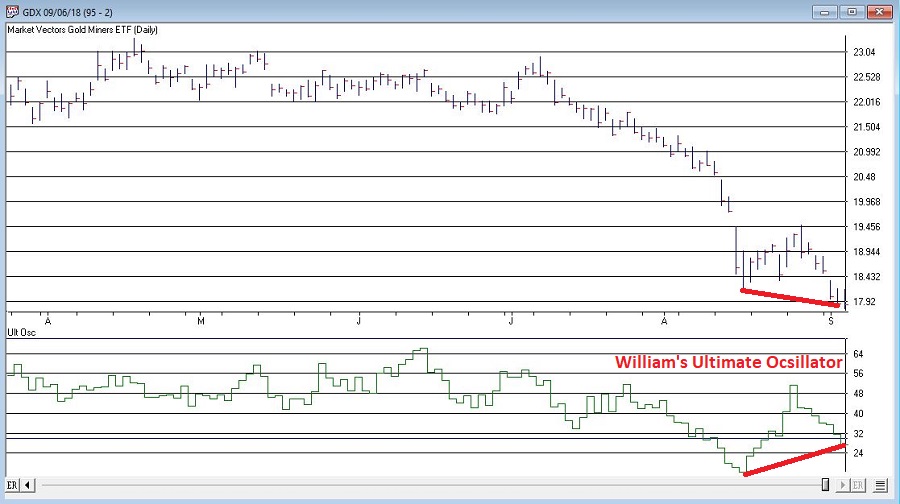
Let’s look at ticker GDX – an ETF that tracks an index of gold mining stocks. In Figure1 1 through 4 below we see:
*GDX price making a lower low
*A given indicator NOT confirming that new low (i.e., a positive divergence)
Figure 1 – GDX and MACD (Courtesy WinWayCharts TradingExpert)
Figure 2 – GDX and 3-day RSI (Courtesy WinWayCharts TradingExpert)
Figure 3 – GDX and TRIX (Courtesy WinWayCharts TradingExpert)
So, do the divergences that appear in Figures 1 through 4 justify a trade? Well, here is where the aforementioned affliction comes into play.
Average Trader: “Maybe, maybe not. In either case I am not entirely sure that trying to pick a bottom in gold stocks based solely on indicator divergences is a good idea”
WESS Sufferer: “Absofreakinglutely!! Let’s do this!!”
You see the problem.
So, let’s assume that a WESS Sufferer likes what he or she sees in Figures 1 through 4. The good news is that we have met the minimum criteria for Mantra #1 above – we have employed some reasonably objective, repeatable criteria (i.e., a bullish divergence between price and a number of variable indicators) to spot a potential opportunity.
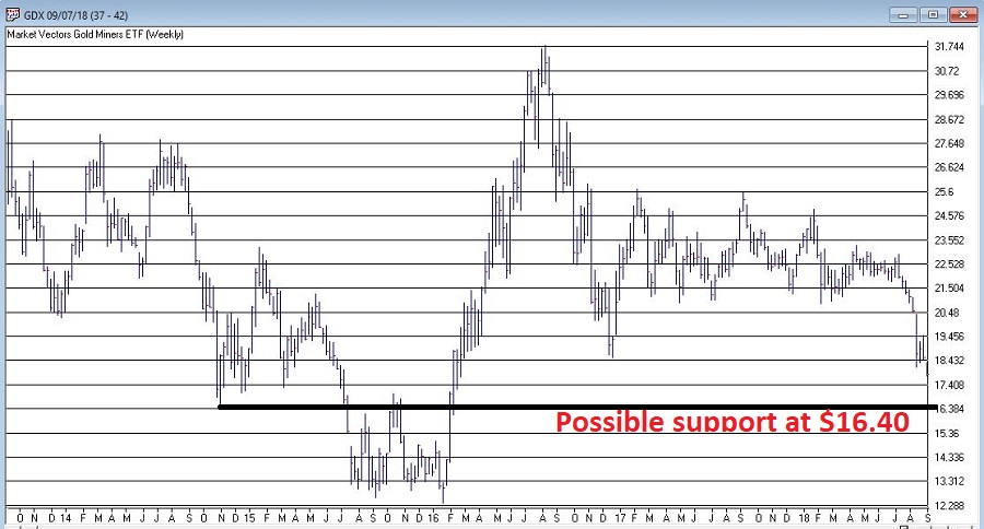
Now we must follow Mantra #2 of risking no more than 2% of my trading capital. Let’s assume our WESS Sufferer has a $25,000 trading account. So he or she can risk a maximum of $500 ($25,000 x 2%).
In Figure 5 we see a potential support area for GDX at around $16.40 a share.
Figure 5 – Ticker GDX with support at $16.40 (Courtesy WinWayCharts TradingExpert)
So, one possibility would be to buy 300 shares of GDX at $17.84 and place a stop loss order below the “line in the sand” at say $16.34 a share. So if the stop is hit, the trade would lose -$450, or -1.8% of our trading capital (17.84 – 16.34 = -1.50 x 300 shares = -$450).
Summary
Does any of the above fit in the category of “A Good Idea”. That’s the thing about trading – and most things in life for that matter – it’s all in the eye of the beholder. Remember, the above is NOT a “recommendation”, only an “example.”
The real key thing to note is that we went from being just a random WESS Sufferer to a WESS Sufferer with a Plan – one that has something other than just an “urge” to find a trade, AND (most importantly) a mechanism for limiting any damage that might be done if things don’t pan out.
And if that doesn’t work, well, there’s always ibuprofen.
Jay Kaeppel
Disclaimer: The data presented herein were obtained from various third-party sources. While I believe the data to be reliable, no representation is made as to, and no responsibility, warranty or liability is accepted for the accuracy or completeness of such information. The information, opinions and ideas expressed herein are for informational and educational purposes only and do not constitute and should not be construed as investment advice, an advertisement or offering of investment advisory services, or an offer to sell or a solicitation to buy any security.
This week it is the U.S. dollar and Gold taking their turns testing critical inflection points.
U.S. Dollar
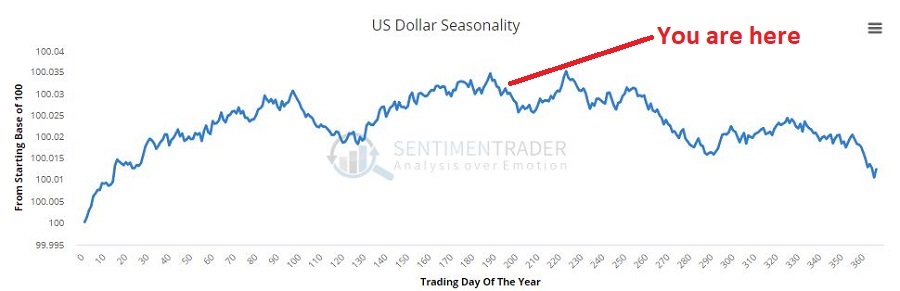
As you can see in Figure 1, on a seasonal basis the dollar is moving into a traditionally weaker time of year.Figure 1 – U.S. Dollar seasonality (Courtesy Sentimentrader.com)
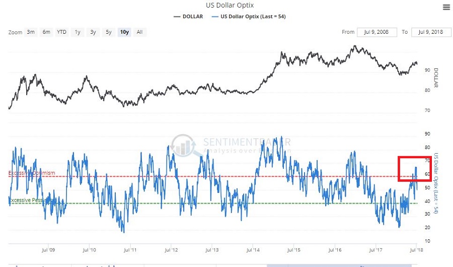
In Figure 2 you can see that traders have been and remain pretty optimistic. This is traditionally a bearish contrarian sign.Figure 2 – U.S. Dollar trade sentiment (Courtesy Sentimentrader.com)
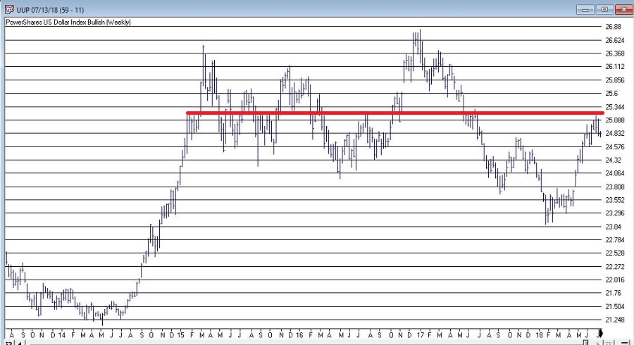
In Figure 3 we see the “line in the sand” for ticker UUP – an ETF that tracks the U.S. Dollar. Unless and until UUP punches through to the upside there is significant potential downside risk.Figure 3 – U.S. Dollar w/resistance (Courtesy TradingExpert)
Gold
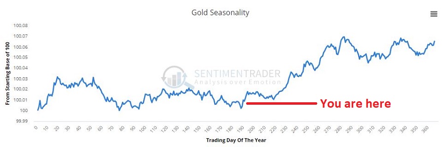
As you can see in Figure 4, on a seasonal basis the dollar is moving into a traditionally stronger time of year.Figure 4 – Gold seasonality (Courtesy Sentimentrader.com)
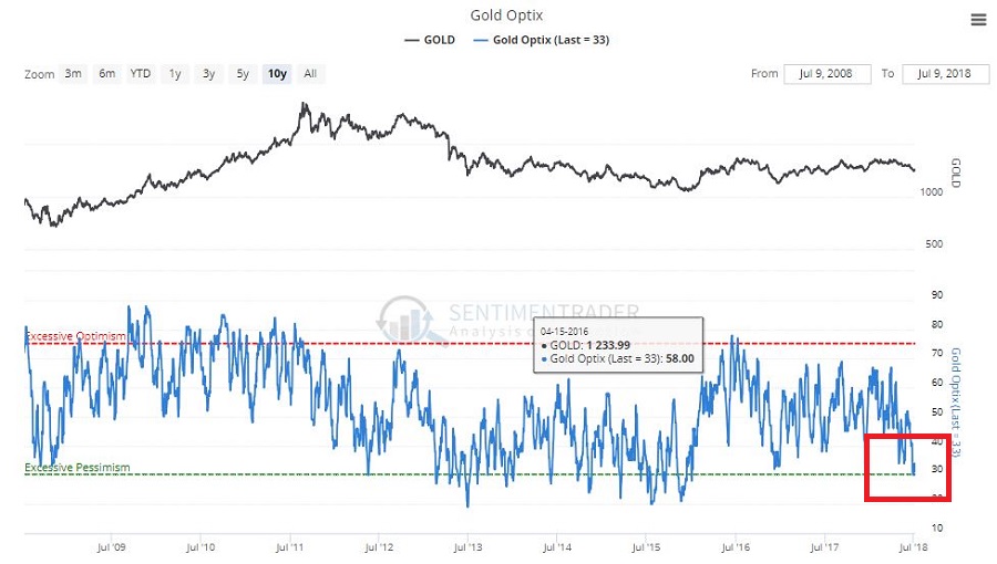
In Figure 5 you can see that traders have been and remain pretty pessimistic. This is traditionally a bullish contrarian sign.Figure 5 – Gold trader sentiment (Courtesy Sentimentrader.com)
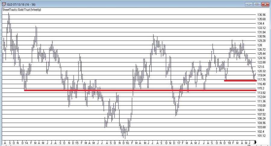
In Figure 6 we see the “line(s) in the sand” for ticker GLD – an ETF that tracks gold bullion.
I would be hesitant about trying to “pick a bottom” as gold still looks pretty week. But if:
a) GLD does hold above the support area in Figure 6 and begins to perk up,
AND
b) Ticker UUP fails to break out to the upside
Things could look a lot better for gold very quickly.
Summary
As usual I am not actually making any “predictions” here or calling for any particular action. I mainly just want to encourage gold and/or dollar traders to be paying close attention in the days and weeks ahead, as the potential for a major reversal in both markets appears possible.
Likewise, if no reversal does take place – and if the dollar breaks out to the upside and gold breaks down, both markets may be “off to the races.”
So dollar and gold traders – take a deep breath; focus your attention; and prepare for action…one way or the other.
Jay Kaeppel
Disclaimer: The data presented herein were obtained from various third-party sources. While I believe the data to be reliable, no representation is made as to, and no responsibility, warranty or liability is accepted for the accuracy or completeness of such information. The information, opinions and ideas expressed herein are for informational and educational purposes only and do not constitute and should not be construed as investment advice, an advertisement or offering of investment advisory services, or an offer to sell or a solicitation to buy any security.
I suppose a more accurate title would be, “A Bunch of Single Country ETFs, Interrupted”, but, well, that just doesn’t have quite the same succinct simplicity.
I always (always, always) try to make an effort to focus on “the current trend” and to avoid focusing on things that “maybe might prove to be ominous signs in retrospect” or to imply that a certain tidbit of information is predictive when in reality it is mostly just anecdotal. Still, human nature is – unfortunately, in this case – a powerful force. Which reminds me to invoke:
Jay’s Trading Maxim #17: Human nature is a detriment to trading and investment success, and should be avoided as much as, well, humanly possible.
The bottom line is that despite my very own warnings and admonitions, sometimes that pesky human nature gets the best of me.
What Has My Attention
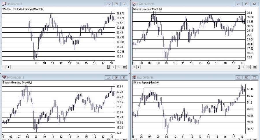
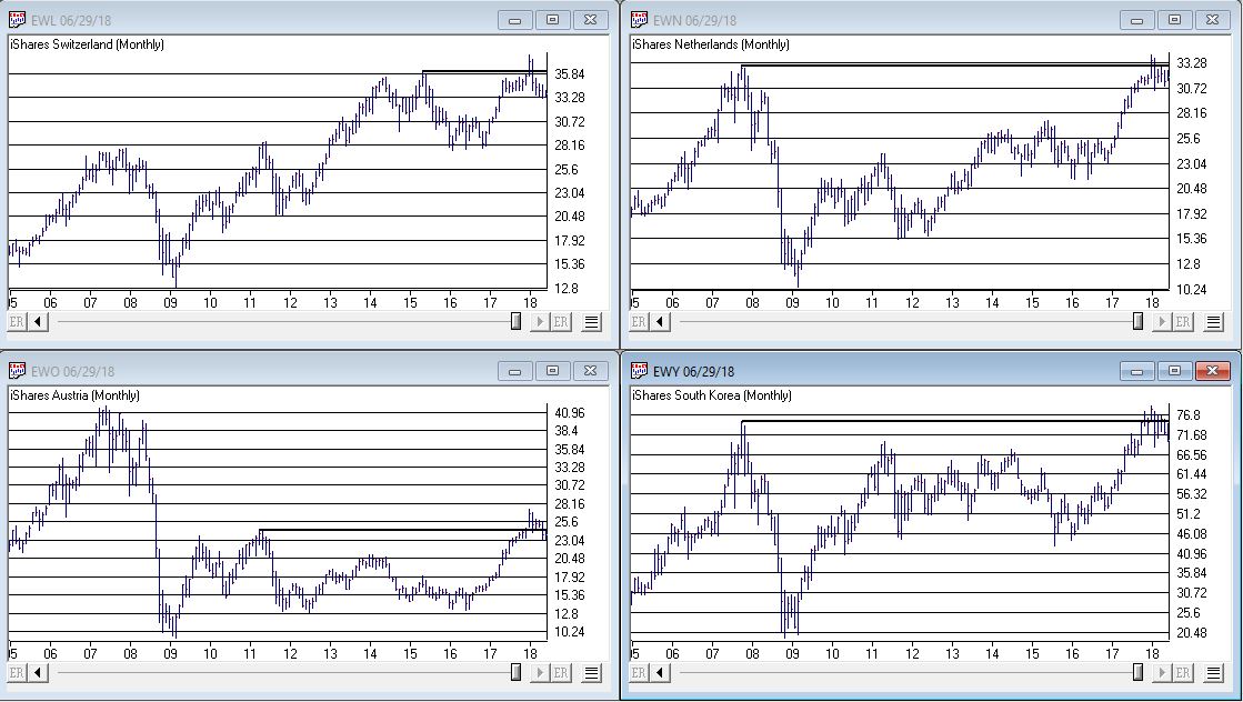
OK, rather than me telling you what I think, please simply peruse the charts in Figures 1, 2 and 3 and see if anything jumps out at you.
(click to enlarge)
Figure 1 – India, Sweden, Japan, Germany (clockwise); (Courtesy TradingExpert)
(click to enlarge)
Figure 2 – Switzerland, Netherlands, South Korea, Austria (clockwise); (Courtesy TradingExpert)
Perhaps you noticed the same thing I did, i.e., a whole bunch of single country ETF’s hitting new highs or testing old resistance and getting rejected. In a number of cases, after appearing to break out to new highs for a period of weeks or month only to fall back below the “line in the sand.”
It’s sort of like the World Cup of Failed Breakouts.
Summary
Now here’s the thing. I have displayed a bunch of charts that anecdotally seem to imply something bearish. To spell it out, failed breakouts are often – though definitely not always – followed by something much worse.
So the line of reasoning goes like this, “If the stock market in umpteen countries is failing to advance then this must be a bad thing.”
But the reality is that all these markets have to do is rally and this whole sort of made up area of concern goes away.
Still, until that actually happens I think I will:
a) Enjoy the rally here in the U.S.
b) Remain vigilant
It seems like a reasonable plan.
Jay Kaeppel
Disclaimer: The data presented herein were obtained from various third-party sources. While I believe the data to be reliable, no representation is made as to, and no responsibility, warranty or liability is accepted for the accuracy or completeness of such information. The information, opinions and ideas expressed herein are for informational and educational purposes only and do not constitute and should not be construed as investment advice, an advertisement or offering of investment advisory services, or an offer to sell or a solicitation to buy any security.
For the record, I am a big believer in trend-following. Picking tops and bottoms with any consistency is essentially impossible (at least in my opinion and/or experience). So from that perspective going with the trend makes a lot of sense. I am also a big believer in relative strength. Much evidence over the years suggests that buying what is “already moving” is a very viable approach to investing. Other studies have demonstrated pretty clearly that you are generally much more likely to succeed by buying stocks making new highs than by buying stocks making new lows.
These approaches make good sense and they work very well over time. Despite this many (most?) investors still feel those pangs to “buy low” in hopes of getting in early and riding a major trend. And the truth (I think) is that this can work too, if done correctly.
Like I said, there are a lot of ways to play this game. But there is a definite “right” way and “wrong” way when it comes to “buying low.”
Buying Low (The Wrong Way): Buy things are plummeting or that have recently plummeted.
The Right Way (The Right Way): Buy things that have, a) plummeted, b) stopped plummeting and, c) have since been moving sideways for some period of time.
Last year I wrote about a “Buy Low” portfolio that I had concocted at the time. Unfortunately, several of the ETFs involved have since ceased trading. So in this piece I will introduce my updated “Buy Low” portfolio. For the record – and as always – I am not “recommending” this portfolio. It is essentially an experiment in one alternative approach to investing.
The “Buy Low” Portfolio
The Buy Low Portfolio consists of the following ETF’s and ETN’s:
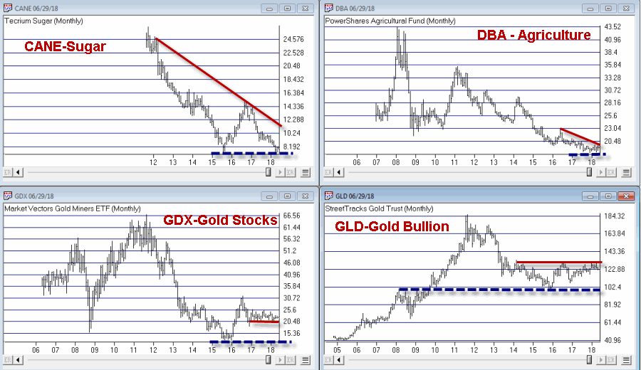
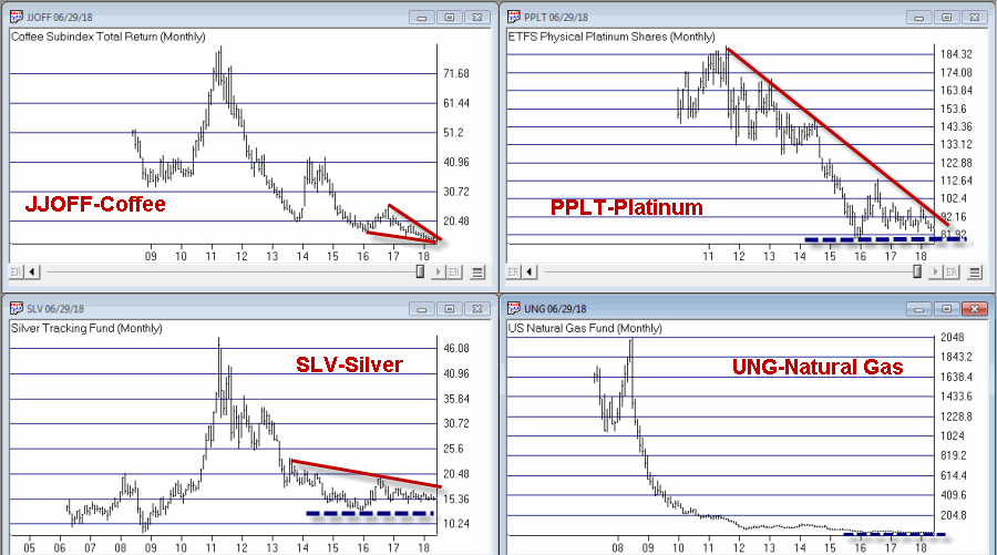
CANE – Tecrium Sugar
JJOFF – Coffee Subindex Total Return
DBA – PowerShares Agricultural
WEAT – Tecrium Wheat
GLD – StreetTracks Gold Trust
PPLT – ETFS Physical Platinum Shares
SLV – iShares Silver Trust
GDX – Market Vectors Gold Miners
UNG – United States Natural Gas
URA – Global X Uranium
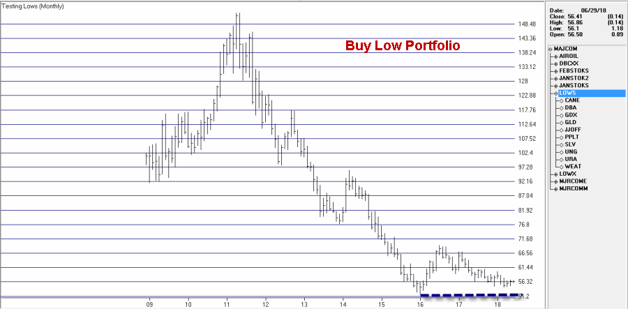
Monthly charts for these tickers appear in Figures 1 through 3. A chart of the composite index I created by combining all of these appears in Figure 4 (Click any chart to enlarge).
Editors note: To create an index like Jay’s Trending Low, follow the instructions at the end of this article ‘Creating an index for a group of tickers in Data Manager’
Summary
Securities that have plummeted in price and then moved sideways for a period of time can (unfortunately) continue to move sideways for quite a while longer before (hopefully) breaking out to the upside. Even worst, they can also fail and breakdown through the previous low. But extended consolidation patterns are often followed by something good.
As you can see all of the tickers in the list above are commodity related. As I’ve written about here and here there is reason to believe that commodities will outperform in the years ahead. That being said, with the stock market rallying in the near-term and with the U.S. Dollar strong there is no compelling reason to think that this “Buy Low Portfolio” is going to make a lot of headway anytime soon.
The Index in Figure 4 is presently 8.2% above its January 2016 low. As long as that low holds I’ll give this experiment more time to work out.
Jay Kaeppel
Disclaimer: The data presented herein were obtained from various third-party sources. While I believe the data to be reliable, no representation is made as to, and no responsibility, warranty or liability is accepted for the accuracy or completeness of such information. The information, opinions and ideas expressed herein are for informational and educational purposes only and do not constitute and should not be construed as investment advice, an advertisement or offering of investment advisory services, or an offer to sell or a solicitation to buy any security.
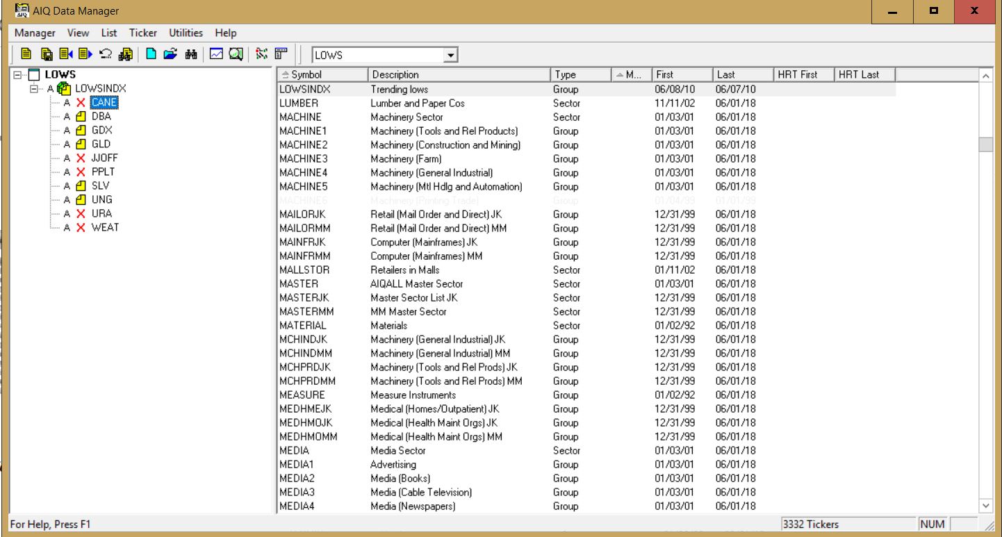
Creating an index for a group of tickers in Data Manager
NOTE: tickers with X in list need to be added to the Data Manager as new tickers and downloaded from your data service
When you create an index for a group of tickers, you can display a chart of the index as well as the underlying tickers. A group index can be analyzed on charts using technical indicators, and Expert Ratings are generated for the group index (except for mutual fund groups). The procedure for creating an index for a group of tickers is as follows:
First, create a group ticker for the index.
Then create a list to insert the group ticker into.
Add tickers to the group.
Finally, create the index by executing the Compute Group/Sector Indices function.
To create an index for a group of tickers, follow the steps below. First, create a group ticker: 1. First, add a new group ticker to your Master Ticker List. Select the Ticker command on the menu bar. Then select New to display the New Ticker dialog box. 2. Enter a ticker for the new group, then be sure to enter the proper Type designation (group or mutual fund group). 3. Click OK, and the second dialog box for entering a new ticker appears. 4. Type in a name (Description) and the First Date for data. The remaining default settings on this second dialog box can remain the same. 5. Click OK and the group ticker is added to your Master Ticker List. Then, create a list to insert the group ticker into: 1. Select the List command on the menu bar. 2. Select New on the drop-down menu and a dialog box appears. 3. Type in a name (8 characters maximum) in the text box. 4. Click OK and the list name appears in the Selected List text box located on the toolbar. 5. The list name is also displayed in the List window. Insert the group ticker from your Master Ticker List under the list name. To insert a ticker directly under a list, do the following:
Highlight (by clicking) the group ticker in the Master Ticker List.
Click the list name in the List window.
Click the Insert to List button on the toolbar (or select the Insert Ticker command from the List sub-menu).
The group ticker will appear in the List window under the list name.
6. Next, insert tickers into the group. To insert tickers into a group: Under the new group, insert all of the tickers that will make up the group by doing the following:
Select the group ticker in the List window by clicking on it.
Select in your Master Ticker List the tickers that you want to add to the group. If you are inserting multiple tickers, hold down the Ctrl key while clicking each ticker.
Click the Insert to List button on the toolbar (or select the Insert Ticker command from the List sub-menu).
The tickers will appear in the List window under the group ticker.
7. Finally, compute the index for the new group. To compute a group index:
Select Compute Group/Sector Indices from the Utilities sub-menu.
In the Compute Group/Sector Indices dialog box, click the Compute List(s) option button.
In the text box for Compute List(s), select the name of the list you created above.
Under Range, choose Update from Last Date of Data and click OK.
Well, OK, maybe not. But life here in the Good Old US of A may be affected profoundly. Which of course, would ripple out and affect much of the rest of the world. So maybe it’s not that outrageous. In any event, it sure is a catchy title, no? In truth this piece is not an immediate call to action, but rather one of those short “hey, you might want to keep your eye on this” type pieces. I am writing about the U.S. Dollar.
There are pro’s and con’s to a strong U.S. Dollar and there are pro’s and con’s to a weak U.S. Dollar. If you would like to know what they are please see the steps below:
Step 1) Go to your web browser. Type www.google.com and press Enter Step 2) Type “pros and cons of strong U.S. dollar” and press Enter. Step 3) Browse among the approximately 308,000 or so links until you find your answer. Step 4) Type “pros and cons of weak U.S. dollar” and press Enter. Step 5) Repeat Step 3.
Since at least the end of the gold standard in 1971 the U.S. dollar has served as the world’s “reserve currency”. (This basically means that if you could only hold one currency you would want to hold the dollar.) This has become one of those things that most people take for granted and assume will go on forever.
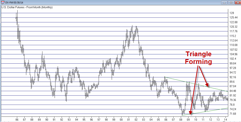
Still, given that we are now the most indebted “We the People” in the history of the planet, perhaps we shouldn’t be surprised that there has been a lot of talk recently (granted mostly among intentionally frightening and mostly annoying infomercials) about how the days of enjoying “reserve currency” status are numbered, and how this will trigger a panic out of the dollar, which will lead to all kind of bad things like, well, see Step 4 above. Will the Dollar Collapse? For me to pretend that I have the slightest idea whether or not the U.S. dollar will someday collapse would be a joke, and not the funny kind. But as a trader and investor my “thing” is not so much “what will happen” as it is “what could happen and what the heck do I plan to do about it if it does?” Which leads me to the following distractions: Jay’s Trading Maxim #235: It’s not so much how much you make when things go right, but how much you keep when thing goes wrong. Jay’s Trading Maxim #236: If you take care of the losing trades, the winning trades will take care of themselves (OK, for the record, this is not mine, I just gave it number 236 so I could use it as a segue into…..) Jay’s Trading Maxim #237: Successful traders worry less about “Kicked Ass” and more about “Ass Kicked”, if you get my drift. So why am I bringing all of this up? Take a look at Figure 1 which displays a monthly chart of continuous U.S. dollar futures. While the history of U.S. dollar trends is all very interesting and I would love to recap it for you, I am going to opt for the “a picture is worth a thousand (likely incredibly boring) words” mantra and encourage you simply to glance at Figure 1 if you want to know where the dollar has been in the past. And when you do – here is the important part – note that the dollar is forming a narrowing triangle (is there another kind?) pattern. In other words, starting with the high in 2006 the dollar has been fluctuating in an ever smaller range.
Figure 1 – A large triangle forming (Courtesy: AIQ TradingExpert)
We “market analyst types” refer to this as “coiling” action. Now if you are like me chances are you just squirmed slightly when you read that last sentence. Because we all know what happens when something stops coiling – that’s right, it “uncoils”. And “uncoiling” is typically not a quiet affair.
So here is the bottom line. At some point – and just for the record it might not be for several years – the U.S. dollar will break out of this triangle one way or the other. And chances are it will move sharply in price from that point. And whether it breaks out to the upside or the downside it will have significant implications for the quality of life here in the U.S. If you don’t believe me, see the 308,000 links referenced in Step #3 above.
So make a note to check in on the dollar once in awhile. Because one of these days something profoundly significant is going to happen.
Jay Kaeppel Chief Market Analyst at JayOnTheMarkets.com and AIQ TradingExpert Pro (http://www.aiq.com) client
Jay has published four books on futures, option and stock trading. He was Head Trader for a CTA from 1995 through 2003. As a computer programmer, he co-developed trading software that was voted “Best Option Trading System” six consecutive years by readers of Technical Analysis of Stocks and Commodities magazine. A featured speaker and instructor at live and on-line trading seminars, he has authored over 30 articles in Technical Analysis of Stocks and Commodities magazine, Active Trader magazine, Futures & Options magazine and on-line at www.Investopedia.com.