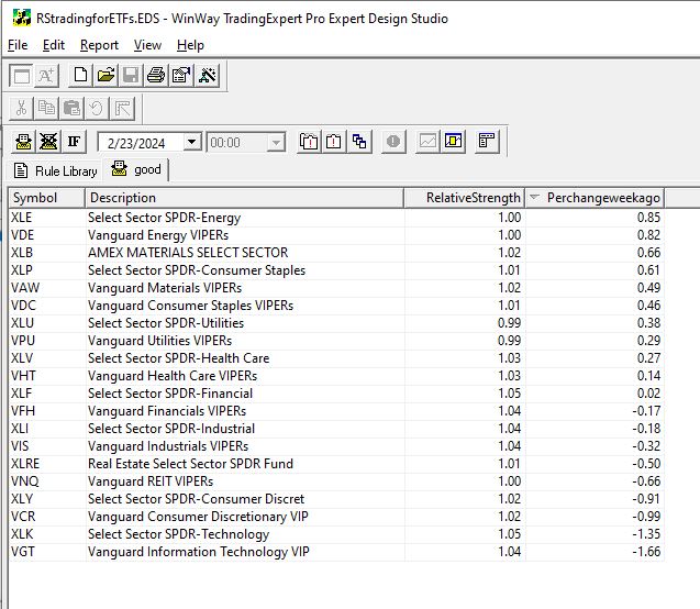
WinWayCharts pre-built Relative Strength report offers a valuable tool for those seeking to capitalize on sector rotation. By shifting the focus to ETFS and cloning the report as closely as possible in the AIQ Expert Design Studio, we gain the ability to apply additional screening criteria. This adds a layer of flexibility, that can achieve significant market outperformance. . Through WinWayCharts Expert Design Studio (EDS) program, users gain the freedom to create their personalized screening techniques.
The approach we aim for is to utilize an EDS model that seeks out high relative strength. To refresh your memory, the short-term Relative Strength report considers the last 120 trading days, divides this period into quarters, and then calculates the average percent change for each quarter with a heavier weight on the most recent quarter. Here’s the EDS code:
RelativeStrength is 0.4Period1+ 0.2Period2 + 0.2Period3 +0.2Period4.
Description is Description().
RSvalue5daysback is valresult(RelativeStrength,5).
Perchangeweekago is ((RelativeStrength – RSvalue5daysback)/RSvalue5daysback)*100.
! change is Perchangeweekago.
good if 1.
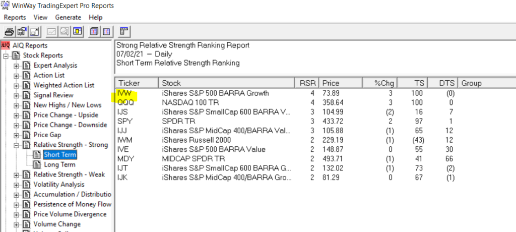
Using this code, an EDS report can be generated to rank ETF sectors from strongest to weakest. While investing in high relative strength sectors can be effective, some individuals might feel uneasy about buying when prices are already high. Often, they regret not entering the market earlier upon seeing a high RS sector.
For those preferring to enter a trend earlier, we can integrate a new screening into our EDS report. We’ve discovered that monitoring the weekly change in RS ranking is valuable for determining whether a sector is gaining or losing momentum.
Relative Strength serves as the primary screening metric, where the objective is to hold positions that appear at the top of the report. Instead of purchasing assets immediately when they top the report, some traders may opt to utilize the Change column to identify sectors with the strongest upward momentum. By selecting sectors with the highest Change numbers, you are essentially investing in sectors exhibiting robust momentum in relative strength.
Traders can easily sort sectors by the Change column by clicking on its title. The benefit of entering sectors with a high Change score is the potential for earlier trend entry. However, the drawback is the possibility of false signals—instances where a trend fails to materialize, causing the sector to stagnate in the relative strength ranking.
Investing in high relative strength sectors or sectors with improving relative strength figures presents a solid strategy for entering industry sectors. These approaches can be combined to create a more dynamic strategy. With the combination strategy, the goal is to identify sectors with both high Relative Strength readings and positive Change readings, indicating strength and ongoing improvement.
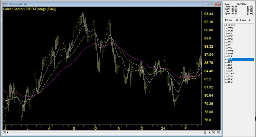
In this Chart, we see the top % change ETF from 2/23/24. The recent trend is up and it’s accelerated in the last week.
By employing the combination strategy, the focus typically narrows down to selections at or near the top of the Relative Strength column with positive Change readings. This dual approach ensures a focus on strong sectors and becoming even stronger, optimizing the potential for successful investments.
The EDS file mentioned in this article is available to download click here
Download and save this file to your /wintes32/ EDS Strategies folder.
The Sector ETF list is available to download click here
Download and save this file to your /wintes32/ folder.
September 7, 2022 – 3pm to 7pm London time, four hour in-depth webinar
covering these in-depth topics, crucial to your successful trading.
Early bird pricing now in effect, see below to book your discounted price and save over 20%
****** Includes PDF handouts and access to the recordings of the event ******
Session 1 – Power tools and features in your WinWayCharts and how to use them
Color Studies, Overlays, Custom Indicators, Seasonality, and Matchmaker. These are important and powerful tools in your WinWayCharts. In this session, we’ll show how to set a Color Study and why, what Overlays are useful for, and more. Learn how these tools will save you time and how they contribute to your trading decisions. Darren’s 3 favourite Bullish/Bearish strategies will be used as the basis for the color study.
Session 2 – Darren’s Indicators and how to apply them
Some indicators are more reliable than others. In this session, we’ll look at some of the nuances of MACD WinWay, RSI WinWay and the CCI indicators and how they add confidence to our trading decisions. We’ll explore these 3 indicators in-depth with examples of them in action in the stock market.
Session 3 – Exchange traded funds rotation strategy so you never have to go short
Using the reports in WinWayCharts we’ll look at a tried and tested ETF rotation strategy that is simple and yet effective at getting you in the right market segment at the right time. This strategy is simple to execute and has consistently beat the market over multiple years. While this strategy doesn’t replace your regular trading, it’s a good place to consider for a segment of trading.
Session 4 – Live Trading using Darren’s Favorite Candlestick Strategy and ETF Strategy
Starting from Market Timing, then moving to the Darren’s 3 Favourite Candlestick Strategy and the ETF Rotation Report, we’ll look for candidate stocks. Using the WinWayCharts indicators we’ll look to confirm the best of the best stock and ETF candidates to place trades with stops using a live trading account.
Your Presenters: Ray Foreman UK director WinWayCharts and, Steve Hill, CEO AIQ Systems, and founder WinWayCharts
Master Trading with WinWayCharts Webinar
September 7, 2022
Early bird pricing now in effect save over 20%
ONLY $299 229
includes all handouts in PDF and access to recordings
December 20, 2021 we published this seasonality article on the Santa Claus rally https://winwaycharts.com/wordpress/tis-the-season-to-be-cautious/ In a nutshell we looked at the last 5 trading days of the year and the first 2 trading days of the next year. We looked back over the last 7 years to see if the rally holds up.
The Dow clearly did show an average rally of over 1% during those 7 trading days.
So how did things go this Santa Claus rally?
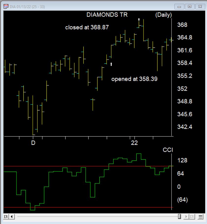
Here’s the DIA the ETF that follows the Dow during the 7 day Santa Claus rally. It made a nice gain of 2.9%. 2 days later things turned down.
This time of year you might expect us to be thinking about the Santa Claus rally, but after the beating we’ve had the last few days, lets check and see how effective this really is.
What Is a Santa Claus Rally?
I lifted this description from Investopedia
A Santa Claus rally describes a sustained increase in the stock market that occurs in the last week of December through the first two trading days in January. There are numerous explanations for the causes of a Santa Claus rally including tax considerations, a general feeling of optimism and happiness on Wall Street, and the investing of holiday bonuses. Another theory is that some very large institutional investors, a number of which are more sophisticated and pessimistic, tend to go on vacation at this time, leaving the market to retail investors, who tend to be more bullish.
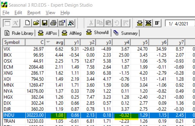
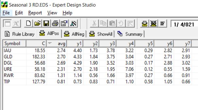
To test this in Expert Design Studio, I used the Seasonality3 ED built-in strategy. I set the Season Length days to 7 days to encompass the last 5 trading days of December and the first 2 days in the New Year.
By setting the date to 1/4/21, the rule looks back 7 trading days from January 4th, each of the last 7 years and gives us an approximate percentage return for each of those 7 days.
Some years with weekends and extra holiday days plus 252 is used as default trading days skew results a small amount. To compensate I also tested 10 trading days back from January 7. The results from the 7 days are below, I tested all the indices in my current database.
INDU is highlighted, this is the Dow 30 index. First it’s clear that in every year except for one, over the last 7 years the Dow has made gains in the Santa Claus period. The average gain Is over 1%. Not too bad for a 7 day trading period. BTW the results from the 10 days from January 7 were similar.
The NASDAQ on the contrary had 3 losing years out of the 7.
So next I decided to look at what ETFs are most likely to have a Santa Claus rally. Here’s the results using the 7 trading days back from Jan 4. This is the ETFs that had gains every year for the last 7.
The first 3 ETFS are all Gold related, the next two are real estate/REITs the last one is a bond fund. Hmm something to keep in mind.
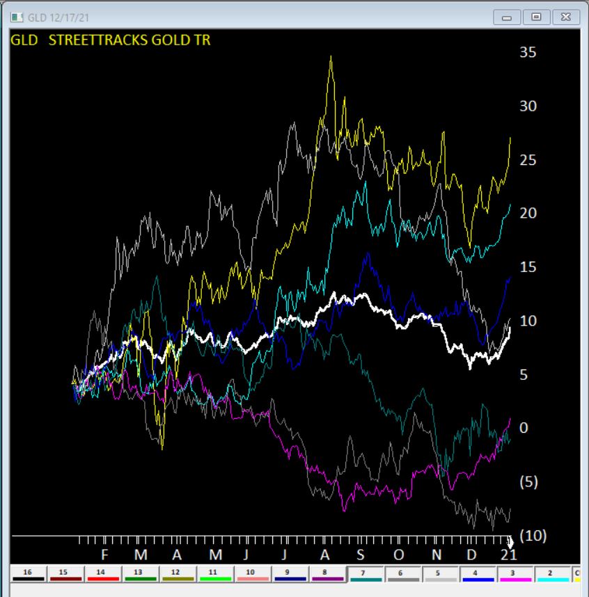
Here’s GLD seasonal charts the right hand side of each year shows the Santa Claus rally clearly. The White line is the average of all 7 years.
Clearly no guarantees what will happen this year, but something to keep in mind.
*”Every situation in life represents an opportunity”
*”Opportunity is where you find it”
Nowhere is this truer than in the financial markets.
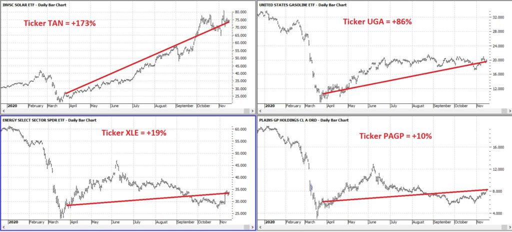
To wit, in this article dated 3/26/2020 (cue the scary music) – when things looked their absolute worst – I highlighted four tickers in the energy sector (yes, THAT energy sector, the one that has been a disaster and loathed and unloved for some time now). Now it would have taken a true “Buy when there is blood in the streets” mentality, and/or almost foolhardy nerves of steel to actually pile into those issues at the time.
But that is sort of the point.
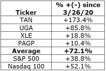
Figure 1 displays the tickers and their price action since the close on 3/26/2020.
Figure 2 displays the comparative performance versus the S&P 500 and the Nasdaq 100.
Figure 2 – “Blood in the Streets” energy stocks versus major indexes
As you can see in Figure 2 these four stocks as a whole have actually outperformed both the S&P 500 Index and the Nasdaq 100 Index.
Now the point IS NOT that I am some great stock-picker (because I am not). The point is that, well, see the two quotes above.
A Broader Look at Energy
For someone with less of the “buy when there is blood in the streets” mentality and more of “trend-following” mentality, a simple trend-following method may soon (at long last) swing to the bullish side.
It works like this:
*Two “tickers” see their respective 5-week average cross above their respective 30-week average
*Ticker 1 is ticker XLE (the SPDR energy ETF)
*Ticker 2 is an index (I created) of securities that have an inverse correlation to the U.S. Dollar
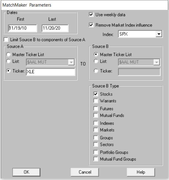
Editors Note: To create an inverse index of the ticker XLE, you’ll first need to use the Matchmaker tool and run a correlation between XLE and your database of stocks. The stocks that correlate the least with have the highest negative correlation.
To create the index. Make a new list in AIQ Data Manager, create a new group ticker called ANTIUS3 and add it to the list. Add the least correlated tickers from Matchmaker to this group, then use Compute Group/Sector Indices to compute all dates for this list. You’ll now have an equivalent to the ANTIUS3.
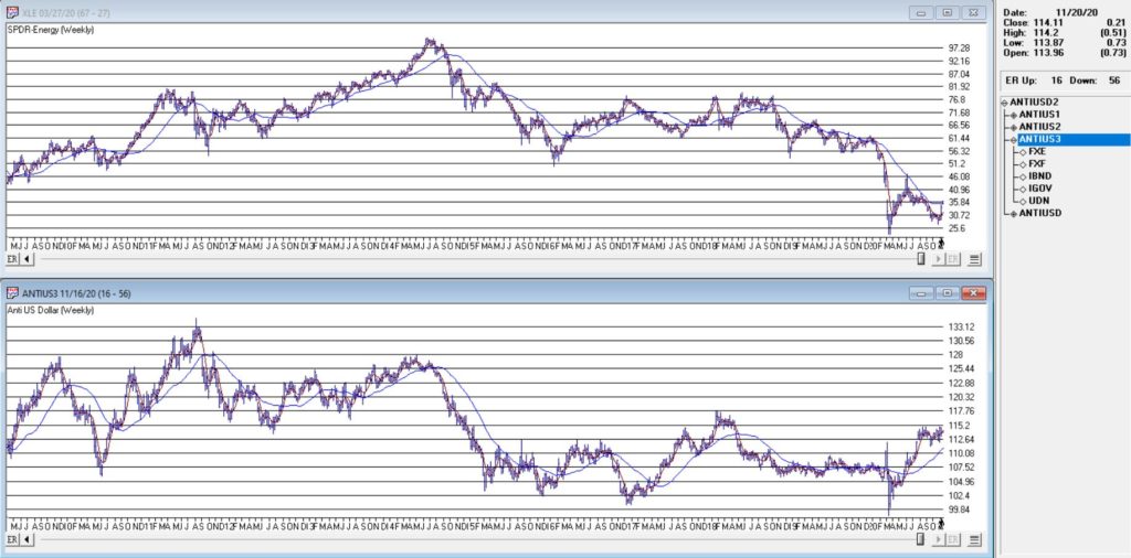
You can see these two – along with their respective 5-week and 30-week – in Figure 3.
Figure 3 – Ticker XLE and Jay’s ANTIUS3 index w/5-week and 30-week averages (Courtesy TradingExpert)
As you can see in Figure 3 the two have a tendency to often move together. At other times they do not. The key point here is that we ONLY pay attention when the two tickers are both trending in the same direction.
Why is this important?
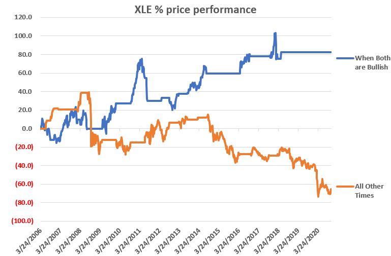
Figure 4 displays the cumulative price growth for ticker XLE (as a proxy for the broad energy sector) under two separate circumstance:
*When BOTH XLE and ANTIUS3 are in uptrends (i.e., 5-week average ABOVE 30-week average)
*When EITHER XLE or ANTIUS3 is NOT in an uptrend (i.e., 5-week average BELOW 30-week average)
Figure 4 – XLE cumulative %+(-) depending on trend status for XLE and ANTIUS3
To put it in numbers:
When BOTH are in Uptrends: XLE = +82.3%
When EITHER is NOT in an Uptrend: XLE = -65.5%
Summary
Another glance at Figure 1 reveals that ANTIUS3 is in an uptrend and that XLE is not quite there yet. So, at the moment there is no bullish signal from the method described above. However, energy does appear to be “trying” to rally. Investors looking for “opportunity” may be wise to keep an eye on the 5-week and 30-week averages of ticker XLE in the weeks and month ahead.
Jay Kaeppel
Disclaimer: The information, opinions and ideas expressed herein are for informational and educational purposes only and are based on research conducted and presented solely by the author. The information presented represents the views of the author only and does not constitute a complete description of any investment service. In addition, nothing presented herein should be construed as investment advice, as an advertisement or offering of investment advisory services, or as an offer to sell or a solicitation to buy any security. The data presented herein were obtained from various third-party sources. While the data is believed to be reliable, no representation is made as to, and no responsibility, warranty or liability is accepted for the accuracy or completeness of such information. International investments are subject to additional risks such as currency fluctuations, political instability and the potential for illiquid markets. Past performance is no guarantee of future results. There is risk of loss in all trading. Back tested performance does not represent actual performance and should not be interpreted as an indication of such performance. Also, back tested performance results have certain inherent limitations and differs from actual performance because it is achieved with the benefit of hindsight.
In the late 1980’s, Japan seemed destined to “rule the financial world”. But when it comes to the financial markets – things don’t always pan out as they appear destined to. The Nikkei Index topped out in late 1989, didn’t bottom out until February 2009 and has yet to return to its 1989 peak.
But it sure is trying. This past week the Nikkei reached its highest level 1991. So, hooray for the Japanese. Back here in the US of A there may be a slightly different take. For as we will discuss in a moment, what is good for Japanese stocks is (apparently) bad for US bonds.
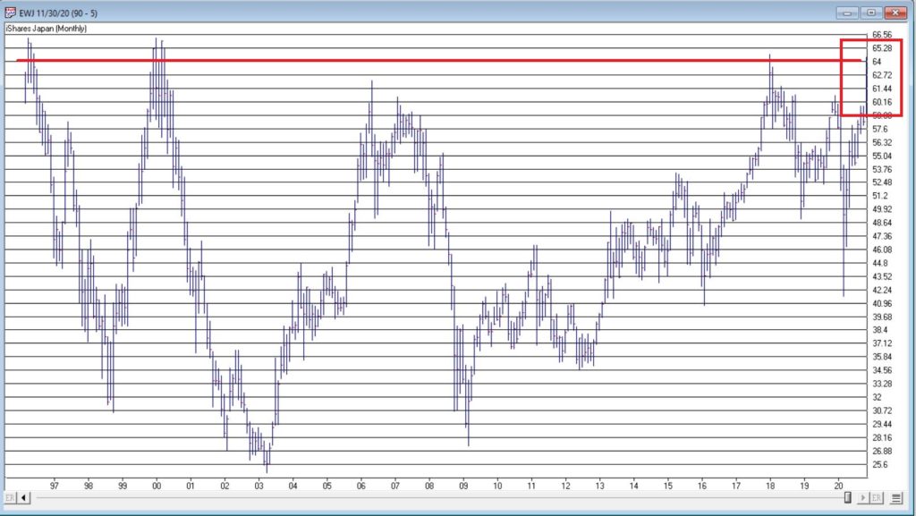
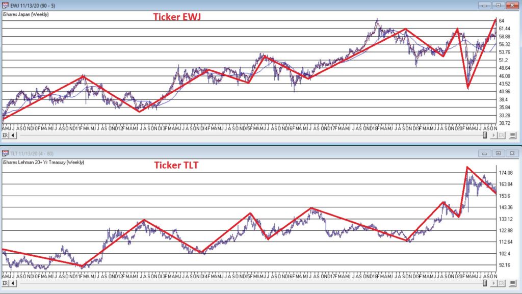
Ticker EWJ
As our proxy for Japanese stocks we will use ticker EWJ (iShares Japan). In Figure 1 you can the monthly action since the ETF started trading in 1996.
Since 1996 EWJ has broken in the $60 a share range on 5 previous occasions, only to be rebuffed. You can see the latest upward thrust at the far right. Will this be the time it breaks through? It beats me and in fact that is not really the focus of this article. The real question posed here is “what about U.S. treasury bonds?” Huh? Consider Figure 2.
The top clip of Figure 2 displays a weekly chart of EWJ with a 5-week and 30-week moving average drawn. The bottom clip displays a weekly chart of ticker TLT – the iShares ETF that tracks the long-term U.S. treasury bond.
Note that – using highly technical terms – when one “zigs”, the other “zags.”
The thing to note is the inverse correlation between the two – i.e., when Japanese stocks advance, US treasuries tend to decline and vice versa. For the record (and for you fellow numbers geeks out there) the correlation coefficient in the last 2 years is -0.45 (1 means they trade exactly the same, -1 means they trade exactly inversely).
For my purposes:
*EWJ 5-week MA < EWJ 3-week MA = BULLISH for US treasuries
*EWJ 5-week MA > EWJ 3-week MA = BEARISH for US treasuries
Any real merit to this?
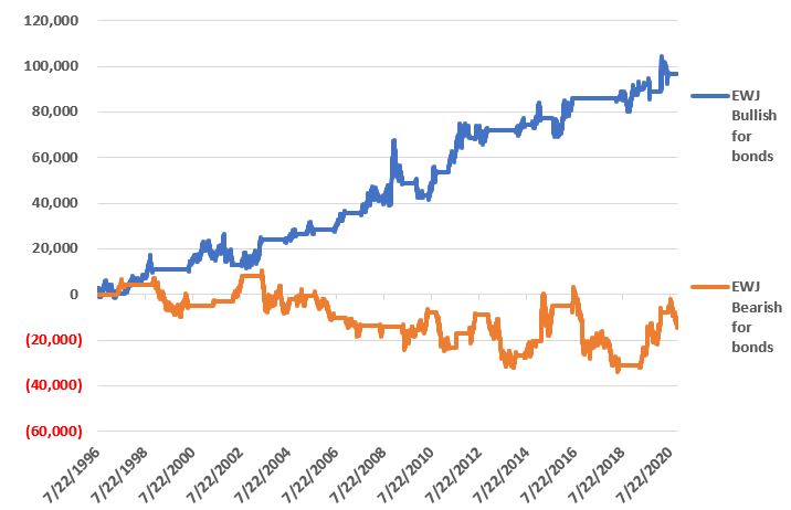
*The blue line in Figure 3 displays the cumulative $ +(-) achieved by holding a long position in t-bond futures ($1,000 a point) when the EWJ indicator is BULLISH (for U.S. bonds)
*The orange line in Figure 3 displays the cumulative $ +(-) achieved by holding a long position in t-bond futures ($1,000 a point) when the EWJ indicator is BEARISH (for U.S. bonds)
Figure 3 – $ + (-) for Treasury Bond Futures when EWJ indicator is BULLISH for bonds (blue) or BEARISH for bonds (orange)
Summary
Bond investors might keep a close eye on Japanese stocks for a while. If the latest thrust higher follows through and becomes the move that finally breaks out to the upside, the implication would appear to be negative for U.S. long-term treasury bonds. On the flip side, if Japanese stocks fail once again to break through and reverse to the downside, then things might look a whole lot better for the 30-year US treasury.
Jay Kaeppel
Disclaimer: The information, opinions and ideas expressed herein are for informational and educational purposes only and are based on research conducted and presented solely by the author. The information presented represents the views of the author only and does not constitute a complete description of any investment service. In addition, nothing presented herein should be construed as investment advice, as an advertisement or offering of investment advisory services, or as an offer to sell or a solicitation to buy any security. The data presented herein were obtained from various third-party sources. While the data is believed to be reliable, no representation is made as to, and no responsibility, warranty or liability is accepted for the accuracy or completeness of such information. International investments are subject to additional risks such as currency fluctuations, political instability and the potential for illiquid markets. Past performance is no guarantee of future results. There is risk of loss in all trading. Back tested performance does not represent actual performance and should not be interpreted as an indication of such performance. Also, back tested performance results have certain inherent limitations and differs from actual performance because it is achieved with the benefit of hindsight.