To put this piece in context please refer to Part I here.
Part I detailed the Good News (the stock market is still very much in a bullish trend and may very well continue to be for some time) and touched on one piece of Bad News (the market is overvalued on a long-term valuation basis).
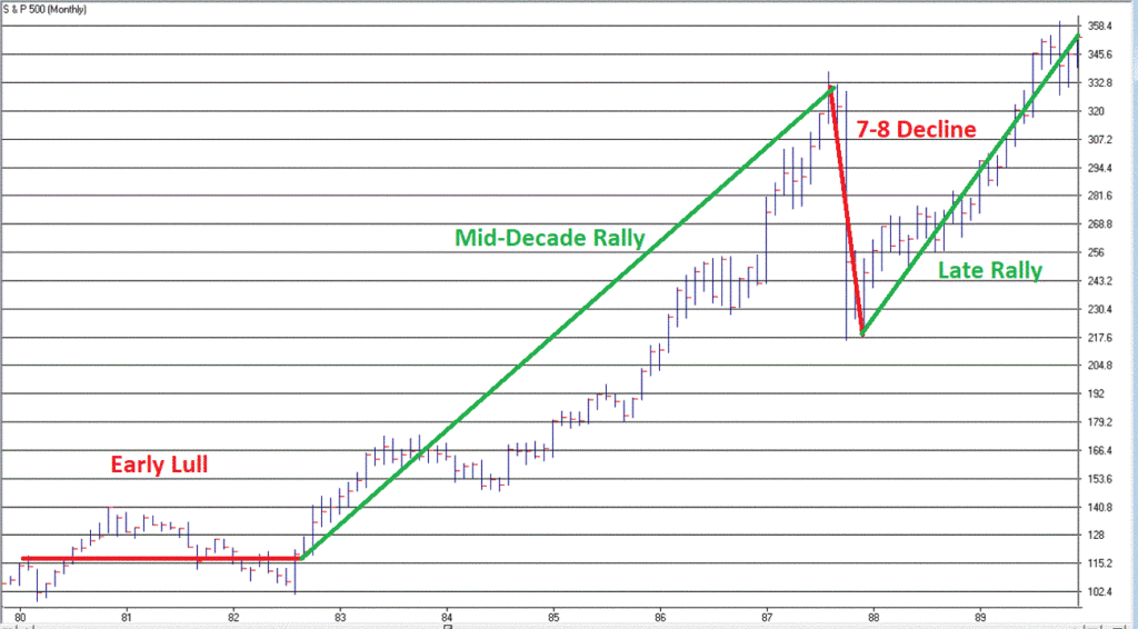
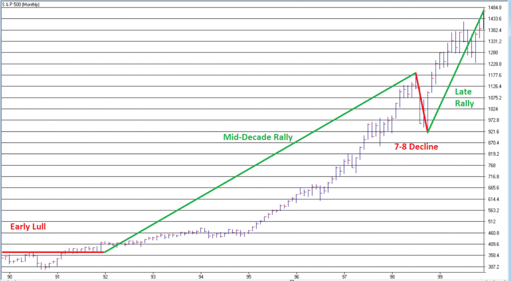
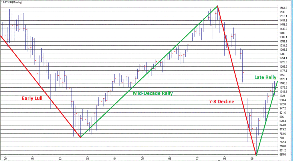
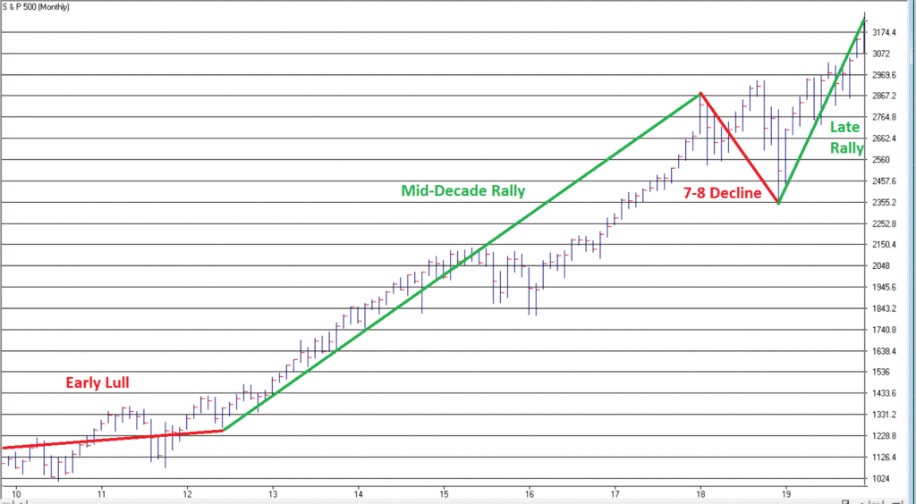
The Next Piece of Bad News: The “Early Lull”
In my book, Seasonal Stock Market Trends, I wrote about something called the Decennial Pattern, that highlights the action of the stock market in a “typical” decade.
The Four Parts of the “Typical Decade” are:
The Early Lull: Market often struggles in first 2.5 years of a decade
The Mid-Decade Rally: Market typically rallies in the middle of a decade – particularly between Oct 1 Year “4” and Mar 31 Year “6”
The 7-8 Decline: Market often experiences a sharp decline somewhere in the Year “7” to Year “8” period
The Late Rally: Market often rallies strongly into the end of the decade.
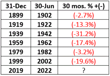
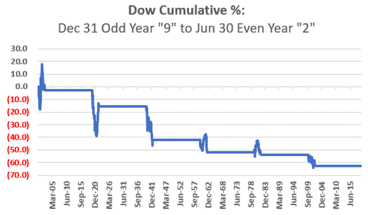
We are now in the “Early Lull” period. This in no way “guarantees” trouble in the stock market in the next two years. But it does offer a strong “suggestion”, particularly when we focus only on decades since 1900 that started with an Election Year (which is where we are now) – 1900, 1920, 1940, 1960, 1980, 2000.
As you can see in Figures 5 and 6, each of these 6 2.5-year decade opening periods witnessed a market decline – -14% on average and -63% cumulative. Once again, no guarantee that 2020 into mid 2022 will show weakness, but….. the warning sign is there
Figure 5 – Dow price performance first 2.5 years of decades that open with a Presidential Election Year (1900-present)
Figure 6 – Cumulative Dow price performance first 2.5 years of decades that open with a Presidential Election Year (1900-present)
Summary
Repeating now: the trend of the stock market is presently “Up”.
Therefore:
*The most prudent thing to do today is to avoid all of the “news generated” worry and angst and enjoy the trend.
*The second most prudent thing to do is to acknowledge that this up trend will NOT last forever, and to prepare – at least mentally – for what you will do when that eventuality transpires, i.e., take a moment to locate the nearest exit.
Stay tuned for Part III
Jay Kaeppel
Disclaimer: The information, opinions and ideas expressed herein are for informational and educational purposes only and are based on research conducted and presented solely by the author. The information presented does not represent the views of the author only and does not constitute a complete description of any investment service. In addition, nothing presented herein should be construed as investment advice, as an advertisement or offering of investment advisory services, or as an offer to sell or a solicitation to buy any security. The data presented herein were obtained from various third-party sources. While the data is believed to be reliable, no representation is made as to, and no responsibility, warranty or liability is accepted for the accuracy or completeness of such information. International investments are subject to additional risks such as currency fluctuations, political instability and the potential for illiquid markets. Past performance is no guarantee of future results. There is risk of loss in all trading. Back tested performance does not represent actual performance and should not be interpreted as an indication of such performance. Also, back tested performance results have certain inherent limitations and differs from actual performance because it is achieved with the benefit of hindsight.
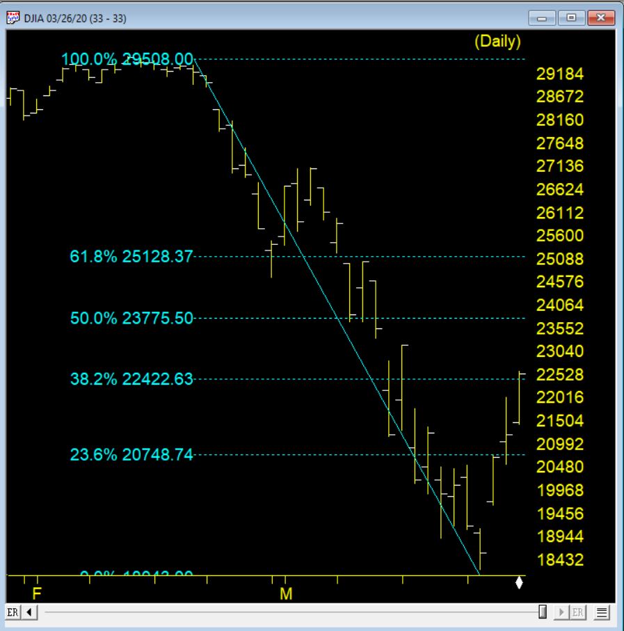
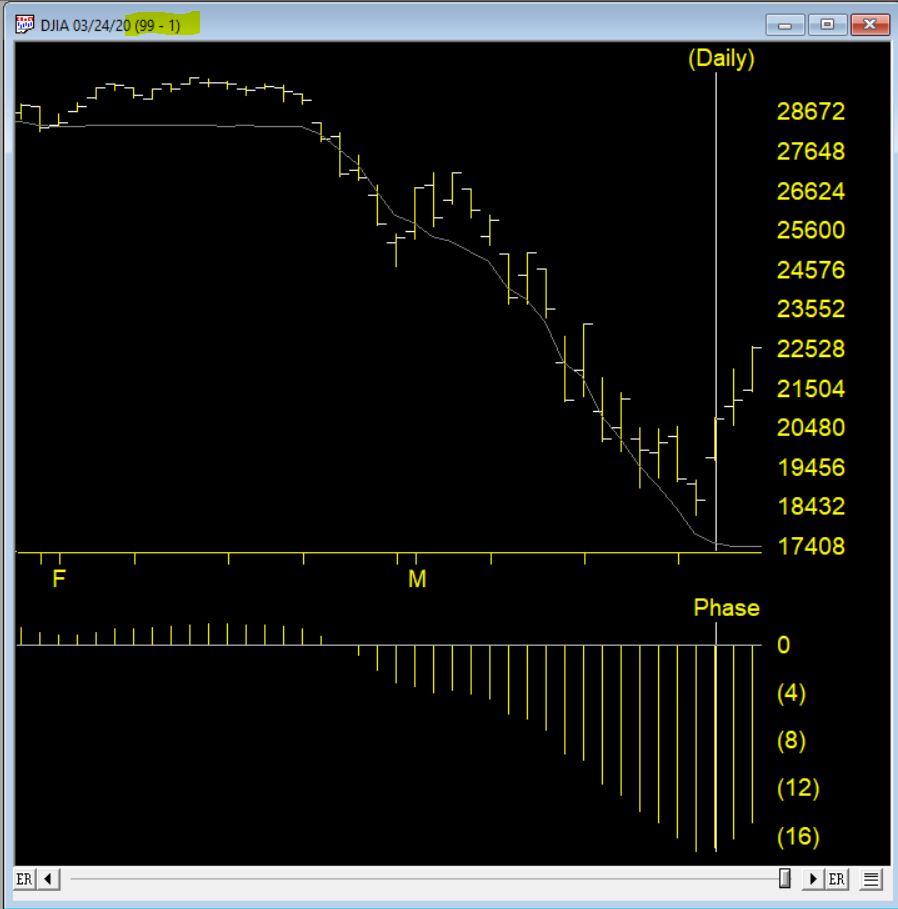
3-26-20 saw the market on the third day of a rebound from the low of 18213 on 3-23-20. The chart below shows the Fibonacci retracements from the recent high to this low. Since that time prices have been a narrow range for this volatile market
The retracement hit the 38.2% level and this level can offer resistance. The market is down again and could be we are headed down to retest at or near the last low.
If we rally passes the 38.2% the next resistance level will be at 23775 or so at the 50% retracement level.
Market Timing signals
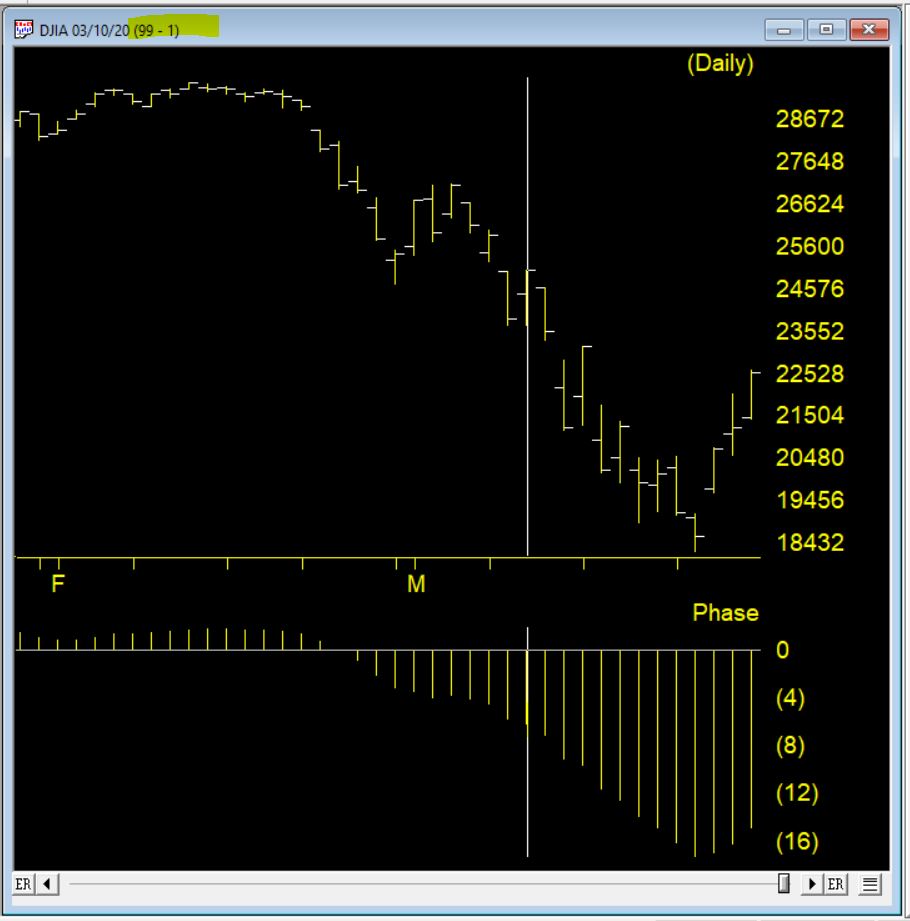
The Market Timing system issued a 99-1 up signal on 3-10-20, the chart below shows the signal. The Phase indicator changing direction in the direction of the signal (moving down then moves up) provides confirmation market Timing signals. IN this case that didn’t happen.
Another up signal 99-1 fired on 3-24-20 and this time the phase turned up the same day and confirmed the signal.
Here are 3 of the bullish rules that fired to create this high up signal
The 21 day stochastic has advanced and crossed the 20% line and the price phase indicator is also increasing. In this weakly downtrending market this is taken as a strong bullish signal suggesting an increase in prices.
Volume accumulation percentage is increasing and the 21 day stochastic has moved above the 20% line. In this downtrending market, this is taken as a strong bullish signal that could be followed by an upward price movement.
The price phase indicator is negative but volume accumulation has started to advance. This is a non-conformation that, regardless of the type of market, is a bullish signal which usually results in an upward movement of the market.
The counter trend AI system that generates these signals can be early in their firing. While the market moved up 2000 a nice move in most markets, in prior trading environments this would have taken a number of weeks, in our current volatility the market moved from the up signal in 2 days.
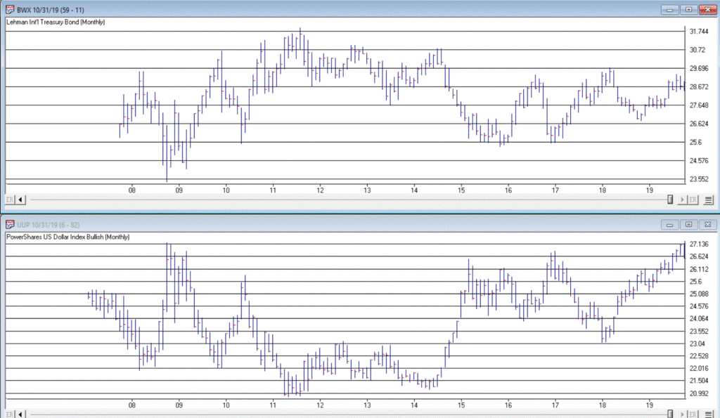
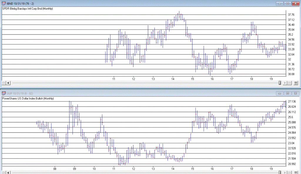
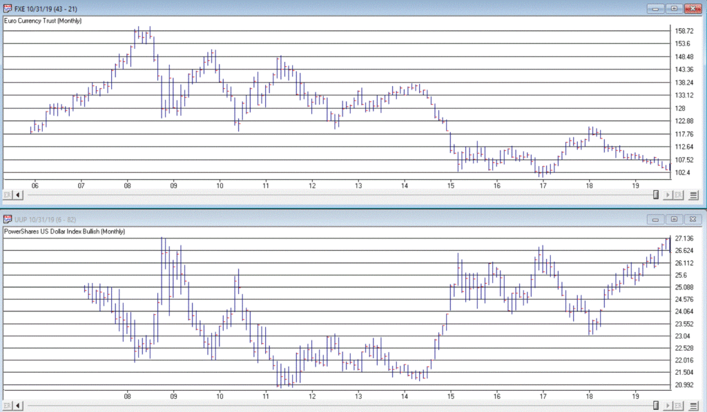
As the primary currency recognized around the globe, the U.S. Dollar is pretty important. And the trend of the dollar is pretty important also. While a strong dollar is good in terms of attracting capital to U.S. shores, it makes it more difficult for U.S. firms that export goods. One might argue that a “steady” dollar is generally preferable to a very strong or very weak dollar.
Speaking of the trend of the dollar, a lot of things move inversely to the dollar. In fact, one can typically argue that as long as the dollar is strong, certain “assets” will struggle to make major advances. These include – commodities in general, metals specifically, foreign currencies (obviously) and international bonds (strongly).
Let’s first take a look at the state of the dollar.
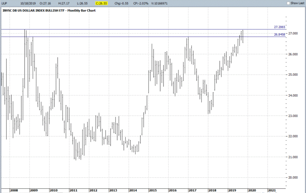
Ticker UUP
For our purposes we will use the ETF ticker UUP ( Invesco DB US Dollar Index Bullish Fund) to track the U.S. Dollar. Figure 1 displays a monthly chart and suggests that UUP just ran into – and reversed at least for now – in a significant zone of resistance.
Which way will things go? It beats me. But I for one will be keeping a close eye on UUP versus the resistance levels highlighted in Figures 1 and 2. So will traders of numerous other securities.
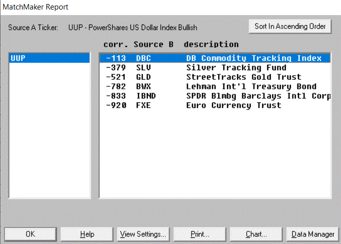
Inverse to the Buck
Figure 4 displays the 4-year weekly correlation for 5 ETFs to ticker UUP (a correlation of 1000 means they trade exactly the same a UUP and a correlation of -1000 means they trade exactly inversely to UUP).
Figure 4 – 4-Year Correlation to ticker UUP (Courtesy WInWayCharts)
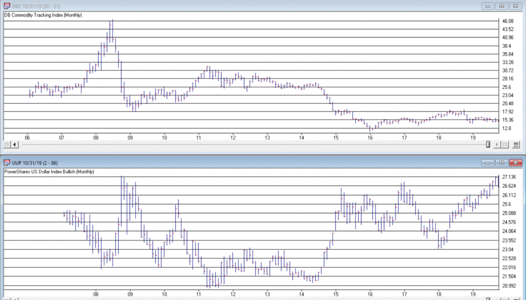
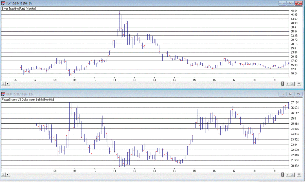
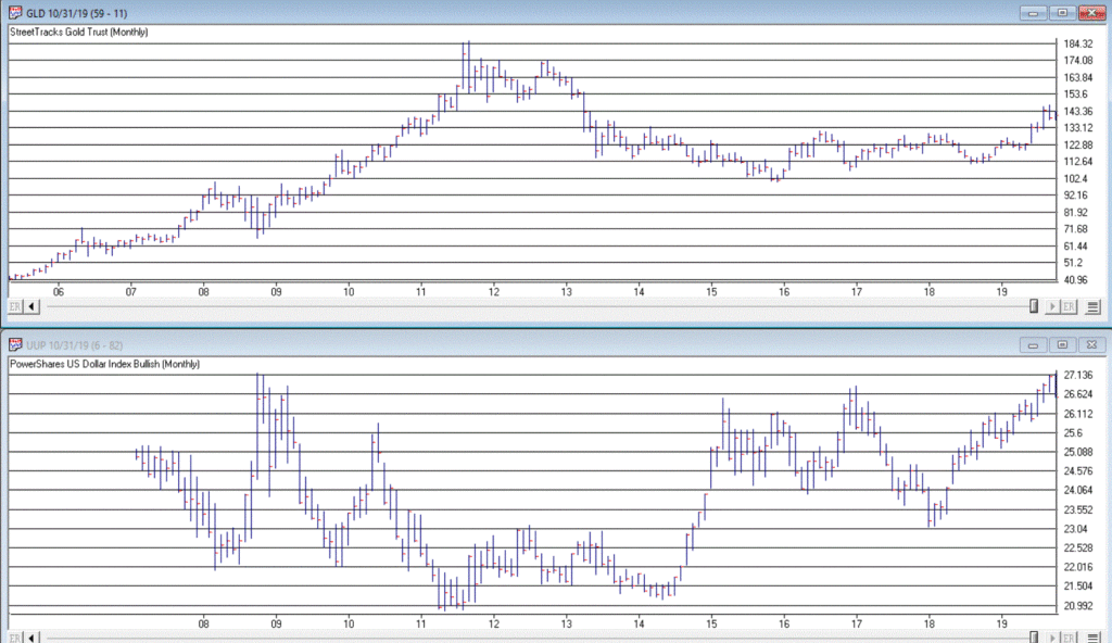
In the following charts, note the inverse relationship between the dollar (UUP on the bottom) and the security in the top chart. When the dollar goes way down they tend to go way up – and vice versa.
Note also that in the last year several of these securities went up at the same time the dollar did. This is a historical anomaly and should not be expected to continue indefinitely.
Figure 5 – Ticker DBC (Invesco DB Commodity Index Tracking Fund) vs. UUP (Courtesy WInWayCharts)
Figure 8 – Ticker BWX (SPDR Bloomberg Barclays International Treasury Bond) vs. UUP (Courtesy WInWayCharts)
Figure 9 – Ticker IBND (SPDR Bloomberg Barclays International Corporate Bond) vs. UUP (Courtesy WInWayCharts)
Figure 10 – Ticker FXE (Invesco CurrencyShares Euro Currency Trust) vs UUP (Courtesy WInWayCharts)
Summary
If the dollar fails to break out of it’s recent resistance area and actually begins to decline then commodities, currencies, metals and international stocks and bonds will gain a favorable headwind. How it all actually plays out, however, remains to be seen.
So keep an eye on the buck. Alot is riding on it – whichever way it goes.
Jay Kaeppel
Disclaimer: The data presented herein were obtained from various third-party sources. While I believe the data to be reliable, no representation is made as to, and no responsibility, warranty or liability is accepted for the accuracy or completeness of such information. The information, opinions and ideas expressed herein are for informational and educational purposes only and do not constitute and should not be construed as investment advice, an advertisement or offering of investment advisory services, or an offer to sell or a solicitation to buy any security.
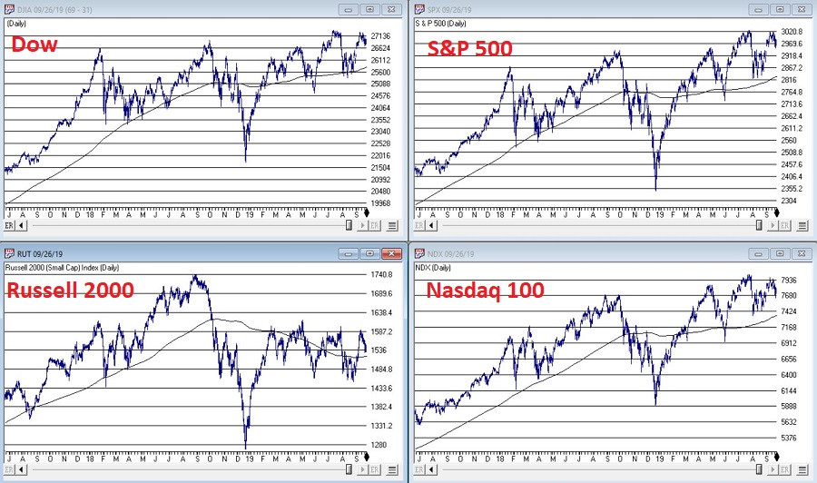
As usual, you can pretty much see whatever you want to see in today’s stock market. Consider the major indexes in Figure 1, displayed along with their respective 200-day moving averages.
If you “want to” be bullish, you can focus on the fact that all 4 of these major indexes are presently above their respective 200-day moving averages. This essentially defines an “uptrend”; hence you can make a bullish argument.
If you want to be “bearish”, you can focus on the “choppy” nature of the market’s performance and the fact that very little headway has been made since the highs in early 2018. This “looks like” a classic “topping pattern” (i.e., a lot of “churning”), hence you can make a bearish argument.
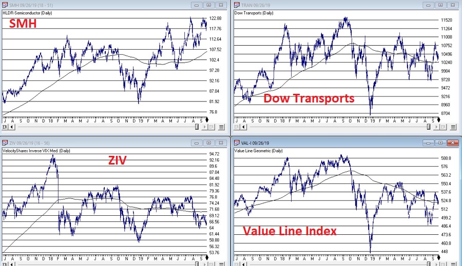
To add more intrigue, consider the 4 “market bellwethers” displayed in Figure 2.
(NOTE: Previously I had Sotheby’s Holdings – ticker BID – as one my bellwethers. As they are being bought out, I have replaced it with the Value Line Arithmetic Index, which has a history of topping and bottoming prior to the major indexes)
The action here is much more mixed and muddled.
*SMH – for any “early warning” sign keep a close eye on the semiconductors. If they breakout to a new high they could lead the overall market higher. If they breakdown from a double top the market will likely be spooked.
*TRAN – The Dow Transports topped out over a year ago and have been flopping around aimlessly in a narrowing range. Not exactly a bullish sign, but deemed OK as long as price holds above the 200-day moving average.
*ZIV – Inverse VIX is presently below it’s 200-day moving average, so this one qualifies as “bearish” at the moment.
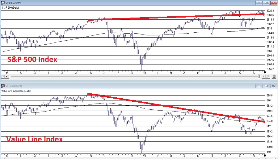
*VAL-I – The Value Line Index is comprised of 1,675 stocks and gives each stock equal weight, so is a good measure of the “overall” market. It presently sits right at its 200-day moving average, however – as you can see in Figure 3 – it is presently telling a different story than the S&P 500 Index.
Figure 3 – S&P 500 trending slightly higher, Value Line unweighted index trending lower (Courtesy WinWayCharts.com)
The Bottom Line
OK, now here is where a skilled market analyst would launch into an argument regarding which side will actually “win”, accompanied by roughly 5 to 50 “compelling charts” that “clearly show” why the analysts’ said opinion was sure to work out correctly. Alas, there is no one here like that.
If the question is, “will the stock market break out to the upside and run to sharply higher new highs or will it break down without breaking out to new highs?”, I sadly must default to my standard answer of, “It beats me.”
Here is what I can tell you though. Instead of relying on “somebody’s opinion or prediction” a much better bet is to formulate and follow an investment plan that spells out:
*What you will (and will not) invest in?
*How much capital you will allocate to each position?
*How much risk you are willing to take with each position?
*What will cause you to exit with a profit?
*What will cause you to exit with a loss?
*Will you have some overarching “trigger” to cause you to reduce overall exposure?
*And so on and so forth
If you have specific answers for the questions above (you DO have specific answers, don’t you?) then the correct thing to do is to go ahead and follow your plan and ignore the myriad prognostications that attempt to sway you one way or the other.
Jay Kaeppel
Disclaimer: The data presented herein were obtained from various third-party sources. While I believe the data to be reliable, no representation is made as to, and no responsibility, warranty or liability is accepted for the accuracy or completeness of such information. The information, opinions and ideas expressed herein are for informational and educational purposes only and do not constitute and should not be construed as investment advice, an advertisement or offering of investment advisory services, or an offer to sell or a solicitation to buy any security.
Stephen Hill is Founder of WinWayCharts. For the past 12 years he has been involved in all aspects of WinWayCharts, from support and sales to programming and education. Steve is a frequent speaker at events in the U.S. and Europe, talking on subjects as diverse as Portfolio Simulation Techniques, Advanced Chart Pattern Analysis and Trading System Design.
Chart pattern analysis, often thought of as part science part art is a key element in many traders decision process. Common patterns like double tops and bottoms are somewhat self-fulfilling, given that most of us can see these patterns occurring. Measures of what constitutes a double top or bottom in good analytical terms we’ll save for another article. In this this article we are focussing on two of my favorite chart patterns; Flags and Pennants
Flags and Pennants are Consolidation or Continuation Patterns
These patterns break out in the direction of the previous trend, confirming the existing trend, suggesting that investors are considering whether the market is overbought or oversold but ultimately deciding to confirm the existing trend. Flags and pennants are of two types, bullish or bearish
Flags and pennants are generally considered continuation patterns as they breakout in the prevailing trend direction. They represent a brief pause especially after a steep run up in an active ticker. They are a fairly common and useful for short term trading.
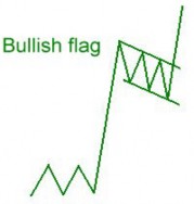
Bullish Flags – formation
Lower tops and lower bottoms bounded by two parallel trendlines with pattern slanting against the prevailing trend are considered bull flags (figure 1).
Figure 1. Bullish flag pattern
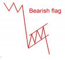
Bearish Flags – formation
Higher tops and higher bottoms bounded by two parallel trendlines with pattern slanting against the prevailing trend are considered bear flags. (figure 2).
Figure 2. Bearish flag pattern
Elements of bullish flags
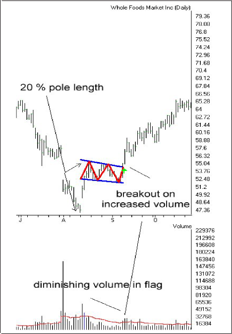
A rapid and steep price rise of around 20% from bottom of the pole to top.
Decreasing volume during the formation of the flag.
Breakout occurs to the upside with resumption of increase volume levels
Flags length excluding the pole classic should be around 10 days, can be less but not more than 20 days.
Figure 3. Whole Foods Market, Inc (WFMI) bullish flag
Bulkowski noted that the high and tight flag performed best. (source Encyclodpedia of Chart Patterns by Thomas Bulkowski).
Some 25% of the patterns are horizontal notes Markos Katsanos. (source Measuring Flags & Pennants: Technical Analysis of Stocks and Commodities vol 23 no 4) bullish flag breakout on increased volume note the pole length is 20% + of the price action and the diminishing volume on the flag. Elements of bearish flags
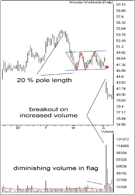
A rapid and steep price decline of around 20% from top of the pole to bottom.
Decreasing volume during the formation of the flag.
Breakout occurs to the downside with resumption of increase volume levels.
Flag length excluding the pole should be around 10 days, can be less but not more than 20 days.
Figure 4 shows MNST classic bearish flag breakout on increased volume note the pole length is 20% + of the price action and the diminishing volume on the flag.
Bullish Pennants – formation
Pennants look very much like symmetrical triangles, on the end of a pole, typically they are smaller in size and duration (figure 5).
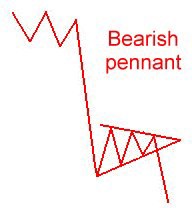
Bearish Pennants – formation
An upside down bullish pennant, the triangle is at the bottom of the pole. (figure 6).
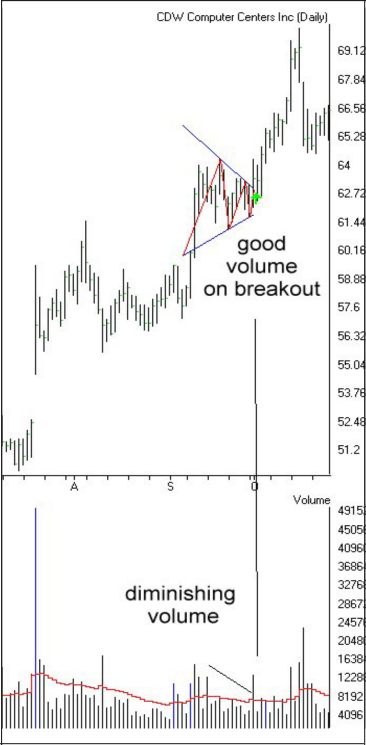
Elements of bullish pennants
A rapid and steep price rise of around 20% from bottom of the pole to top.
Decreasing volume during the formation of the pennant.
Pennants look like symmetrical triangles on a pole, price action is converging.
Diminishing volume as pennant forms.
Breakout to the upside with re- sumption of volume levels.
Pennant length excluding the pole should be around 10 days, can be less but not more than 20 days.Figure 7 shows CDW classic bullish pennant breakout on increased volume
A rapid and steep price drop of around 20% from top of the pole to bottom.
Decreasing volume during the formation of the pennant.
Pennants look like symmetrical triangles on a pole, price action is converging.
Diminishing volume as pennant forms.
Breakout to the downside with resumption of volume levels.
Pennant length excluding the pole should be around 10 days, can be less but not more than 20 days.
How do you trade flags and pennants?
Katsanos study of Flags and pennants revealed that the average breakout was 45% over an average period of 11 days. Bulkowski noted a 63% average gain. to trade these breakouts, set tight stops at low of day before breakout and use trailing stops once breakout occurs.
Target prices are more difficult to predict as these are continuation patterns, but after 11 days you are beyond the average move in days.
AIQ tip
Once a breakout occurs, use AIQ space on right of the chart (rtalerts only) and advance 11 days into the future. Draw a trendline parallel to the pole trend from the breakout point.
First the reality. Nobody knows what the market is going to do. Yes, I am aware that there are roughly a bazillion people out there “prognosticating” (myself included) about the stock market. And yes, if one makes enough “predictions”, the law of averages dictates that one will be correct a certain percentage of the time.
Still, the market does offer clues. Sometimes those clues turn out to be false leads. But sometimes they do offer important information. For example, Figure 1 displays four major market indexes. As you can see, in the Aug-Sep-Oct time frame all four of these averages “broke out” to new all-time highs (i.e., The Good News) and then broke back down below the previous resistance line drawn on each chart (i.e., The Bad News).
Figure 1 – Four major indexes breakout then fail (Courtesy TradingExpert)
False breakouts happen all the time. And the reality here is that sometimes they mean something and sometimes they don’t. But when all four major average do the same thing, a warning sign has been issued to those who are interested in seeing it. That’s why it can be useful to seek “confirmation”. For my purposes I look to what I refer to as my 4 “bellwethers”, which are:
SMH – Semiconductors
TRAN – Dow Transportation Average
ZIV – Velocity Shares Inverse VIX Index
BID – Sotheby Holdings
These tickers appear in Figure 2 (click to enlarge).
While the major indexes were testing new highs in Aug/Sep and then breaking down in October:
SMH – Never really came close to breaking out above its March high
TRAN – Followed the major indexes by hitting new highs in Aug/SP and then breaking down in October
ZIV – Never came anywhere close to its Jan-2018 high
BID – Broke to a new high in Jun/Jul, then failed badly.
In a nutshell, the failed major index breakouts were accompanied by absolutely no positive signs from the 4 bellwethers. So, the warning signs were there if one wished to see them.
So where are the bellwethers now? Another close look at Figure 2 reveals that:
SMH – the key support level at 80.92
TRAN – the key level for the Dow Transports is 8744.36
ZIV – the key support level is 60.60
BID – a potential support level is 32.95 (the Apr 2013 low)
Summary
*Given the washed-out/oversold level that many indicators and sentiment surveys have reached…
*…Combined with the fact that we are in the seasonally favorable pre-election year (no down pre-election years since the 1930’s)
*There is a chance that 2019 could be surprisingly bullish, and shell-shocked investors should not stick their heads in the sand to the possibility.
At the same time:
*Based solely on trend-following indicators ALL of the major market indexes are technically in confirmed bear markets. As a result, there is absolutely nothing wrong with having some portion of one’s capital in defensive positions at the moment (30% cash or short-term bonds?).
*Keep a close eye on January performance. A bullish January would be a positive sign just as a negative January could – in this case – signal a continued market decline.
*Keep a close eye on the 4 Bellwethers relative to their respective support levels.
In a nutshell:
*Up January + Bellwethers holding above support = GOOD
*Down January + Bellwether breaking down below support = BAD
Those are all the “clues” I can offer at the moment.
Jay Kaeppel
Disclaimer: The data presented herein were obtained from various third-party sources. While I believe the data to be reliable, no representation is made as to, and no responsibility, warranty or liability is accepted for the accuracy or completeness of such information. The information, opinions and ideas expressed herein are for informational and educational purposes only and do not constitute and should not be construed as investment advice, an advertisement or offering of investment advisory services, or an offer to sell or a solicitation to buy any security.