In the late 1980’s, Japan seemed destined to “rule the financial world”. But when it comes to the financial markets – things don’t always pan out as they appear destined to. The Nikkei Index topped out in late 1989, didn’t bottom out until February 2009 and has yet to return to its 1989 peak.
But it sure is trying. This past week the Nikkei reached its highest level 1991. So, hooray for the Japanese. Back here in the US of A there may be a slightly different take. For as we will discuss in a moment, what is good for Japanese stocks is (apparently) bad for US bonds.
Ticker EWJ
As our proxy for Japanese stocks we will use ticker EWJ (iShares Japan). In Figure 1 you can the monthly action since the ETF started trading in 1996.
Since 1996 EWJ has broken in the $60 a share range on 5 previous occasions, only to be rebuffed. You can see the latest upward thrust at the far right. Will this be the time it breaks through? It beats me and in fact that is not really the focus of this article. The real question posed here is “what about U.S. treasury bonds?” Huh? Consider Figure 2.
The top clip of Figure 2 displays a weekly chart of EWJ with a 5-week and 30-week moving average drawn. The bottom clip displays a weekly chart of ticker TLT – the iShares ETF that tracks the long-term U.S. treasury bond.
Note that – using highly technical terms – when one “zigs”, the other “zags.”
The thing to note is the inverse correlation between the two – i.e., when Japanese stocks advance, US treasuries tend to decline and vice versa. For the record (and for you fellow numbers geeks out there) the correlation coefficient in the last 2 years is -0.45 (1 means they trade exactly the same, -1 means they trade exactly inversely).
For my purposes:
*EWJ 5-week MA < EWJ 3-week MA = BULLISH for US treasuries
*EWJ 5-week MA > EWJ 3-week MA = BEARISH for US treasuries
Any real merit to this?
*The blue line in Figure 3 displays the cumulative $ +(-) achieved by holding a long position in t-bond futures ($1,000 a point) when the EWJ indicator is BULLISH (for U.S. bonds)
*The orange line in Figure 3 displays the cumulative $ +(-) achieved by holding a long position in t-bond futures ($1,000 a point) when the EWJ indicator is BEARISH (for U.S. bonds)
Figure 3 – $ + (-) for Treasury Bond Futures when EWJ indicator is BULLISH for bonds (blue) or BEARISH for bonds (orange)
Summary
Bond investors might keep a close eye on Japanese stocks for a while. If the latest thrust higher follows through and becomes the move that finally breaks out to the upside, the implication would appear to be negative for U.S. long-term treasury bonds. On the flip side, if Japanese stocks fail once again to break through and reverse to the downside, then things might look a whole lot better for the 30-year US treasury.
Jay Kaeppel
Disclaimer: The information, opinions and ideas expressed herein are for informational and educational purposes only and are based on research conducted and presented solely by the author. The information presented represents the views of the author only and does not constitute a complete description of any investment service. In addition, nothing presented herein should be construed as investment advice, as an advertisement or offering of investment advisory services, or as an offer to sell or a solicitation to buy any security. The data presented herein were obtained from various third-party sources. While the data is believed to be reliable, no representation is made as to, and no responsibility, warranty or liability is accepted for the accuracy or completeness of such information. International investments are subject to additional risks such as currency fluctuations, political instability and the potential for illiquid markets. Past performance is no guarantee of future results. There is risk of loss in all trading. Back tested performance does not represent actual performance and should not be interpreted as an indication of such performance. Also, back tested performance results have certain inherent limitations and differs from actual performance because it is achieved with the benefit of hindsight.
The bond market was very quiet in the 3rd quarter. Figure 1 displays ticker IEF (7-10 year treasuries ETF) in the to clip and ticker AGG (Aggregate Bond Index ETF) in the bottom clip.
Essentially the entire bond market has been flat since early June. The market seems to be assuming that “the Fed will take of everything” and keep interest rates low and stable for the foreseeable future so…..ZZZZZZZZ.
But this type of activity often breeds complacency. I am not making any predictions here but I do want to raise a question that investors might wish to ponder, i.e., “what would be more shocking that a spike in interest rates?” OK, yes, I realize it is 2020 and it is pretty much hard to be shocked by anything anymore. But still, on a relative basis how many investors are even thinking about the potential risk of higher interest rates at the moment?
Could it Happen?
The Bond Market VIX (ticker MOVE) recently fell to its lowest level ever (before spiking sharply higher on 10/5/20). As you can see in Figure 2 this type of “quietness” often precedes a significant move in the bond market. For the record, low readings in MOVE can be followed by large up moves in price as easily as large down moves in price. So, a low MOVE reading is not “bearish” per se, but rather merely suggests that we are experiencing the “calm before the storm.”
So why is my “Spidey sense” tingling? Figure 3 displays the yield on 30-year treasuries (ticker TYX) on the bottom and an indicator I refer to as VFAA on the bottom (the calculation appears at the end of this piece). VFAA is a derivative on a Larry William’s indicator he calls VixFix.
Figure 3 – 30-year treasury yields with VFAA suggesting a potential bottoming area (Courtesy TradingExpert)
As you can see in Figure 3, peaks in the VFAA indicator often occur near intermediate term lows in bond yields (reminder: bond prices move inversely to yield, so a bottom in interest rates indicates a top in bond prices). As you can also see on the far-right hand side, the stage clearly appears to be set for “the next go round.”
Why does this matter? If interest rates do rise in the months ahead bond prices – particularly long-term bond prices can get hit hard. To illustrate the potential risks, Figure 4 displays the action of treasury security ETFs of various maturity during a 5-month rise in rates back in 2016.
Figure 4 – Bond ETF action during rate rise in 2016
Summary
It is possible for long and short-term bonds to “de-couple”. In other words, the possibilities are:
*Short-term rates remain stable (as the Fed keeps pumping) while long-term rates rise (as inflation fears arise as a result of all the Fed pumping)
*Short-term rates remain stable while long-term rates plummet (if the economy appears to be weakening). This would result in gains for long-term bonds only
*None of the above
The bottom line: Bonds have fallen asleep – but DO NOT fall asleep on bonds.
VFAA Formula
Below is the code for VFAA
VixFix is an indicator developed many years ago by Larry Williams which essentially compares the latest low to the highest close in the latest 22 periods (then divides the difference by the highest close in the latest 22 periods). I then multiply this result by 100 and add 50 to get VixFix.
*Next is a 3-period exponential average of VixFix
*Then VFAA is arrived at by calculating a 7-period exponential average of the previous result (essentially, we are “double-smoothing” VixFix)
Are we having fun yet? See code below:
hivalclose is hival([close],22).
vixfix is (((hivalclose-[low])/hivalclose)*100)+50.
vixfixaverage is Expavg(vixfix,3).
vixfixaverageave is Expavg(vixfixaverage,7).
VFAA = vixfixaverageave
Jay Kaeppel
Disclaimer: The information, opinions and ideas expressed herein are for informational and educational purposes only and are based on research conducted and presented solely by the author. The information presented represents the views of the author only and does not constitute a complete description of any investment service. In addition, nothing presented herein should be construed as investment advice, as an advertisement or offering of investment advisory services, or as an offer to sell or a solicitation to buy any security. The data presented herein were obtained from various third-party sources. While the data is believed to be reliable, no representation is made as to, and no responsibility, warranty or liability is accepted for the accuracy or completeness of such information. International investments are subject to additional risks such as currency fluctuations, political instability and the potential for illiquid markets. Past performance is no guarantee of future results. There is risk of loss in all trading. Back tested performance does not represent actual performance and should not be interpreted as an indication of such performance. Also, back tested performance results have certain inherent limitations and differs from actual performance because it is achieved with the benefit of hindsight.
Truth be told I am not much of a “stock picker”. Oh, I can pick ‘em alright just like anyone else. They just to don’t go the right way as often as I’d like. I also believe that the way to maximize profitability is to follow a momentum type approach that identifies stocks that are performing well and buying them when they breakout to the upside (ala O’Neil, Minervini, Zanger, etc.) and then riding them as long as they continue to perform. Unfortunately, I’m just not very good at it.
Back when I started out, there was such a thing as a “long-term investor.” People would try to find good companies selling at a decent price and they would buy them and hold them for, well, the long-term. Crazy talk, right? As I have already stated, I am not claiming that that is a better approach. I am just pointing out that it was “a thing.”
An Indicator
There is an indicator (I will call it VFAA, which is short for vixfixaverageave, which – lets face it – is a terrible name) that I follow that was developed as an extension of Larry William’s VixFix Indicator. There is nothing magic about it. Its purpose is to identify when price has reached an exceptionally oversold level and “may” be due to rally. The code for this indicator appears later.
For the record, I DO NOT systematically use this indicator in the manner I am about to describe, nor am I recommending that you do. Still, it seems to have some potential value, so what follows is merely an illustration for informational purposes only.
The Rules
*We will look at a monthly bar chart for a given stock
*A “buy signal” occurs when VFAA reaches or exceeds 80 and then turns down for one month
*A “sell (or exit) signal” occurs when VFAA subsequently rises by at least 0.25 from a monthly closing low
Seeing as how this is based solely on monthly closes it obviously this is not going to be a “precision market timing tool.”
Some “Good Companies” with “Troubled Stocks”
So now let’s apply this VFAA indicator to some actual stocks. Again, I AM NOT recommending that anyone use this approach mechanically. The real goal is merely to try to identify situations where a stock has been washed out, reversed and MAY be ready to run for a while.
Ticker BA
Figure 1 displays a monthly chart for Boeing (BA) with VFAA at the bottom. The numbers on the chart represent the hypothetical + (-) % achieved by applying the rules above (although once again, to be clear I am not necessarily suggesting anyone use it exactly this way).
From March 2019 into March 2020 BA declined -80%. It has since bounced around and VFAA has soared to 110.88. VFAA has yet to rollover on a month-end basis, so nothing to do here except exhibit – what’s that word again – oh right, “patience.”
Ticker GD
Figure 2 displays a monthly chart for General Dynamics (GD) with VFAA at the bottom.
Are these “world-beating numbers”? Not really. But in terms of helping to identify potential opportunities, not so bad. VFAA gave a “buy signal” for GD at the end of July. So far, not so good as the stock is down about -6%.
Ticker WFC
Figure 3 displays a monthly chart for Wells Fargo (WFC) with VFAA at the bottom.
There are not many “signals” but the ones that occurred have been useful. Between 2018 and 2020 WFC declined -65%. It has since bounced around and VFAA has soared to 102.44. VFAA has yet to rollover on a month-end basis. But at some point it will, and a potential opportunity may arise.
VFAA Formula
Below is the code for VFAA
VixFix is an indicator developed many years ago by Larry Williams which essentially compares the latest low to the highest close in the latest 22 periods (then divides the difference by the highest close in the latest 22 periods). I then multiply this result by 100 and add 50 to get VixFix.
*Next is a 3-period exponential average of VixFix
*Then VFAA is arrived at by calculating a 7-period exponential average of the previous result (essentially, we are “double-smoothing” VixFix)
Are we having fun yet? See code below:
hivalclose is hival([close],22).
vixfix is (((hivalclose-[low])/hivalclose)*100)+50.
vixfixaverage is Expavg(vixfix,3).
vixfixaverageave is Expavg(vixfixaverage,7).
VFAA = vixfixaverageave
EDITORS NOTE: The WinWay Expert Design Studio code for the indicator is available to download from here. Save this file to your /wintes32/EDS Strategies folder https://aiqeducation.com/VFAA.EDS
Summary
One thing to note is that VFAA “signals” on a monthly chart don’t come around very often. So, you can’t really sit around and wait for a signal to form on your “favorite company”. You have to look for opportunity wherever it might exist.
One last time let me reiterate that I am not suggesting using VFAA as a standalone systematic approach to investing. But when a signal does occur – especially when applied to quality companies that have recently been “whacked”, it can help to identify a potential opportunity.
Jay Kaeppel
Disclaimer: The information, opinions and ideas expressed herein are for informational and educational purposes only and are based on research conducted and presented solely by the author. The information presented represents the views of the author only and does not constitute a complete description of any investment service. In addition, nothing presented herein should be construed as investment advice, as an advertisement or offering of investment advisory services, or as an offer to sell or a solicitation to buy any security. The data presented herein were obtained from various third-party sources. While the data is believed to be reliable, no representation is made as to, and no responsibility, warranty or liability is accepted for the accuracy or completeness of such information. International investments are subject to additional risks such as currency fluctuations, political instability and the potential for illiquid markets. Past performance is no guarantee of future results. There is risk of loss in all trading. Back tested performance does not represent actual performance and should not be interpreted as an indication of such performance. Also, back tested performance results have certain inherent limitations and differs from actual performance because it is achieved with the benefit of hindsight.
I haven’t written a lot lately. Mostly I guess because there doesn’t seem to be a lot new to say. As you can see in Figure 1, the major market indexes are in an uptrend. All 4 (Dow, S&P 500, Russell 2000 and Nasdaq 100) are above their respective 200-day MA’s and all but Russell 2000 have made new all-time highs.
As you can see in Figure 2, my market “bellwethers” are still slightly mixed. Semiconductors are above their 200-day MA and have broken out to a new high, Transports and the Value Line Index (a broad measure of the stock market) are holding above their 200-day MA’s but are well off all-time highs, and the inverse VIX ETF ticker ZIV is in a downtrend (ideally it should trend higher with the overall stock market).
As you can see in Figure 3, Gold, Bonds and the U.S. Dollar are still holding in uptrends above their respective 200-day MA’s (although all have backed off of recent highs) and crude oil is sort of “nowhere”.
Like I said, nothing has really changed. So, at this point the real battle is that age-old conundrum of “Patience versus Complacency”. When the overall trend is clearly “Up” typically the best thing to do is essentially “nothing” (assuming you are already invested in the market). At the same time, the danger of extrapolating the current “good times” ad infinitum into the future always lurks nearby.
What we don’t want to see is:
*The major market averages breaking back down below their 200-day MA’s.
What we would like to see is:
*The Transports and the Value Line Index break out to new highs (this would be bullish confirmation rather the current potentially bearish divergence)
The Importance of New Highs in the Value Line Index
One development that would provide bullish confirmation for the stock market would be if the Value Line Geometric Index were to rally to a new 12-month high. It tends to be a bullish sign when this index reaches a new 12-month high after not having done so for at least 12-months.
Figure 4 displays the cumulative growth for the index for all trading days within 18 months of the first 12-month new high after at least 12-months without one.
Figure 4 – Cumulative growth for Value Line Geometric Index within 18-months of a new 12-month high
Figure 5 displays the cumulative growth for the index for all other trading days.
Figure 5 – Cumulative growth for Value Line Geometric Index during all other trading days
In Figure 4 we see that a bullish development (the first 12-month new high in at least 12 months) is typically followed by more bullish developments. In Figure 5 we see that all other trading days essentially amount to nothing.
Figure 6 displays the Value Line Geometric Index with the relevant new highs highlighted.
The trend at this very moment is “Up.” So sit back, relax and enjoy the ride. Just don’t ever forget that the ride WILL NOT last forever. If the Value Line Geometric Index (and also the Russell 2000 and the Dow Transports) joins the party then history suggests the party will be extended. If they don’t, the party may end sooner than expected.
So pay attention.
Jay Kaeppel
Disclaimer: The information, opinions and ideas expressed herein are for informational and educational purposes only and are based on research conducted and presented solely by the author. The information presented does not represent the views of the author only and does not constitute a complete description of any investment service. In addition, nothing presented herein should be construed as investment advice, as an advertisement or offering of investment advisory services, or as an offer to sell or a solicitation to buy any security. The data presented herein were obtained from various third-party sources. While the data is believed to be reliable, no representation is made as to, and no responsibility, warranty or liability is accepted for the accuracy or completeness of such information. International investments are subject to additional risks such as currency fluctuations, political instability and the potential for illiquid markets. Past performance is no guarantee of future results. There is risk of loss in all trading. Back tested performance does not represent actual performance and should not be interpreted as an indication of such performance. Also, back tested performance results have certain inherent limitations and differs from actual performance because it is achieved with the benefit of hindsight.
The question on many investors’ minds is “are we in a bond bear market?” Given that long-term treasuries have lost roughly 17% since July of 2016 it is a fair question.
The main model that I use is still bearish on bonds (more on this topic below). Still, there are a few potential “lights at the end of the bond tunnel” – at least potentially in the near-term.
Long-Term Rates
My mega long-term “fail-safe” bond trend indicator appears in Figure 1. It is the yield on 30 year treasuries (ticker TYX – which is multiplied by 10 for some unknown reason) with a 120-month exponential moving average.
Figure 1 – 30-Yr. Treasury yields (Ticker TYX) with 120-month average (Courtesy TradingExpert)
When the day comes that TYX breaks out above the 120-month moving average I for one will officially designate the great bond bull market as “over.” And that day is coming. But for what it’s worth – it’s not quite here yet.
Metals Positive for Bonds
In this article I wrote about a bond timing model that uses the relationship between gold and copper. Like a lot of timing models of all stripes it does a good job of differentiating good times for bonds from bad times for bonds, but is very far from perfect.
It goes like this:
A = Gold / Copper
B = 30-day moving average of A
C = 80-day moving average of A
D = B – C
If D > 0 = Bullish for bonds*
If D < 0 = Bearish for bonds*
*- with a 1-day lag
This indicator flipped to bullish at the close on 2/7/18 after being bearish since 7/10/2017.
Figure 2 displays the action of ticker TLT since the last “sell” signal in July 2017. As you can see, in the end it ended up being “correct” as TLT was lower on 2/7/18 than it was on 7/10/17. But that was not the case until the last week or so. So for most of the time during this bearish period TLT traded higher.
Figure 2 – Ticker TLT with recent Jay’s Metal Model signals (Courtesy TradingExpert)
What is most important however is to focus on the long-term results. In Figure 2 the blue line depicts the growth of equity achieved by holding long 1 t-bond futures contract ONLY when the model is bullish while the red line depicts the growth of equity achieved by holding long 1 t-bonds futures contract ONLY when the model is bearish (red line).
Figure 2 – T-bond futures $ gain/loss when Jay’s Metal Model is bullish (blue line) versus when model is bearish (red line)
The long-term difference in performance is fairly obvious. That being said it should also be noted that the blue line is by no means a series of straight line advances, i.e., there is no guarantee that this latest bullish signal will prove fortuitous, especially given that we may be transitioning from a long-term bond bull market to a long-term bond near market.
One More Possible Piece of Good News
In this article I applied an indicator I originally learned from Tom McClellan at http://www.mcoscillator.com to weekly TLT. This indicator looks at the number of times TLT has been up minus the number of times down over the past 20 weeks. Very often a drop to -2 or below followed by an upside reversal of 2 points (i.e., it drops to -2 then subsequently rises to 0, or drops to -3 then rises to -1 and so on) has presaged a favorable up move in bonds. This indicator applied to TLT recently fell to -2 and may flash a favorable signal soon (please note that it HAS NOT given a buy signal yet and that it could take several weeks before it does).
Figure 3 – Weekly TLT with UpDays20 Indicator (Courtesy TradingExpert)
One Piece of “Still Bad News”
In this article I wrote about one of the main bond models I use that uses the trend in Japanese stocks to trade bonds inversely, i.e., if Japanese stocks are bearish it is bullish for bonds and vice versa. I use a 5-week and 30-week moving average to quantify Japanese stocks as “bullish” or “bearish”.
In Figure 4 when the blue line in the top clip is above the red line this is considered bearish for bonds and when the blue line is below the red line it is considered bullish for bonds. For now the blue 5-week average line is still well above the red 30-week average, so this indicator still designates the trend for bonds as “bearish”.
Figure 4 – Ticker TLT tends to trade inversely to ticker EWJ (Courtesy TradingExpert)
Summary
So are bonds due to rally? Well, it seems like at least a short-term bounce could be in the offing. That being said, with bonds breaking down sharply at the moment, 1) this “idea” is geared for “traders” who are not afraid of (and are unacquainted with) taking risks, 2) it might make sense to wait for the UpDays20 indicator discussed above to tick higher by two points – which could take up to several weeks to play out – before “taking the plunge.”
As always I am not “recommending” anything, just highlighting what I see. For longer-term investors the “Boring Bond Index” bond strategy I wrote about here remains a viable long-term approach to bond investing.
Jay Kaeppel
Disclaimer: The data presented herein were obtained from various third-party sources. While I believe the data to be reliable, no representation is made as to, and no responsibility, warranty or liability is accepted for the accuracy or completeness of such information. The information, opinions and ideas expressed herein are for informational and educational purposes only and do not constitute and should not be construed as investment advice, an advertisement or offering of investment advisory services, or an offer to sell or a solicitation to buy any security.
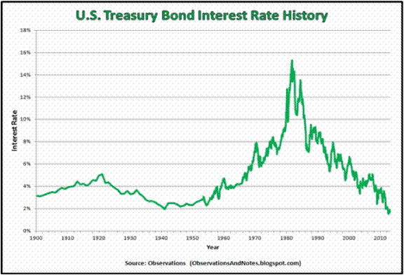
There is a lot of hand-wringing going on these days regarding the bond market. And rightly so given that interest rates have been (were?) in a downtrend for 35+ years. Given that, given the long-term cyclical nature of interest rates and given that rates are at a generational low level, “concern” is understandable.
However, needless hand-wringing over events that have yet to occur is not.
Figure 1 – Long-term treasury yields through the years (Courtesy: ObservationsanNotes.blogspot.com)
(The chart in Figure 1 is updated only through about 2012. Nevertheless, it effectively highlight the long-term cyclical nature of interest rates.)
The problem is the “well, interest rates are destined to rise therefore I should immediately [fill in your defensive action here].”
Many analysts and investors are following and attempting to interpret every tick in bond yields. In fact, some very well known bond “people” have proclaimed a “bond bear market”. And they may be right. But still…
What I Follow in the Bond Market
What follows are a few random thoughts on some of the things I look at when tracking the bond market.
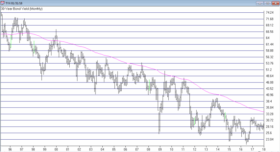
#1. 30-Year Yield versus 120-month Exponential Moving Average
Figure 2 displays ticker TYX, an index which tracks the yields on 30-year bonds (for some reason it multiplies by 10 – so a yield of 3% appears on the chart as 30.00).
Figure 2 – 30-year treasury yields versus 120-month exponential moving average (Courtesy TradingExpert)
Using the data from Figure 1 I have found that a 120-month (i.e., 10-year) average does a pretty good job of riding the major trends in interest rates. As you can clearly see in Figure 2, TYX is still noticeably below its 120-month EMA. This could obviously change quickly but for the moment by this objective measure the long-term trend in interest rates right at this very moment is still “down.”
Please note that I am not saying that interest rates will not rise and move above this MA. I am saying two things:
1. Until the crossover occurs try not to focus too much attention on dire predictions.
2. Once the crossover does occur the bond market environment that most of us have known throughout all or most of our investment lives will change dramatically (more on this topic when the time is right).
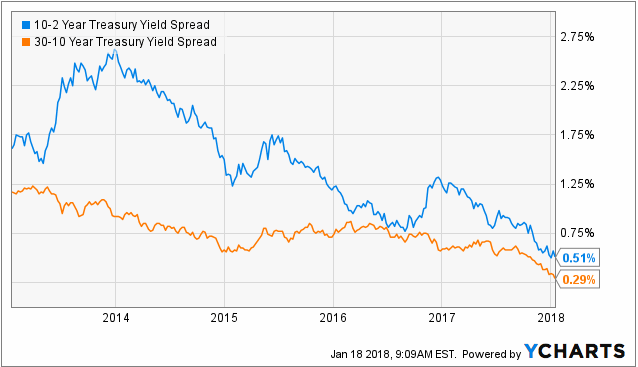
#2. The Yield Curve(s)
Figure 3 displays the yield curves for 30-year yields minus 10-year yields and 10-year yields minus 2-year yields. The narrowing trend is obvious. This is causing great consternation because historically when the yield curve “inverts” (i.e., when shorter-term rates are higher than longer-term rates) it is a very bad sign for the economy and the financial markets.
Figure 3 – 10-yr yield minus 2-year yield (blue) and 30-year yield minus 10-year yield (orange); (Courtesy: YCharts)
The problem here is that there is still an important difference between “narrowing” and actual “inverting”. Many people seems to look at Figure 3 and assume that an inverted yield curve (i.e., if and when these lines go into negative territory) is “inevitable” and that things are therefore doomed to get worse for the economy and the markets.
Repeating now: There is still an important difference between a “narrowing” yield curve and an actual “inverted” yield curve. Until the yield curve actually does invert try not to focus too much attention on dire predictions.
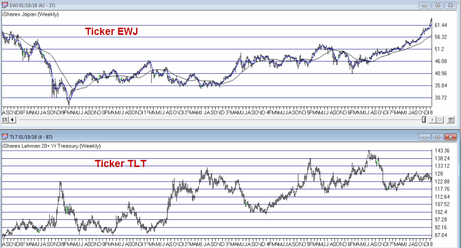
#3. The Current Trend in Bonds
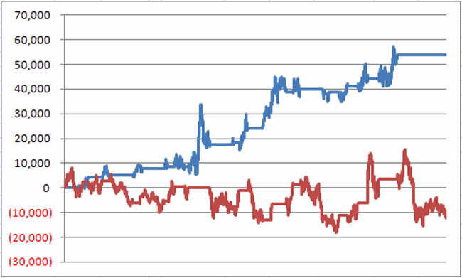
One trend following indicator that I follow (and have written about in the past) is the inverse relationship between long-term t-bonds and Japanese stocks. Figure 4 display ticker EWJ (an ETF that tracks an index of Japanese stocks) versus ticker TLT (an ETF that tracks the long-term treasury bond).
Figure 4 – Ticker EWJ versus Ticker TLT (Courtesy TradingExpert)
Figure 5 displays two equity curves. The blue line represents the $ gain achieved by holding long 1 treasury bond futures contract ONLY when the EWJ 5-week moving average is below the EWJ 30-wek moving average and the red line represents the $ loss achieved by holding long 1 treasury bond futures contract ONLY when the EWJ 5-week moving average is above the EWJ 30-week moving average.
Figure 5 – Holding long t-bond futures when EWJ is in a downtrend (blue line) versus holding long t-bond futures when EWJ is in an uptrend (red line); December 2003-present
Notice anything different about the blue line versus the red line? With EWJ trending strongly higher, caution remains in order or the long-term treasury bond. If the trend in EWJ reverses things may look better for long-term bonds.
#4. Short and Intermediate Term Bonds remain a Viable Alternative
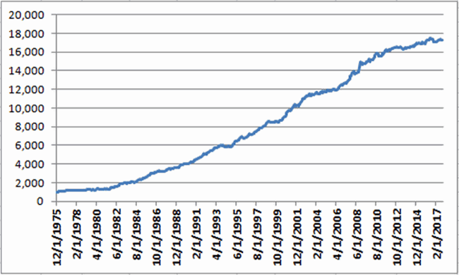
As I wrote about here an index of short and intermediate treasury and high grade corporate remains a viable long-term approach for income investors. Figure 6 displays the growth of $1,000 invested using the “Boring Bond Index” I wrote about in the aforementioned article. This index has gained in 38 of the past 42 years.
Figure 6 – Growth of $1,000 invested using “Boring Bond Index” Method; 12/31/1975-11/30/2017
Summary
There are good reasons to be wary of interest rates and bonds. At the same time overreacting to dire headlines also remains a very poor approach to investing.
So in sum:
*The very long-term trend in interest rate is still technically “down”
*The yield curve is narrowing but still has a ways to go before it inverts
*The current trend in long-term bonds is bearish
*Short and intermediate term bonds experience much less volatility than long-term bonds (and reinvest more frequently, which may come in handy if rates do begin to rise in earnest).
*If and when TYX pierces its long-term average and/or when the yield curve inverts, the time will arrive for investors to make some wholesale changes in how they approach their bond market investments.
*If and when EWJ starts to fall, things may improve for the current plight of the long-term treasury.
*And through it all, a boring approach to bonds may still prove very useful.
Jay Kaeppel
Disclaimer: The data presented herein were obtained from various third-party sources. While I believe the data to be reliable, no representation is made as to, and no responsibility, warranty or liability is accepted for the accuracy or completeness of such information. The information, opinions and ideas expressed herein are for informational and educational purposes only and do not constitute and should not be construed as investment advice, an advertisement or offering of investment advisory services, or an offer to sell or a solicitation to buy any security.

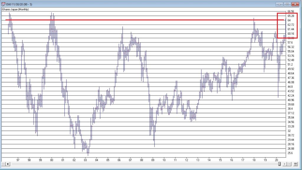
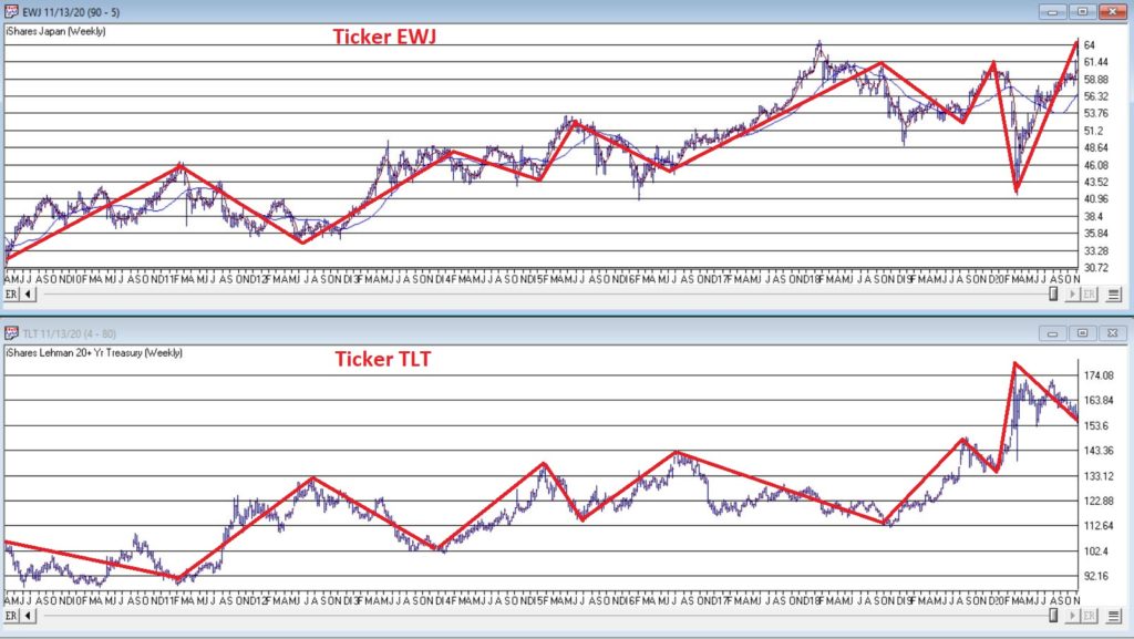
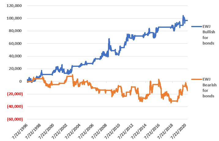
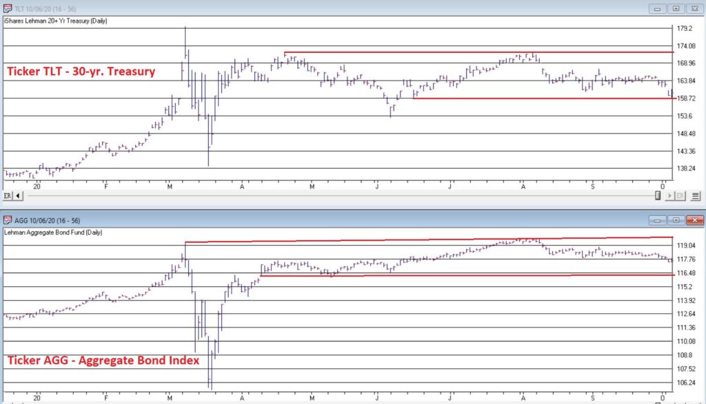
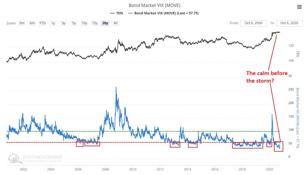
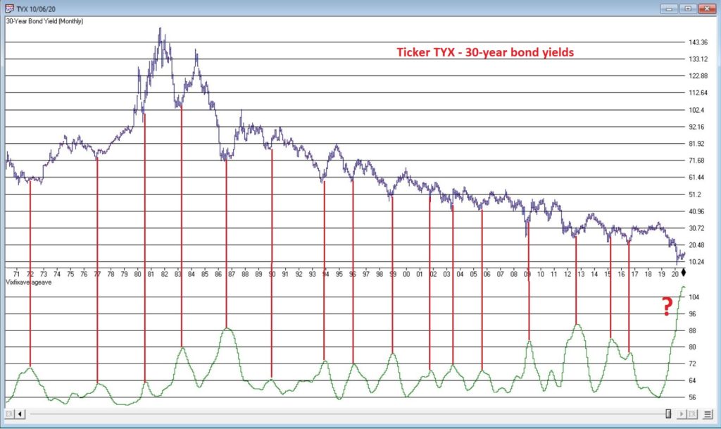
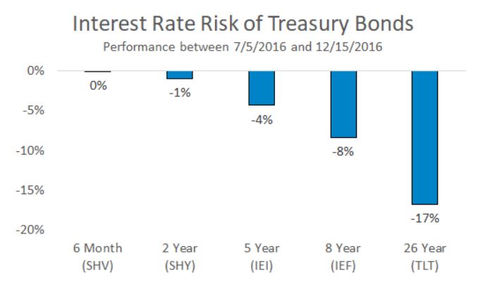
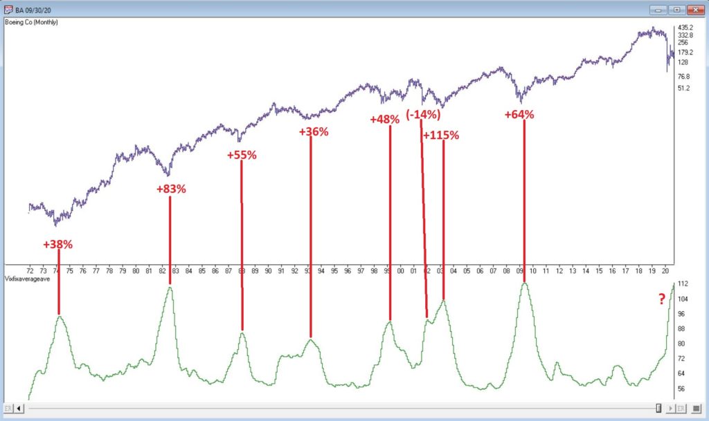
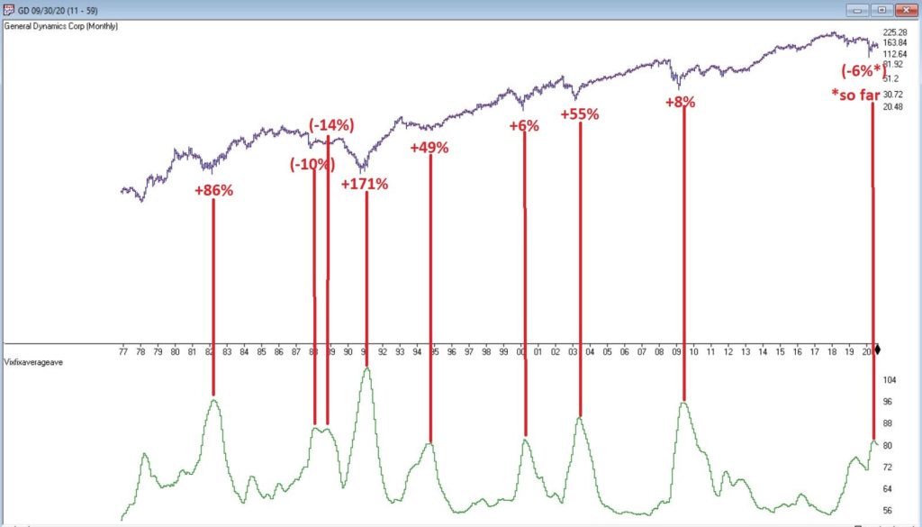
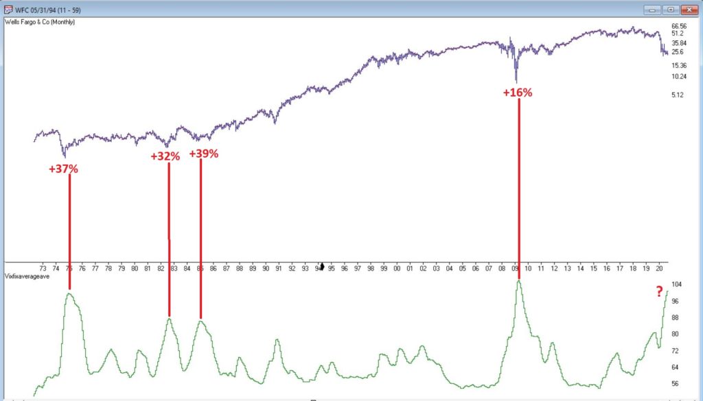
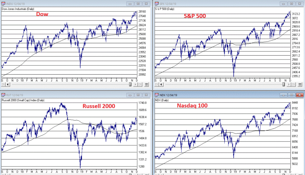
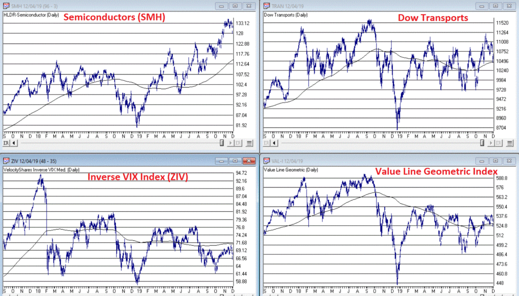
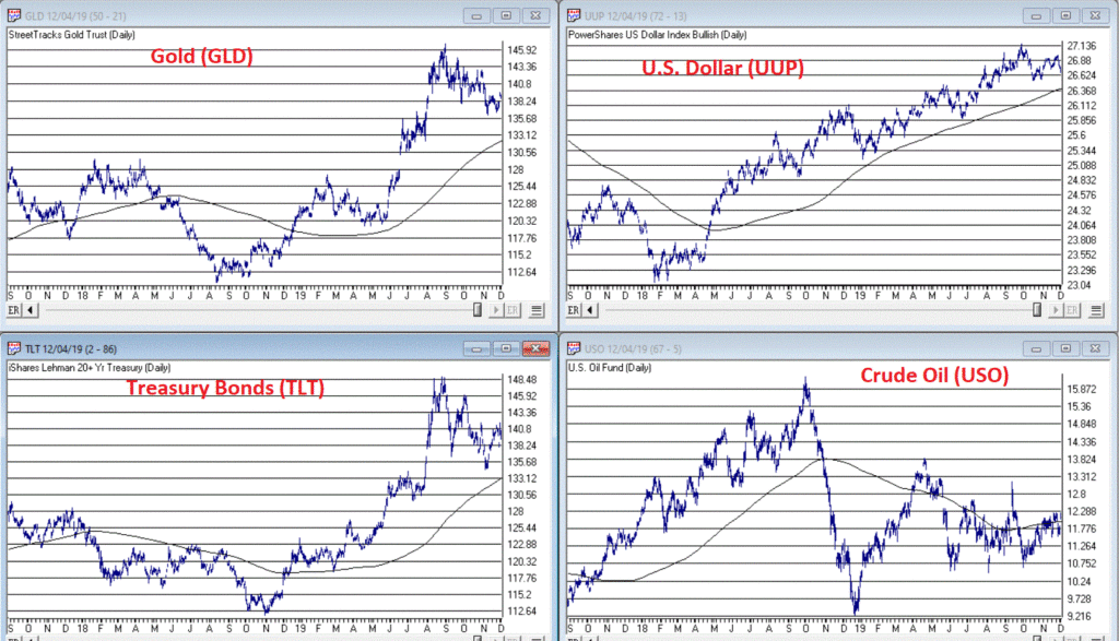
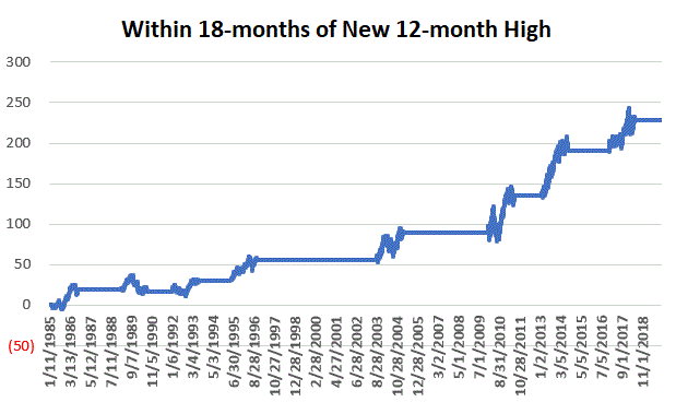
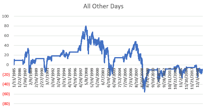
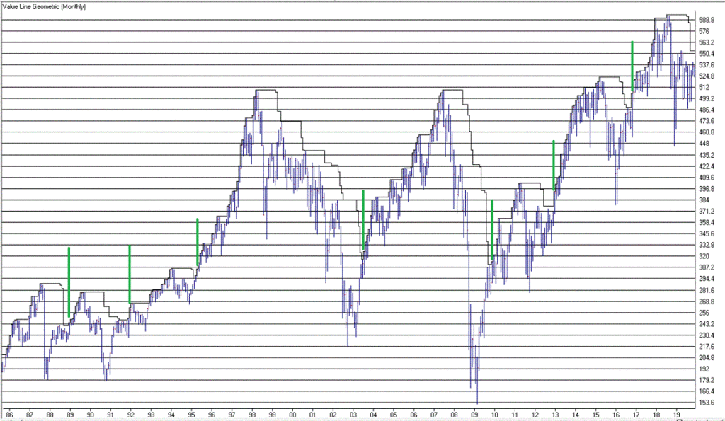
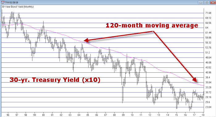 Figure 1 – 30-Yr. Treasury yields (Ticker TYX) with 120-month average (Courtesy TradingExpert)
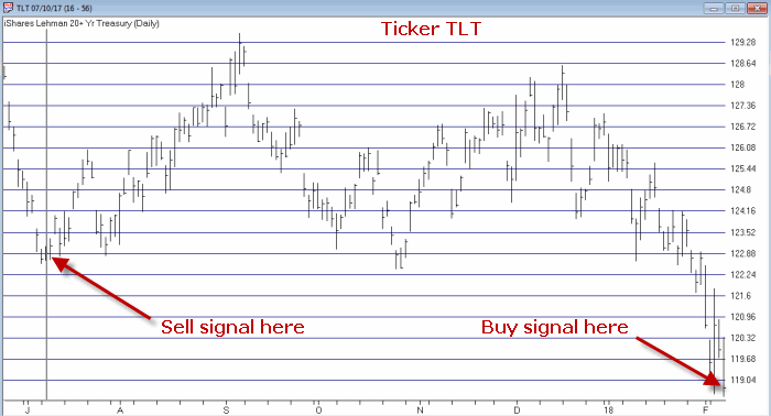 Figure 2 – Ticker TLT with recent Jay’s Metal Model signals (Courtesy TradingExpert)
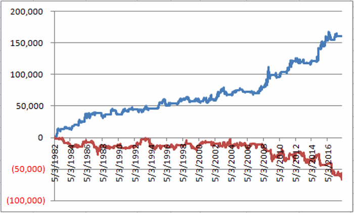 Figure 2 – T-bond futures $ gain/loss when Jay’s Metal Model is bullish (blue line) versus when model is bearish (red line)
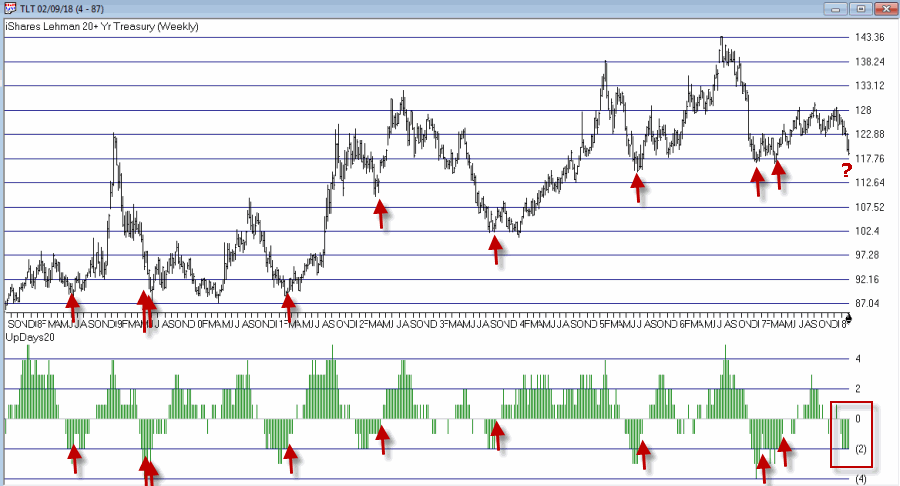 Figure 3 – Weekly TLT with UpDays20 Indicator (Courtesy TradingExpert)
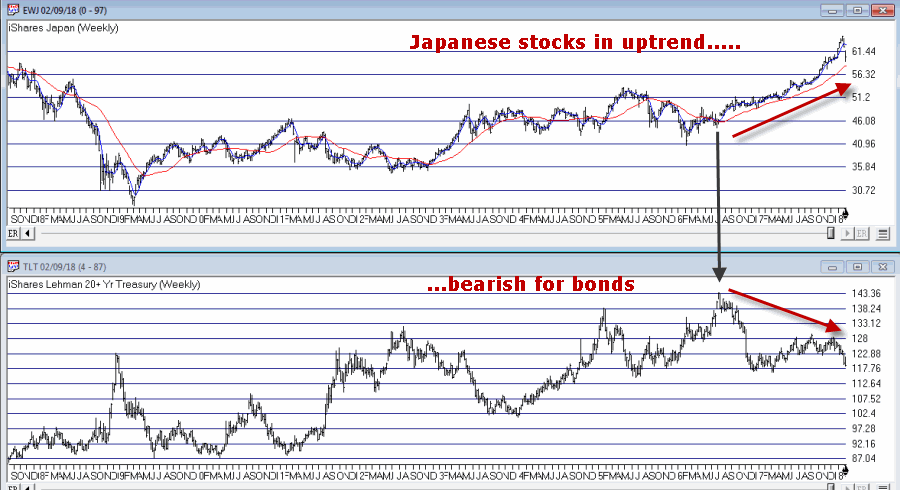 Figure 4 – Ticker TLT tends to trade inversely to ticker EWJ (Courtesy TradingExpert)